![]()
Please see our in-depth Buyer Side section for more information on how to create powerful user interfaces for documents.
Info: If no Frame is selected, you will access the Buyer Side general settings. Read more about the general settings here
When a frame is selected, the Buyer Side tab will show the Buyer Side configuration options for the frame. By default, a frame and its content are neither selectable nor changeable on Buyer Side.

Rotation: The Buyer can rotate the frame. This will show a rotation slider on the Buyer Side.
When both Rotation and Position are enabled, a rotation icon will appear on top of the selected frame:

Groups and Rotation
If rotation is used for a group, no slider will be shown and the group frame must be rotated using the rotation icon on the frame. As rotating groups will also reposition frames, you must also enable the Position option, otherwise no rotation icon will be shown.
Position: The Buyer can resize and position the frame freely on the page. As long as Keep Frames inside Pages is not enabled in the Buyer Side general settings, a Buyer can also move frames outside the page or onto other pages.

Lock Size: The Buyer can still move the frame but not resize it.
Note: The Lock Size option only appears if you have the feature Position activated.
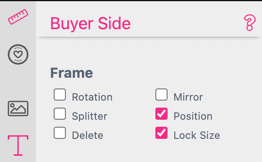
If Lock Size is activated the resize Icon will disappear from the selected frame.

Mirror: Allows the Buyer to mirror a frame horizontally or vertically by right-clicking on the frame.

Delete: The Buyer can delete the frame by selecting the trashcan icon or right-clicking on the frame.

Depending on the existing frame features, additional options will be displayed:
Arch: Controls the angle of an Arch (-90 to 90). Arch Warp needs to be switched on for the frame for this option to appear.

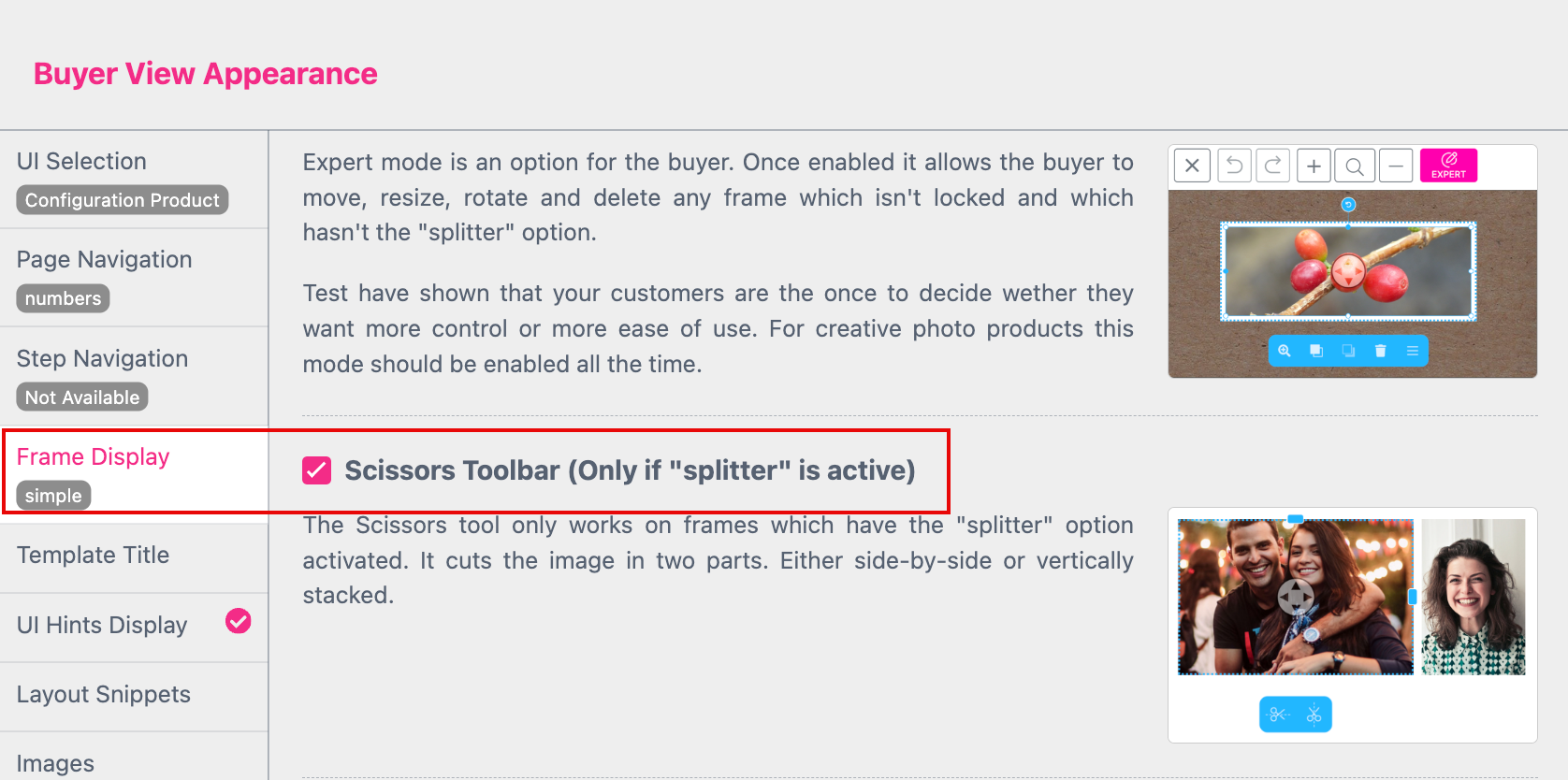
This is a powerful tool for photo collages image frame manipulation tool. The Splitter option allows Buyers to vertically and horizontally split images as well as resize image frames, all while keeping a set distance on the provided grid.
Take the Splitter tool for a test drive with our Baby Photo Book example (Pages 4 & 6):


By default the “Scissor Toolbar” is set to “Active” to be shown at the Buyer Side. You find that setting at the Buyer View Appearance Dialog at the Frame Display Tab.
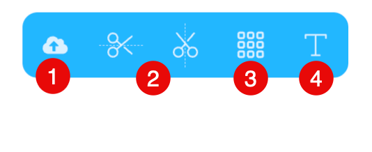
Now the Buyer can:
Notice: To enable the Splitter tool, you must also enable Content in the Image feature Buyer Side settings.

Learn more about Splitters here.

Content: Will let the Buyer upload new images and/or select a template image. The Buyer can also scale and pan them and use image filters, depending on your general settings.
Note: Image Size for upload is limited to max. 160 MPixel and 50MB file size.
Selecting Content will also enable additional Buyer Side image options:
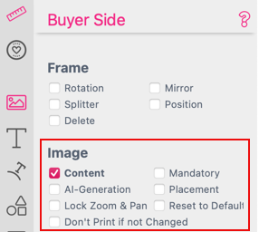
Mandatory: The Buyer must change this image and will be informed accordingly. This is useful to dissuade customers from accidentally buying products with example images in the final product.
Please read Reduce opacity for Default Images as well.
Placement: Allows Buyers to choose a fitting mode for an uploaded image.

With placement, the Buyer can choose between:
We recommend to allow placement especially for stickers as you never know what the buyers intend is. e.g. if the buyer wants to upload a Logo and the image frame is set to Fill there is no chance for the buyer to insert the logo uncropped unless he can switch placement to fit.
Lock Zoom & Pan: The Buyer can not zoom and pan the uploaded images. Therefore this option will only be available if Content is activated.
Reset to Default: Allows the Buyer to reset the image frame to the default image set in the Editor.
Depending on the UI settings (with or without groups), a button or thumbnail will appear on the Buyer Side Photo Frame tab to restore the image back to a default image.

Don’t Print if not Changed: Disable output of this image unless it is changed by the Buyer.
Reduce opacity for Default Images: Enables the Buyer to recognize at first glance which images must be changed in any case. This option can be set at Buyer View Appearance. It will not apply to the fallback image (gray camera symbol)
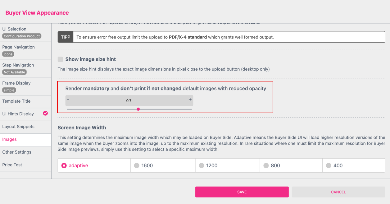
Simply move the opacity slider. This feature is only supported if the Image Frame Settings mandatory and/or don’t print if not changed are activated.
At the Buyer Side the image will now be shown with a reduced opacity

ExchangeID: Define an ID for this image to keep its content when the layout is changed. Learn more in the Snippets Chapter.
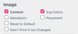
SVG Colors: This is a special feature only for SVG graphics. It lets Buyers change the colors of a SVG graphic. In order to use this feature you have to define the customizable colors first. Read more about replacing colors in SVG.

The Buyer Upload Image Group is a special Image Group. It is always there by default and is also the group where all of the images a customer uploads will be shown in. So if one does not enable the Buyer Upload Group, customers will not be able to upload new images.
If the Buyer should be able to additionally or exclusively select an image from a given library of images, one must select at least one Image Group containing an uploaded image.
Read more about creating Image Groups here.

Enabling the Auto Distribute feature for an image frame will autofill the frame with an image when a Buyer uploads multiple images.
This means that all unused Buyer uploaded images will be distributed across all image frames in the document with the Auto Distribute this Image feature switched on.
As Auto Distribute can happen in a lot of scenarios we strongly recommend not to use this feature for image frames within Stickers as it may lead to confusion (e.g. buyer is inserting a photo sticker frame and it instantly gets filled with an unused image sometimes).
Auto Distribute will also override placement settings distributed images will be inserted in fill mode.

If a document is designated as a Snippet, then enabling this feature allows an image frame to be selected as the target of an image to be inserted within an Image Filter Snippet. With this feature, you can build decorations around images and apply wonderful effects on photos to be further personalized by the Buyer.
Please see the Snippet chapter on Image Filter Snippets for more information on this feature!
Watch the Tutorial Video about Single Line Text Frames
Content - Will allow the Buyer to change the text in the frame. You may also limit the number of characters allowed in this frame by setting a Max. Chars value in the Single-Line text properties tab.
Selecting Content also enables additional features:

Color: Lets Buyers select a different color for the text. The available colors are defined by the selected Color Groups.

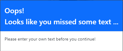
Mandatory: This forces the Buyer to change the text and will prompt a warning when it is left unchanged. This is very useful to prevent customers from accidentally buying products with example text in the final product.
Clear on Focus: When enabled, the text content will be deleted when the Buyer starts editing.
For this feature to work with Single Line texts, Inline Editing needs to be switched off.
To disable Inline Single Line Text Editing, simply deselect the text frame and enter the Buyer Side general settings:

Keep Form Fields: Allows Buyers to enter or change expressions (e.g. ${data.firstname}) which will get evaluated. This is needed for data-driven workflows as expressions otherwise can be only entered in Designer Side.
Don’t Print if not Changed: Disables output of this content unless it is changed. This allows text frames with instructions such as, “Put optional text here …” which simply disappears if not changed.
This is very useful for creating optional image titles.
Font: Allows the Buyer to select from various fonts uploaded to the Font resource tab.
Stroke Color: Allows Buyers to select a color for the stroke of the text (must have a stroke enabled). The selection of available colors is shared with Color.
Stroke Width: Allows Buyers to smoothly adjust the stroke width of the text.
Offensive: Enables a check against the defined offensive word list (either supplied in the Printess Account Portal or via API).
Caption: Enter an optional caption for the input field of this frame.
ExchangeID: This is a special setting for Layout Snippets. Here one can set an identifier for the content of this frame. Using the same identifier between different Snippets allows customers to change the design but keep the content already entered. Read more in the Snippets chapter.
With the script helper “u.part()” you can split the content of a single Form Field to up to 9 different Single Line Text Frames. When you assign it to a Frame you have to define the text part for each frame from (1of9) to (9of9) and the name of the Form Field. So the entire script looks like: “${u.part(“1of3”,form.form-field-name)}”. The example shows the spilt of the content to 3 different frames. The Form Field is named “text”. So the three different scripts for the three frames are:
${u.part("1of3",form.text)}
${u.part("2of3",form.text)}
${u.part("3of3",form.text)}
You can assign the script at the Text Field of the frame at the Text Tab at the Feature Panel. For the first frame it will look like that.

You can also write the script directly into the Single Line Text Frame. Repeat that for the second and the third frame. Now the content of one Form Field will be split to three different frames. This is how it looks at the Buyer.

By using the Translation Table you can change the language of your text content. The text will then automatically change corresponding to the browser language. The browser language is set by the Buyer or you can set it trough the API using the “translationKey”.
To make this work you have to enter the text for the respective language in the Translation Table first. This example is using the “Key” longContent in the “Name Space” “tx”:. In the example it is set up for four languages: “de”, “en”, “es” and “fr”.
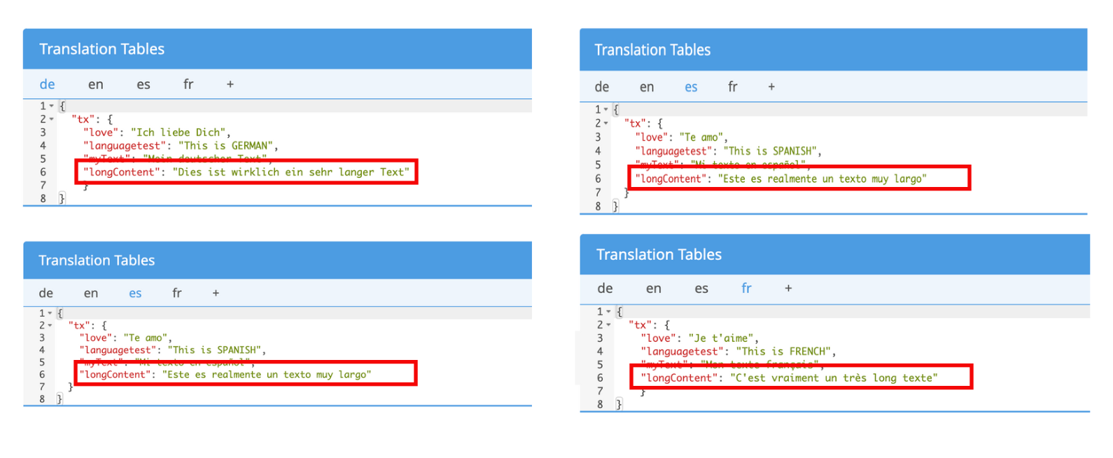
Learn more about the Translation Table here.
To assign the “Key” longContent of the “Name Space” “tx”: to a Single Line Text Frame you have to use the following syntax:
${gl("tx.longContent")}
Just write it into the Text Field of the frame at the Text Tab at the Feature Panel. The text from the Translation Table will immediately be displayed in the Single Line Text Frame. Depending on the language set for the Editor.

For testing you can now change the language of the Editor and the Buyer Side by adding"?lang=fr" to the URL for example. So the entire URL will look like: “https://editor.printess.com/?lang=fr”. And the text will be translated into French in this case.
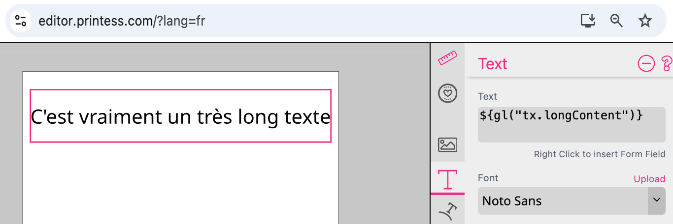
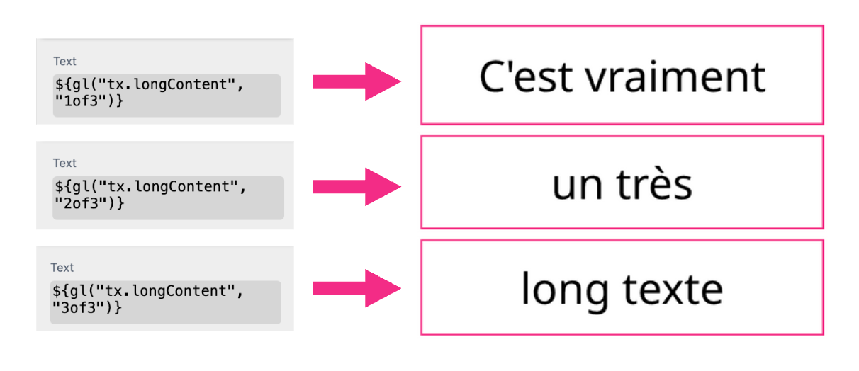
Longer texts can be distributed over up to nine individual Single Line Text Frames. The syntax must be supplemented for this.
In this example we want to distribute the text over three frames. So we define:
${gl("tx.longContent", "1of3")}
${gl("tx.longContent", "2of3")}
${gl("tx.longContent", "3of3")}
Click here to open an example document
This example is taking a UI message from the Translation Table to split into in several Single Line Text Frames.

Content: Will allow the Buyer to change the text in the frame. You may also limit the number of characters allowed in this frame by setting a Max. Chars value in the Text on Path feature properties tab.
Color: Lets Buyers select a different color for the text. The available colors are defined by the selected Color Groups.
Mandatory: When mandatory is enabled, the Buyer must change this text and will be informed accordingly. This is useful to avoid customers accidentally buying products with example text in the final product.
Keep Form Fields: Allows Buyers to enter or change expressions (e.g. ${data.firstname}) which will be evaluated. This is needed for data-driven workflows, as otherwise expressions can be only entered in Designer Side.
Offensive: Enables the check against the defined offensive word list (either supplied in the Printess Account Portal or via API).
Don’t Print if not Changed: Disables output of this frame unless it is changed. This allows for text frames with instructions like ‘put optional text here …’ which simply disappear if not changed.
Font: Allows the Buyer to select from various fonts uploaded to the Font resource tab.
Stroke Color: Allows Buyers to select a color for the stroke of the text (must have a stroke enabled). The selection of available colors is shared with color.
Stroke Width: Allows Buyers to smoothly adjust the stroke width of the text.
Clear on Focus: When enabled, the text content will be deleted when the buyer starts editing.
Caption: Enter an optional caption for the input field of this frame.
ExchangeID: Define an ID for this text to keep its content when the layout is changed Learn more in the Snippets Chapter.
Shape: These settings refer to the path (shape) the text runs on. Learn more about Shape Feature Settings.
Watch the Tutorial Video about Multi Line Text Frames
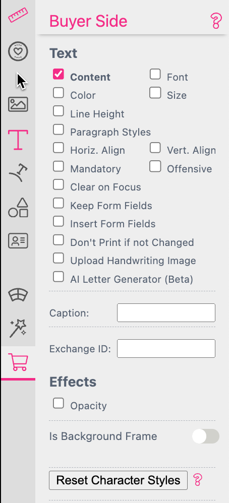
Content: Allows the Buyer to change the text in the frame. Depending on the general edit settings for Multi Line text, Buyers can either directly use the multi line text Editor on desktop browsers or edit the form-based text.
Color: Allows choosing a different color for the text. Granularity works the same as for font. The available colors are defined by the selected Color Groups. Selected Text-Color will set also the text-effect colors.
Horiz. Align: When selected, customers can change the horizontal alignment of paragraphs. Depending on the general edit settings for Multi Line text this can affect the complete text or only paragraphs.

Bullet: Allows Buyers to set the horizontal alignment to a list with bullets. Read more about Bullet Lists.
Vert. Align: When selected, Buyers can control the vertical alignment of the text within the frame.
Mandatory: When selected, the Buyer must change this text or a warning message will prompt them to change it before continuing. This is useful to avoid customers accidentally buying products with example text in the final product.
Clear on Focus: When this is enabled the text content will be deleted when the Buyer starts editing.
Keep Form Fields: Allows Buyers to enter or change expressions (e.g. ${data.firstname}) which will be evaluated. This is needed for data-driven workflows, as expressions otherwise can be only entered in the Designer side.
Insert Form Fields: This lets a Buyer insert Form Fields by right-clicking on the page (currently only available on desktop). Makes sense to be used in conjunction with Keep Form Fields, because only enabling the latter feature will not actually resolve Form Fields on the Buyer Side.
Don’t Print if not Changed: Disables the output of this frame unless it is changed. This allows for text frames with instructions like ‘put optional text here …’ which simply disappear if not changed.
Font: Lets the Buyer choose a different font for the text. Depending on the general edit settings for Multi Line text, Buyers can control text down to the character level, paragraph level, or for the complete text. Available fonts are defined by the selected Font Groups.
Size: Allows choosing a different font size for the text. Granularity works the same as for font and color.
Offensive: Enables the check against the defined offensive word list (either supplied in the Printess Account Portal or via API).
Upload Handwriting Image: This gives the Buyer an option to exchange the text with a photographed handwritten message. Printess will automatically apply a monochrome filter to eliminate gradients in the background and provide a crisp look for the message.
The Buyer can adjust the contrast level for optimal visibility as well as the color of the writing. If the Buyer selects Back to Text Editing, the uploaded photo will be discarded and the previous Multi Line text will appear again.

AI Letter Generation (Beta): This option allows the Buyer to get a letter generated using an AI. Therefore you have to define a JSON first to define the Buyer Side options for the generation of the text. You have to save it at the Advanced Settings at your Printess Account.
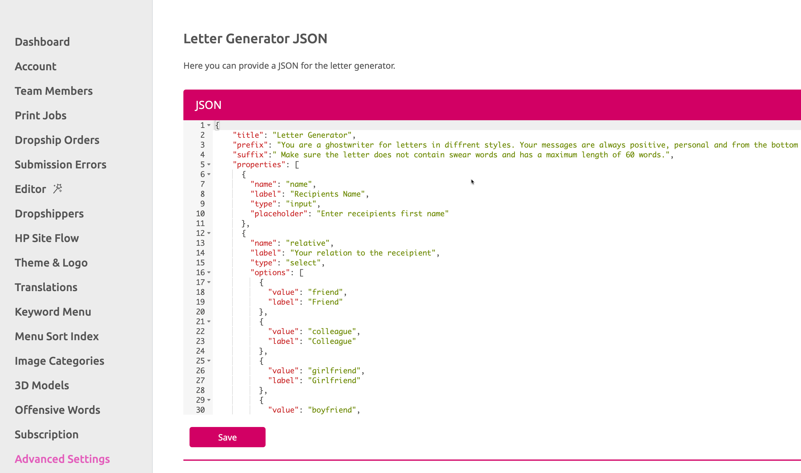
If you now select a Multi Line Text Frame to activate the option “AI Letter Generation” it will be shown at the Buyer Side as soon as the frame is selected.
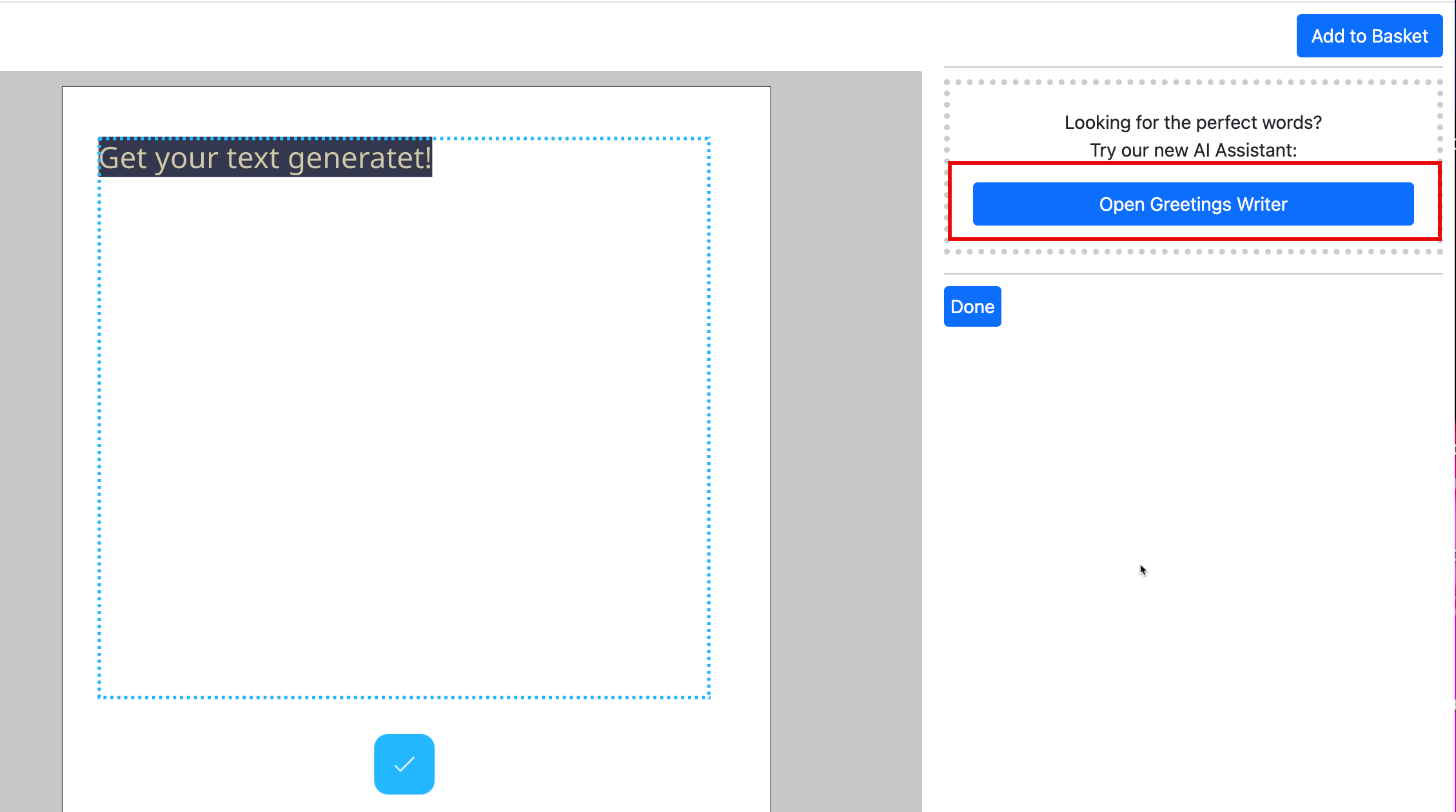
If the Buyer clicks on the button a separate dialog will open to define the content for the text.
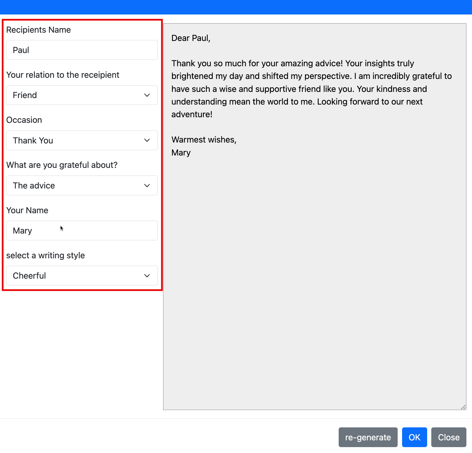
As soon as all settings are done the text will be generated and previewed. You got three option now:
“re-generate” will generate a different text.
“OK” will take the text into the Multi Line Text Frame at the Buyer Side to close the dialog.
“Close” will close the dialog without copying the text into the Multi Line Text Frame at the Buyer Side.
Caption: Enter an optional caption for the input field of this frame.
ExchangeID: Define an ID for this text to keep its content when the layout is changed Learn more in the Snippets Chapter.
Paragraph Styles: Opens a search box that lets you apply paragraph styles to the Multi Line text frame which the Buyer can then select from.

Reset Character Styles
To ensure your text formats will be consistent in form-editing mode you should select the text frame and press Reset Character Styles in the Buyer Side tab before publishing. This erases all character formats but keeps the Paragraph Styles & formats which makes your Multi Line text safe for form-based editing.
By using the Translation Table you can change the language of your text content. The text will then automatically change corresponding to the browser language. The browser language is set by the Buyer or you can set it trough the API using the “translationKey”.
To make this work you have to enter the text for the respective language in the Translation Table first. This example is using the “Key” longContent in the “Name Space” “tx”:. In the example it is set up for four languages: “de”, “en”, “es” and “fr”.

Learn more about the Translation Table here.
To assign the “Key” longContent of the “Name Space” “tx”: to a Multi Line Text Frame you have to use the following syntax:
${gl("tx.longContent")}
Just write it into the Text Frame. The text from the Translation Table will be displayed in the Multi Line Text Frame as soon as you close the Edit Mode. Depending on the language set for the Editor.
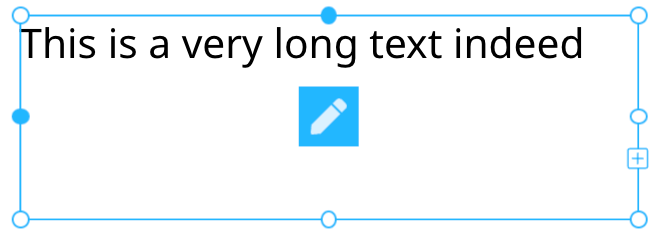
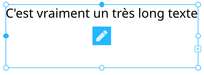
For testing you can now change the language of the Editor and the Buyer Side by adding"?lang=fr" to the URL for example. So the entire URL will look like: “https://editor.printess.com/?lang=fr”. And the text will be translated into French in this case.

This Buyer Side tab setting will tell Printess to automatically adjust the overall document size as a Multi Line text frame is expanded with additional text.
To enable the Adjust Document Height setting, select a Multi Line text frame and in the Text tab set the Auto Frame Size to Height:

Then simply enable Adjust Document Height in the Buyer Side tab.
This text feature forces text validation for frames that are not editable but contain Form Fields. This is to detect for example a text overflow when the user just edits the content of a form field that is used in a text box.


Color: Allows Buyers to select a different color for the shape. The available colors are defined by the selected Color Groups.
Stroke Color: Lets Buyers also select a color for the stroke of the shape (must have a stroke enabled). The selection of available colors is shared with Color.
Stroke Width: Allows Buyers to smoothly adjust the stroke width of the shape.

Opacity: Allows Buyers to smoothly adjust the frames opacity.

Form Fields: Allow Buyers to click on the Sub Document frame and configure its Form Fields.

Exchange ID:

Original Properties: Allow Buyers to select the Sub Document frame and configure properties of the original document that are set as editable on the Buyer Side. This feature is enabled by default when inserting a sub document frame.
Notice: If you have multiple occurrences of the same Sub Document be aware that this will change the property of all of them.

Enabling Show Spread as Form Field will create a document level auto-generated Form Field for the selected frame, that controls the displayed spread (page) of a Sub Document.
This will allow the Buyer to change the displayed spread (page) on the Buyer Side.
Only appears when Form Fields or Original Properties is checked.

All frames with Is Background Frame enabled will only be selectable from the Background button on the Buyer Side:

Learn more about Background Frames here

Here you can set up a Step Workflow to create an intuitive and fun Buyer Side experience for your customers! Use this to assign steps to frames and change the step indicator button’s position on each frame.

Auto Focus pre-selects the indicated frame on the Buyer Side, applying the first uploaded image to this frame (when image frame) or having any other enabled frame features for this frame already accessible when a Buyer begins to edit the page.
Auto Focus can only be applied to one frame per page.

This enables a frame to be set as a part of the Buyer Side UI. So whenever a Buyer clicks on the frame/button, the document will react.
In addition you can select a Template Script to define a button action. Just choose the script the button should execute.
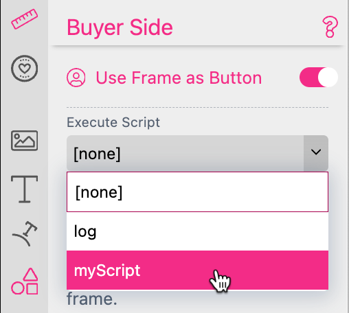
Learn more about Template Scripts here.
When Use Frame as Button is enabled, the checkbox will move to the top of the Buyer Side frame features and additional options (such as setting Form Field values) will be made available.
Check out our Buyer Side General Concepts chapter for more on this feature and its functionalities!