With Printess you create Templates. A Template contains one or multiple Documents.
Having multiple documents in one template is super handy:
If you are using a document inside another document, it’s called a Sub Document
Learn how to manage multiple documents inside a Printess template. See how previews and conditions work and how to print something else then you show to the buyer.
Sub Documents are the Swiss Army Knives of complex tasks in Printess.
Sub Documents are especially useful in the following situations:
One has to imagine a Sub Document as one of the pages of another document placed into the main document like an image. The magic thing is: it’s not an image, but a personalizable document.
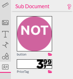
Essentially every document can be a Sub Document. Just create another document. Simply go back to the main document and switch to the Sub Document tab, then all other documents are shown with their first page as icons in the Sub Document Feature tab.

The small folder icon beside the document name will switch to this Sub Document. Click on the icon to insert the Sub Document into your document. Once inserted you can adjust the size of it and much like an image, you can fit, fill or crop it in its frame. Read more about Sub Document fitting here!
A Sub Document also has the option to select from one of its pages (Spreads). This is done by enabling Show Spread as Form Field in the Sub Document Frame Feature tab. Read more about Sub Page selection here..
One interesting aspect of selecting a page of a Sub Document on the Buyer Side, is that if you use text or image Frames and switch on Show Spread as Form Fields for personalizable features, the Buyer can select a Page and this will also define the user interface shown, as only the Frames on the selected page will show its form fields. This clearly does not work with general document form fields created in the Resource tab, as they are global to all pages.
Normally one would like to create their design on a flat surface. Once the design is done a good product preview will sell the item.
This can be achieved by warping the main document into a product preview.
In this designable drinking glass document, the Buyer designs his document essentially in a Sub-Document with the de-rolled printable area as document size.
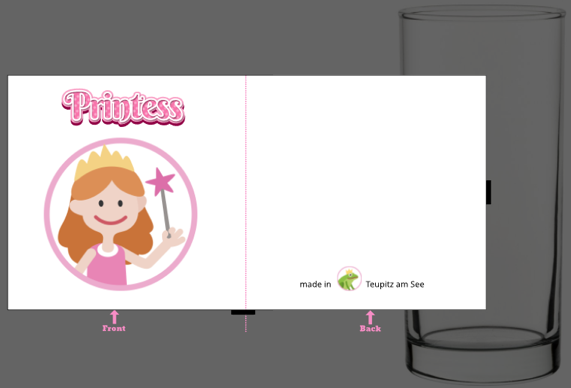
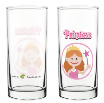
When the Buyer is happy with his design he can switch to the Preview Document, where the design is placed as a Sub Document warped on the glass front and back by cropping and using the Mug Warp feature.
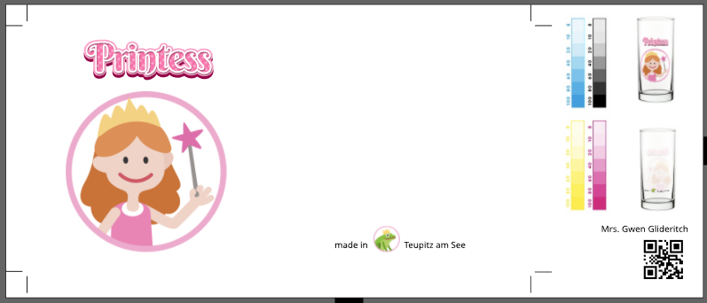
The same principle applies to creating a document for printing. Besides the printing area, the document may need to contain a Barcode for the production workflow, a human readable customer name and a preview of the finalized product for quality control. Printess can achieve all of this in one simple Template!
Our example document Chocolate Bars shows a very nice example of a configurable chocolate bar where the Photorealistic Preview itself is the configuration interface. This example also uses the Spread Selection form field to change the Sub Documents between Banana or Strawberry - really impressive!
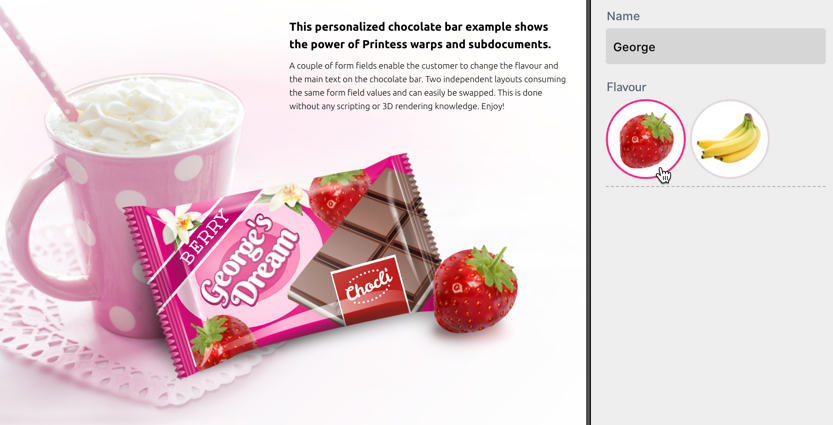
Please have a look at the Chocolate Bar Example which is available in the Create New Document screen. If you look under the hood of this document you will see that the design itself is still just a simple, flat, very easy to maintain document.
Notice: As we can see in the above examples, Printess can utilize many Sub Documents and their applied Wraps and Effects to create beautiful previews for the Buyer. Unfortunately, these same Wraps and Effects can impact rendering times on the Buyer Side as well as within the Printess Editor.
When using multiple Sub Documents, consider changing the render quality settings in the Sub Document Frame Feature tab. ![]()
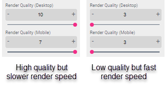
Low render quality settings will have a poor quality but high render speed, while high render quality settings have a high quality but may render slower.
Read more about render quality settings here.
Tip: If you have to transform your Sub Document to create a realistic Preview be aware that the “Perspective” Transformation Option is much faster in rendering than the “Mesh” option.
It’s super handy to use Sub Documents in conjunction with Splitters to build layout which can adapt to various page sizes and aspect ratio’s.
Read more about flexible layouts with sub documents
Sometimes you need a graphical element which is also a functional block of the document. Let’s have a look at a simple example of a typically formatted price tag with an input box to change the price.
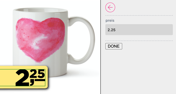
As this cannot be achieved with a single line text frame, the solution is to create a Sub Document for the price tag which will break up the price into a large number and a smaller cents number.
To do this, create two Single Line text boxes and arrange them as you would like. Then just create a Document Form Field named “price” and add two small script literals to make this price tag functional:
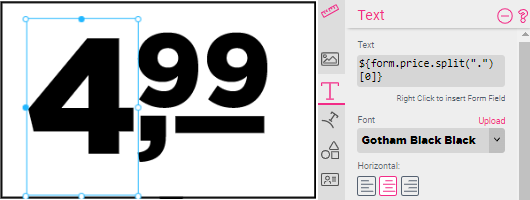
Note that the text for the big number contains a small JavaScript literal:
${form.price.split(".")[0]}
This splits the price by . and selects the portion before it at index [0]].
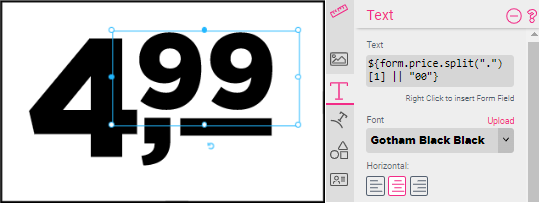
${form.price.split(".")[1] || "00"}
The cents are done the same way except that the second portion at index [1] is taken.
Grid Style Calendar
Printess enables for incredibly complex building blocks, which can then be used across several pages. One of the more intricate but powerful examples can be found in the Calendar Grid Style example one can create at the New Document tab.
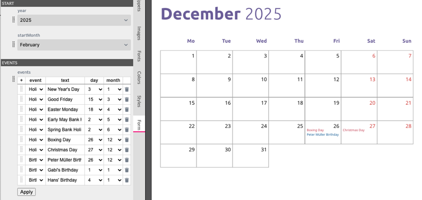
Have a look into the month Sub Document. Not only can it calculate the existing days of a month in any given year but it can take data from an events table full of holidays and birthdays, and its design is completely controlled via Styles.
Read more about how the calendar was created in the Scripting section of the manual.
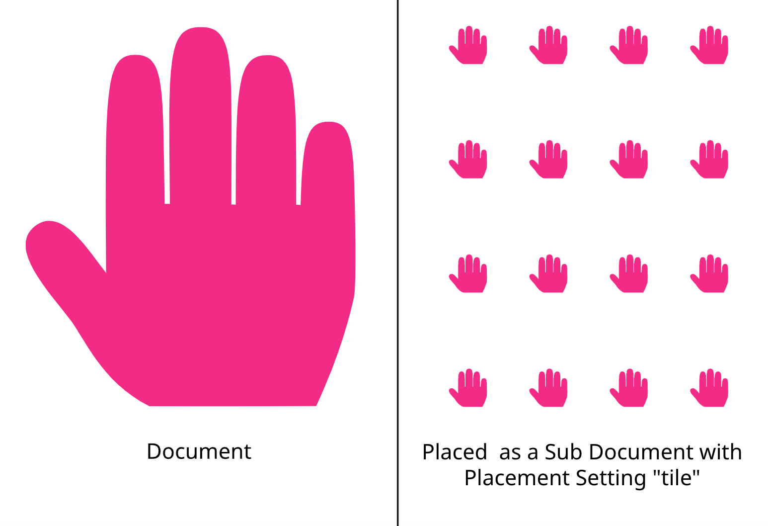
If you offer textile printing or you want to design a wrapping paper for example you will need to create a repeating pattern. Just place your layout as a sub-document and set the Sub-Document Placement of the frame to tile.
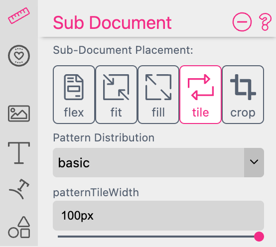
Printess will automatically generate a repeating pattern.
Pattern Distribution allows you to define the alignment of the repeated Sub Document.
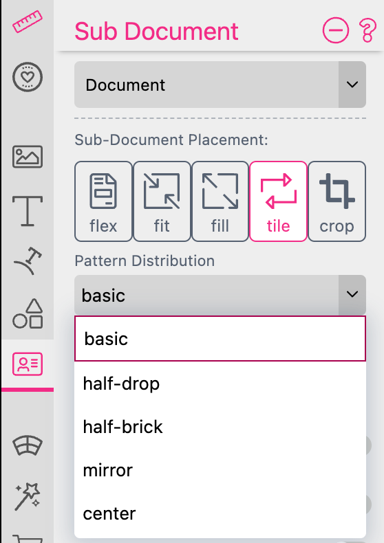
This graphic shows you the result of the different Pattern Distribution options:

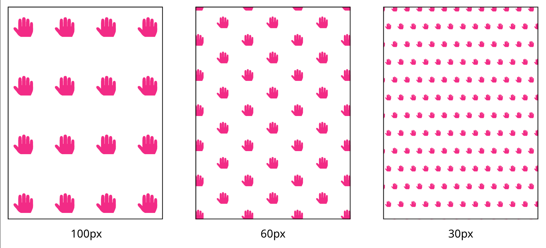
Pattern Tile Width enables you to define the size of the repeated Sub Document.
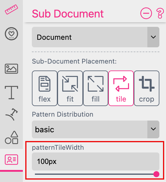
By default it is set to the maximum width of 100px. But you can type in any other value and change the unit to pt, cm, mm, inch or %.
This graphic shows you the result of different Pattern Tile Width settings:
To make a Pattern Tile Width Slider available at the Buyer Side it takes some additional steps:
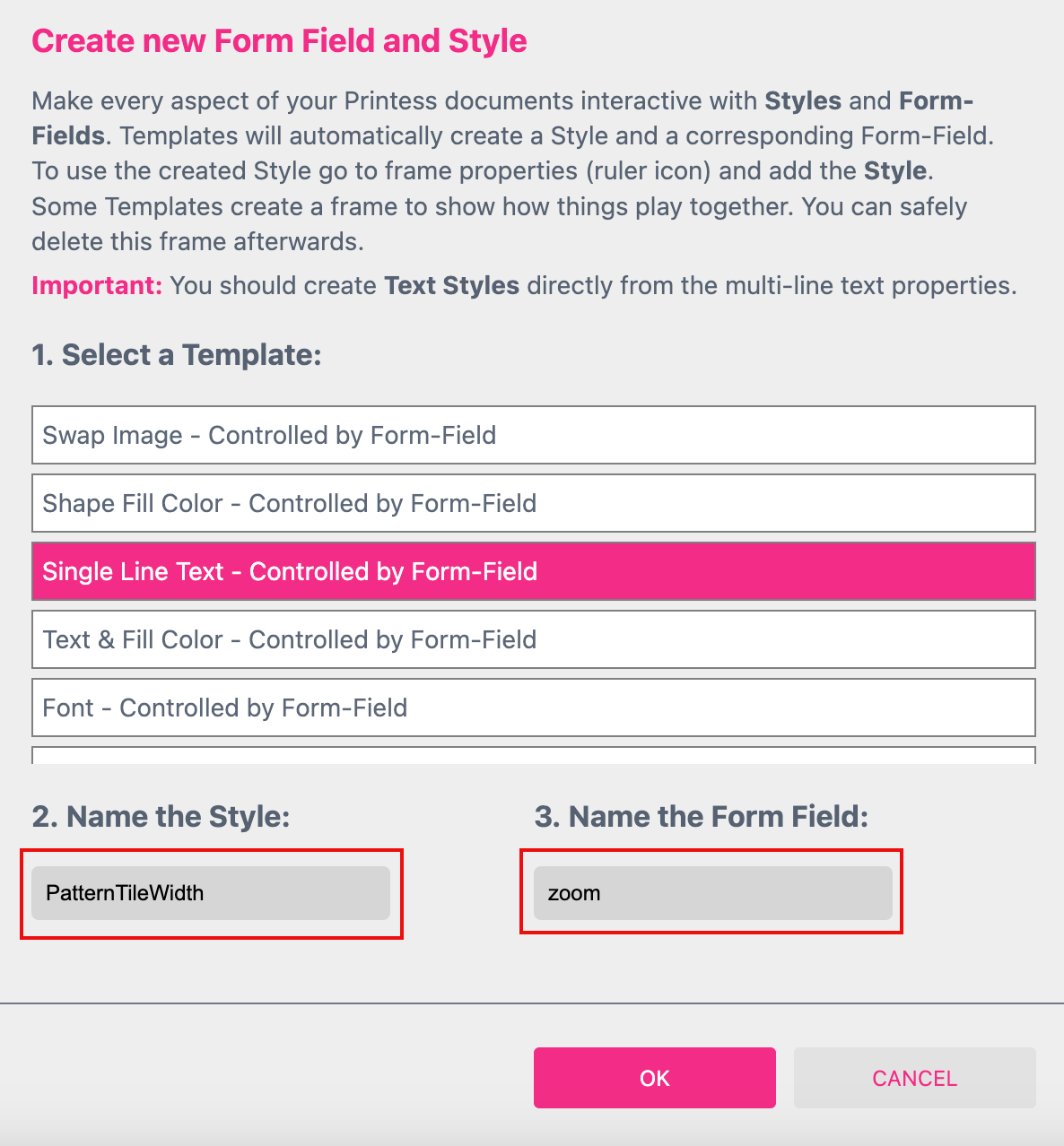
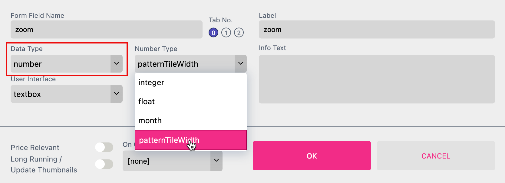
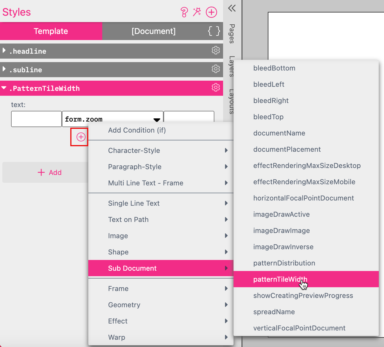
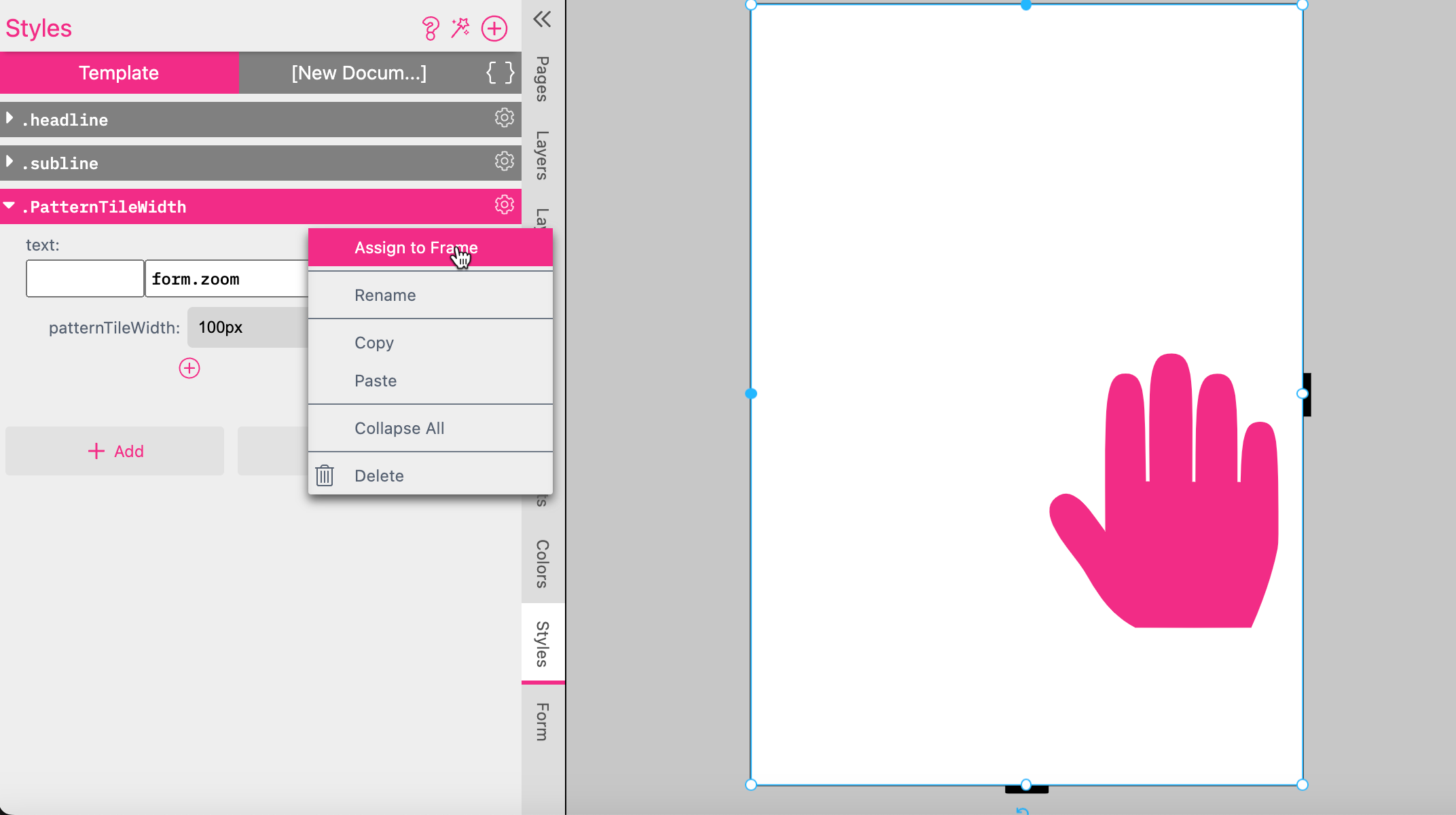
Now click the gear icon of the Style to select Assign To Frame while the Sub Document Frame is activated.
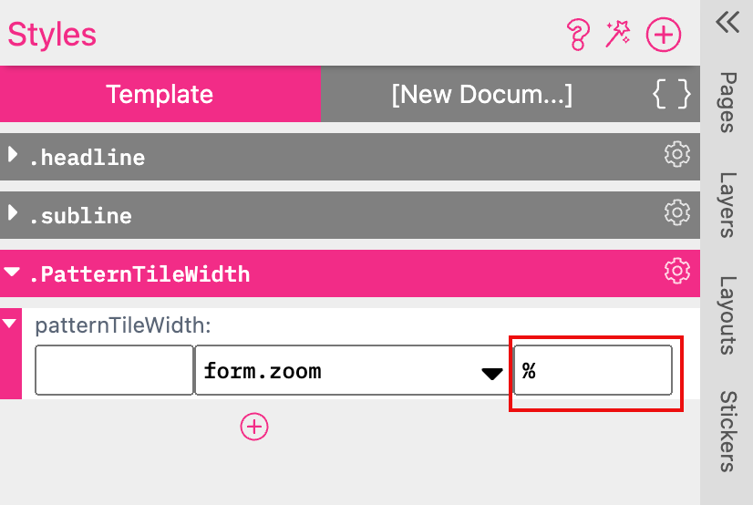
Add the percent character “%” to the TextAfter of the PatterTileWidth Style.
Now the Zoom Slider is available at the Buyer Side
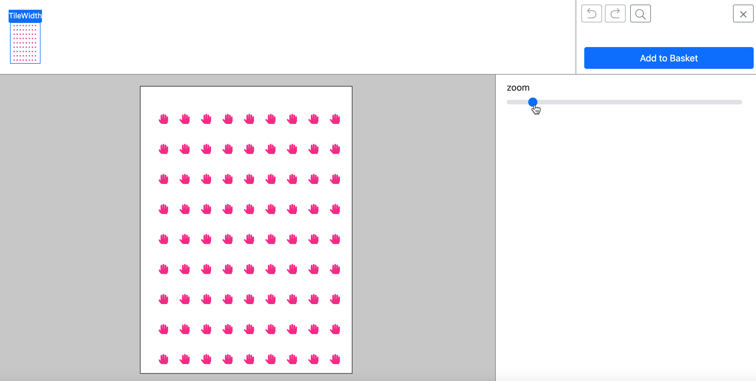
You can define a value for the rotation of the Pattern. So that each single element will be rotated by random.
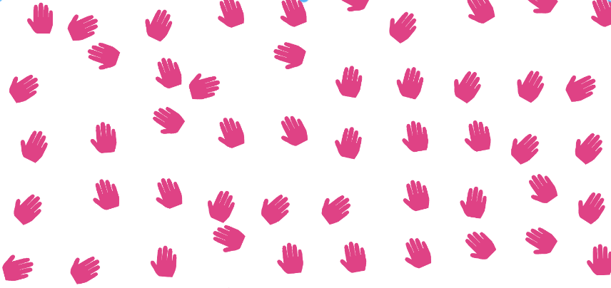
You can define a value for the density of the Pattern. This will create a Pattern of more elements which are closer.
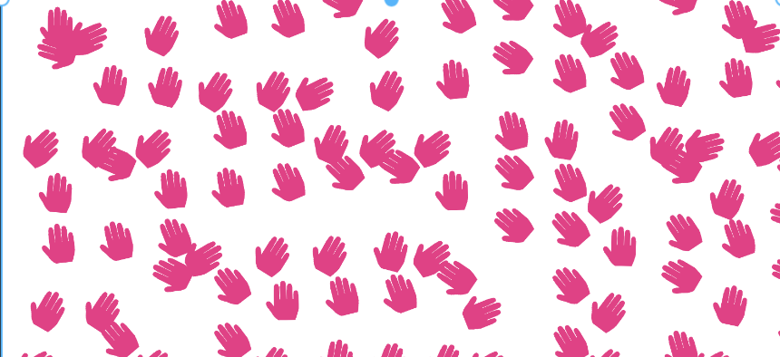

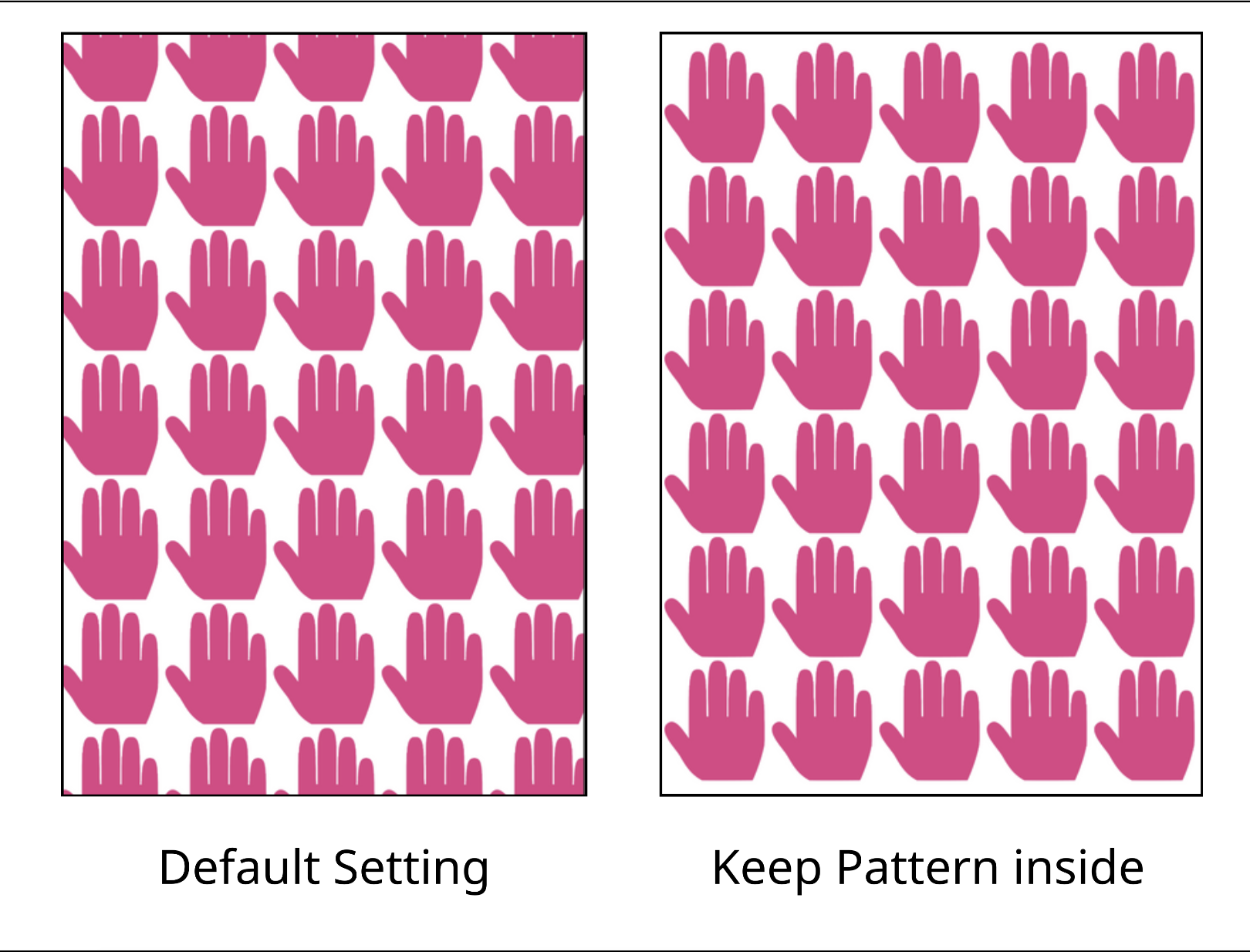
By default the Pattern fills the frame so that the single elements at the edges are cropped.
If you activate the option Keep Pattern Inside non of the elements will be cropped.
Please have a look at our Children’s Book example where a Sub Document is used to propagate the hair style throughout the document.
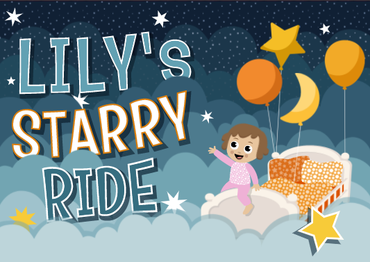
Read more about the Children’s Book in the Styles and Form Fields chapter here!
In the same chapter we also talk about the Retro Sign example. This example also makes extensive use of Sub Documents to create convenient features likes holes, varnishing and corner cuts in the document.
(Read more about the Retro Sign in the auto-generated and special Form Fields chapter.)