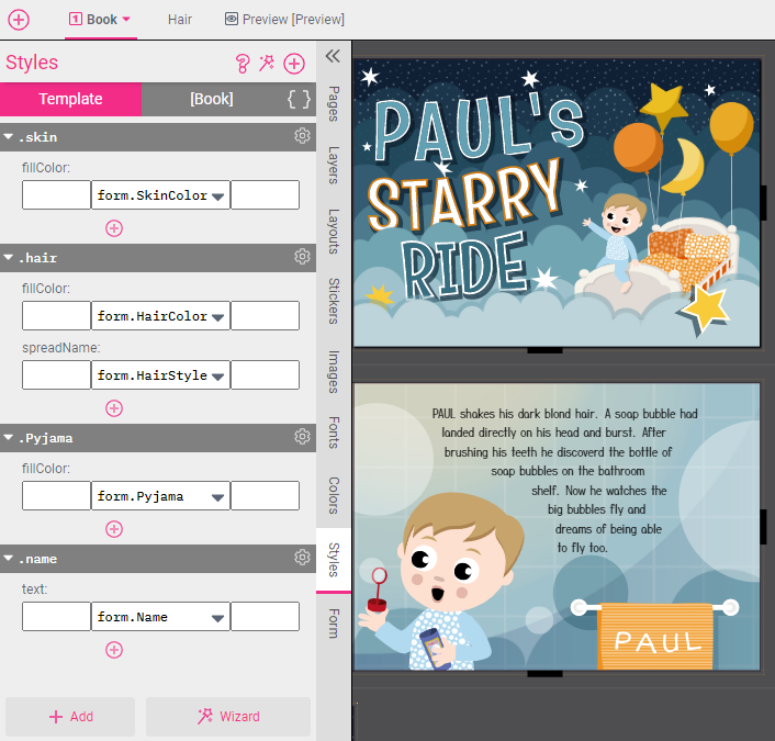
Let’s have a look at a child book example, where all the complex personalization options for selectable hair and skin color are built with just a few simple Styles.

We have switched on Show Styles in the top menu bar Settings menu to present us with small colored badges that show us the various Style names.
As you can see, eyebrows and hairdos have the Style .hair assigned and all skin elements have the Style .skin. (Click here to see how Styles are assigned!)
Looking into the Styles tab, we can see that both Styles set the fillColor and are connected to a Form Field.
In this case, it’s easy to see that the Style simply sets the fillColor of all skin elements to the color selected in the Form Field. Let’s have a look at what the Form Field looks like:
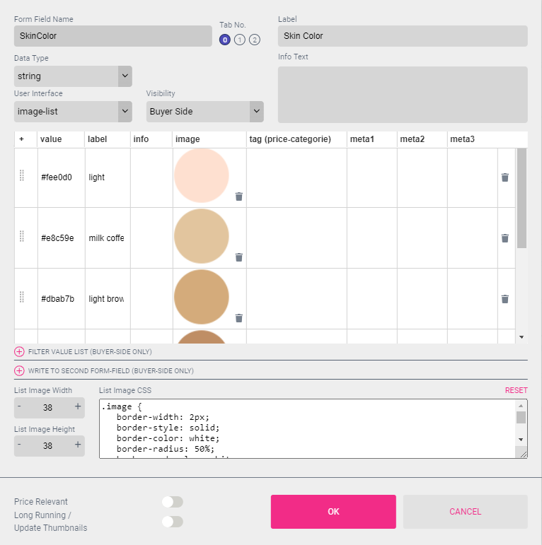
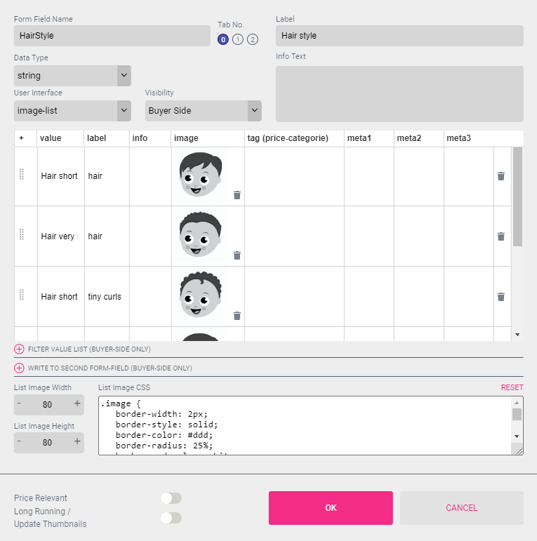
The Form Field User Interface is set to Image-List, creating a selection of nice color patches from small images. The Value of the Form Field is simply a color value (this can also be a pre-existing named color swatch).
So whenever the Buyer selects one of the available skin colors, the applied Style will ensure that everywhere there are skin portions in the document the skin color changes.
This even works (as long as a Template Style is used) in Sub Documents. In this children’s book, everywhere hair is used a Sub Document containing the hair in different Styles is also used.
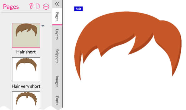
Let’s have a look at this document containing separate pages for each hairstyle. For each page, the spreadName has been set to the name of the hairstyle (hair short, hair very short, etc.).
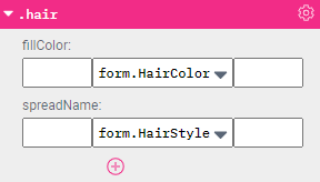
This is how it looks in the code editor:

Each hairstyle shape also has the Style .hair assigned, which in this case will set the fill color for the hair fillColor: ${form.HairColor};.
The same Style is also assigned to all places where this “Hair” Sub Document is used in the children’s book. In this example, the Style Property spreadName spreadName: ${form.HairColor}; also into effect by choosing the correct page from the Sub Document to show the selected hairstyle.
In this case, the Form Field to control the Styles spreadName property simply has the names of the pages in its values:
Not only can properties like color be controlled via Styles, but content like a text or an image can be changed by a Style. Throughout this document the name of the child is also populated through a Style.
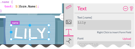
Because we use a Style to set the text for each frame with the Style .name assigned, the input field for the text is also disabled and the name of the Style which controls it is displayed above.
Adding the .Pajama Style and Form Field (which pretty much works the same as the skin color) we get an easy-to-use user interface and a simple to maintain (yet feature-rich) personalizable document.
A nice use of Form Fields in conjunction with Styles are Pinned Form Fields.
Let’s create an example where we control the colorization of an image frame with a Form Field which only appears once the Buyer clicks on the image.
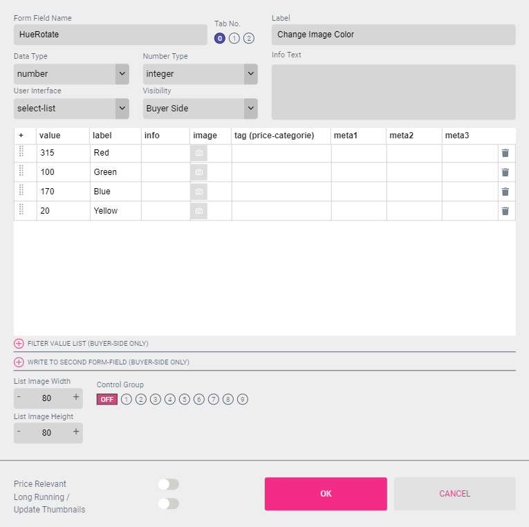
Start by creating an image frame with any image. Use sepia (100) to monochromatically colorize it. Next create a document Form Field named ‘HueRotate’ and set the Data Type to number and the User Interface to select-list. Make sure you create a document type Form Field - as Template Form Fields don’t have this option.
Now enter the value list numbers and the corresponding labels by selecting the small + on top left of the table.
Next we will connect it to the frame by selecting the image frame and then selecting Pin to Frame in the Form Fields context menu:
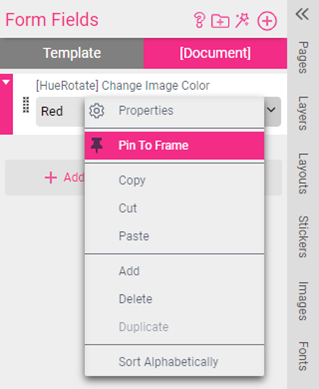
A small pin will appear on top of the Form Field indicating that it’s pinned to a frame:
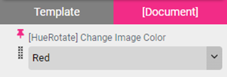
You can test that the Form Field only appears when the image frame is selected by switching to the Buyer Side.
Next, we will connect the Form Field and the image frame by using a Style. Open the Styles tab and create a simple document Style. Next, click the Add icon ![]() and choose Effect - hueRotate to apply this Effect to the Style:
and choose Effect - hueRotate to apply this Effect to the Style:
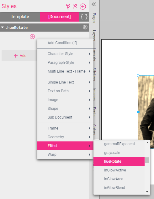
Next, right-click on the Style and apply the Form Field to it:
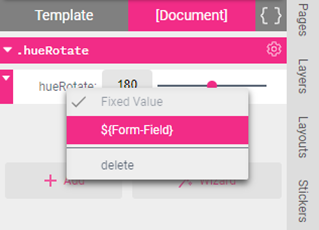
You will see that the hueRotate Style format changes after we applied the Form Field to it. Now we want to select the middle section select the form.HueRotate field. This will pull the data from the Values column of our Form Field to be used in the Style.
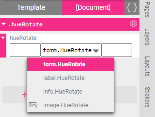
Lastly, select the image frame and then select the Style Settings icon ![]() and choose Assign to Frame.
and choose Assign to Frame.
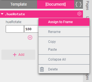
This will now change the color angle of the image based on the user’s selection in the drop down.
Go to the Buyer Side to proudly test your creation.
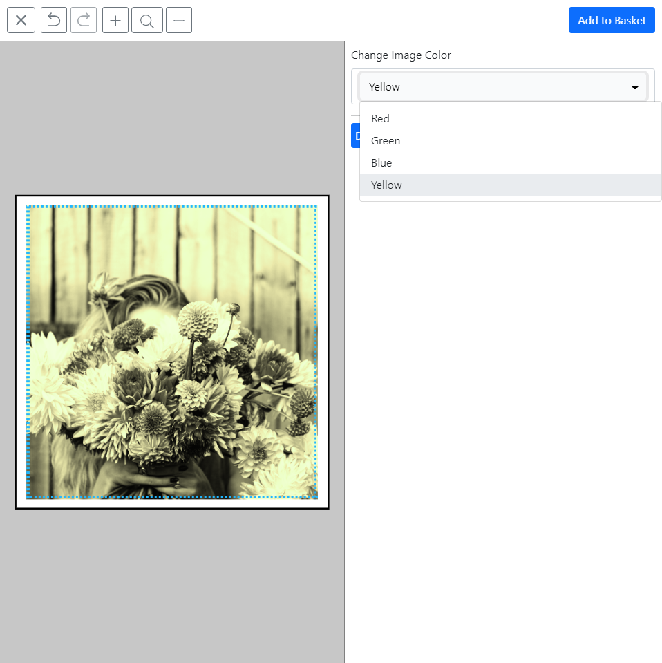
If more than just the Hue Rotate is necessary to reach the desired recoloring its also possible to control several image manipulation properties at once. This is done with the Create Style function integrated into the Image tab.
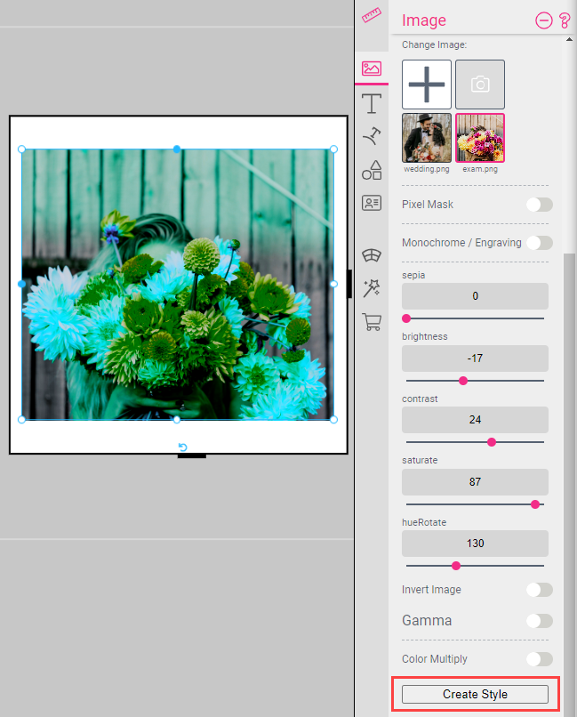
Once the image has the desired coloring, simply select the Create Style button and enter a Style name. In this case we have chosen imageColor. The created Style will then appear in the Styles tab:
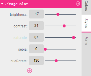
Adding Conditions to a Created Style
After this one of the Styles must be made into the default Style and for all others an “if” condition needs to be added.
Select the Add icon ![]() and choose Add Condition (if). Then add the condition for the Style.
This will cause the Style to react to the label or value of the Form Field, as shown below:
and choose Add Condition (if). Then add the condition for the Style.
This will cause the Style to react to the label or value of the Form Field, as shown below:
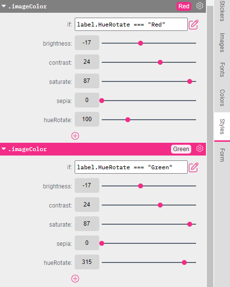
Here is the code for the above example, if you’d like to copy it to the Code Editor:
.imageColor {
	if: ${label.HueRotate === "Green"};
   brightness: -17;
   contrast: 24;
   saturate: 87;
   sepia: 0;
   hueRotate: 100;
}
.imageColor {
	if: ${label.HueRotate === "Red"};
   brightness: -17;
   contrast: 24;
   saturate: 87;
   sepia: 0;
   hueRotate: 315;
}
Conditional Styles are useful in cases where one would like to create Styles which only come into effect at the moment a condition is met.
A Conditional Style contains a condition which (when met) will activate the Style.
Learn more about the Condition Editor.
A couple good examples for Conditional Styles is switching frame positions and sizes based on document formats, and using Flex Designs to change between landscape and portrait formats.
Let’s have a look at how to create Conditional Styles that manipulate two different aspect ratios controlled by a DOCUMENT_SIZE Form Field. Open the Printess Editor and Create New Template.
Learn more about changing DOCUMENT_SIZE with Form Fields.
To achieve this, first we will right-click on the document and select Get Size from Form Field, this will give us an Auto-Generated Form Field named DOCUMENT_SIZE:
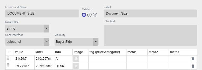
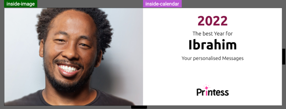
Now we create two Conditional Styles to control the position and size of the main image in the calendar. Below are the if conditions for this example:
info.DOCUMENT_SIZE === “A4”
info.DOCUMENT_SIZE === “DESK”
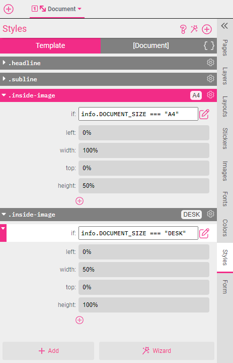
As you can see, we used only percentage values - this keeps the document size flexible even when we change dimensions.
Here is the code if you’d like to copy it to the Code Editor.
.inside-image {
  	if: ${info.DOCUMENT_SIZE === "A4"};
	left: 0%;
 	width: 100%;
 	top: 0%;
 	height:50%
}

.inside-image {
 	if: ${info.DOCUMENT_SIZE === "DESK"};
  	left: 0%;
  	width: 50%;
  	top: 0%;
  	height:100%
}
The settings used in this example (left, width, top, and height) can also be manually added. This is done by simply clicking the Add icon ![]() and selecting Geometry.
and selecting Geometry.
This is how the document looks if the DOCUMENT_SIZE form field is switched to A4:
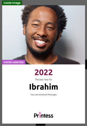
And this is how it looks when switched to DESK:
Another use case of Conditional Styles is switching visibility of certain Frames in a document. In the Style example below, the ‘hide’ Style is assigned a frame that will only be visible if the Form Field ‘hide’ is set to ‘Show’.
Here is the hide Form Field:

And here is the Conditional Style linked to the above Form Field through form.hide:

.hide {
 	visible: ${form.hide === "Show"};
}
Now when applied to a frame, this Conditional Style will give a Buyer the option to Show or Hide frames on their product:
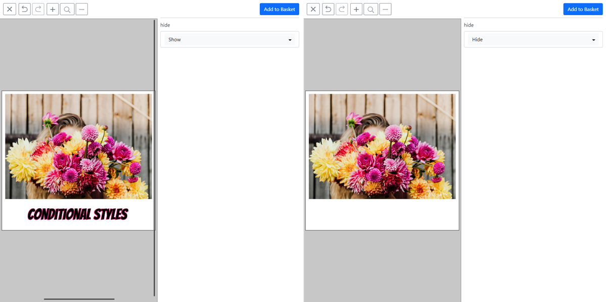
With the same method one can easily control drop shadows, effects, and every other aspect of a frame. To discover more examples, we strongly recommend to use the Style Wizard which will create frames, Styles, and their corresponding Form Fields. Our Style Wizard is a great way to have fun learning about the superpowers of Styles.
Start using the Style Wizard here!
Additionally, we recommend exploring the available Style properties in our comprehensive Style Reference Manual.
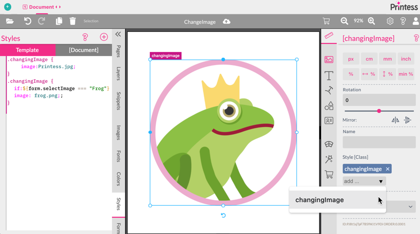
Quite often one needs to change images based on Form Field values. This can be achieved by using styles.
In this example we simply want to react on a simple select-list form field for image selection.
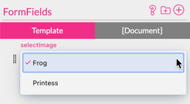
We can simply pair this with a conditional style which simply points to the right (previously uploaded) image based on the form field value.
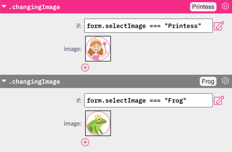
.changingImage {
		image:Printess.jpg;
}
.changingImage {
	if:${form.selectImage === "Frog"}
	image: frog.png;;
}
When this Style is applied to a frame containing an image feature it will change the image when the Form Field changes its value.
Tip: You can also directly apply an image by using the image itself in an image-list form field and address it directly in the style. The Image then also automatically is used for the user interface to provide a visual selection.
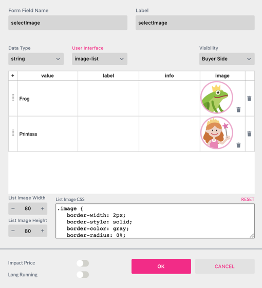
This is the corresponding style. In this case no Conditional Style is required note that the image is directly addressed with image.selectImage.

.changingImage {
		image:${image.selectImage}
}
The same can be achieved by adding the image name directly to the form field in our example add Printess.jpg and frog.png to the form field value column. The corresponding style should look like this:

.changingImage {
		image:${form.selectImage}
Same counts for the info column where the style would look like this:

.changingImage {
		image:${info.selectImage}
}