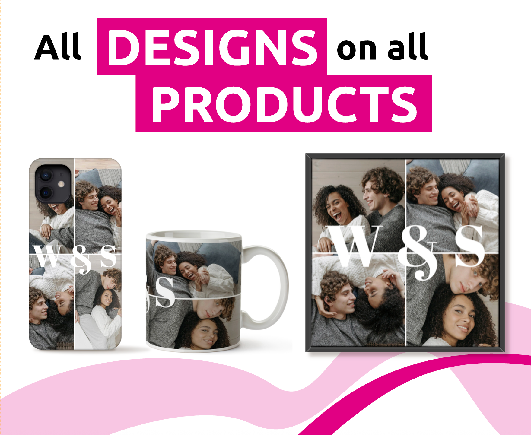
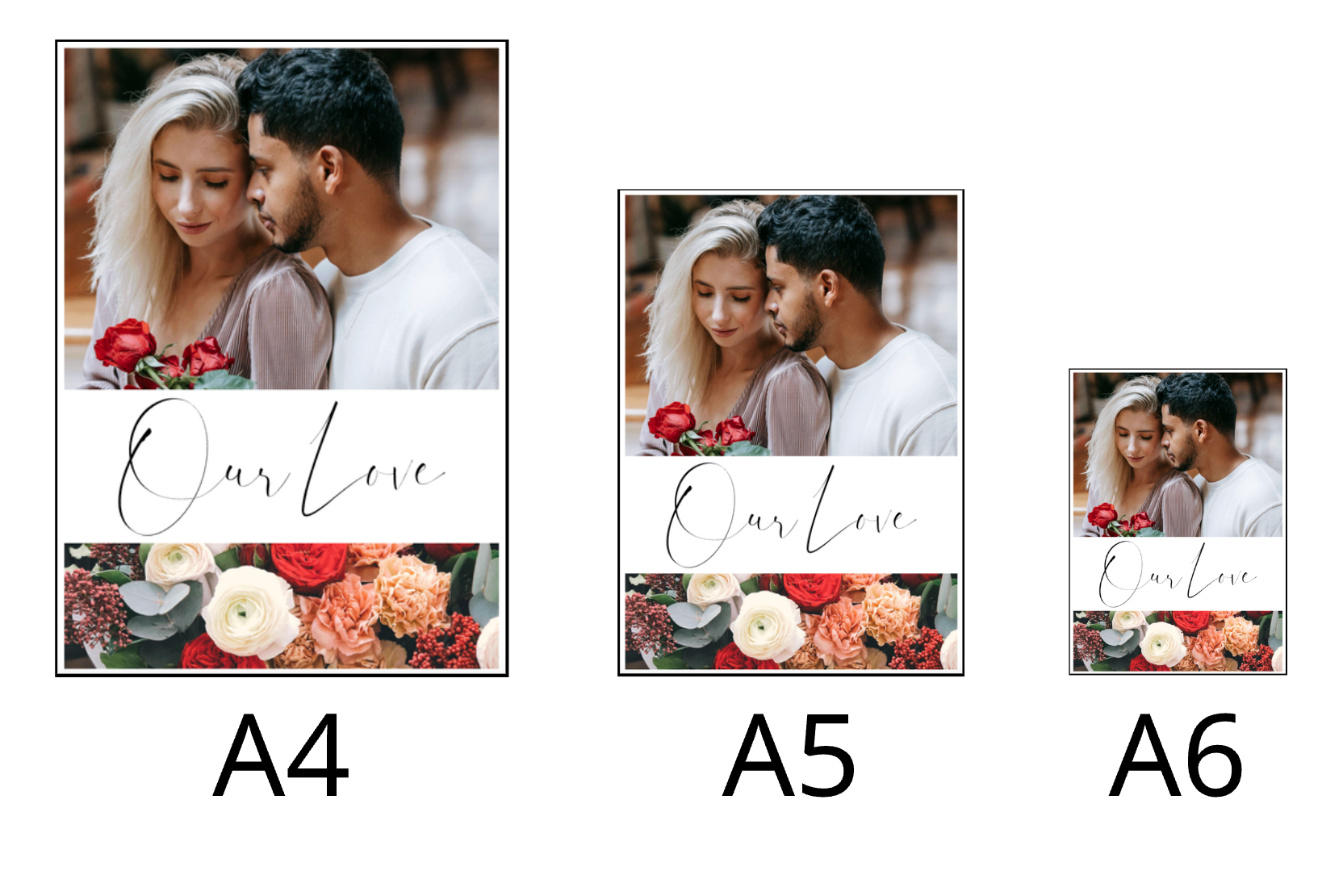
Printess was designed with flexible document sizes in mind and it’s easy to create so called Flex Designs. Flex Designs are needed wherever documents need to change their size while keeping the design intact.

With Printess your Documents can be flexible in size. So if you offer a greeting card in different sizes you only have to set up one Printess Template.
Read more about the DOCUMENT_SIZE Form Fields
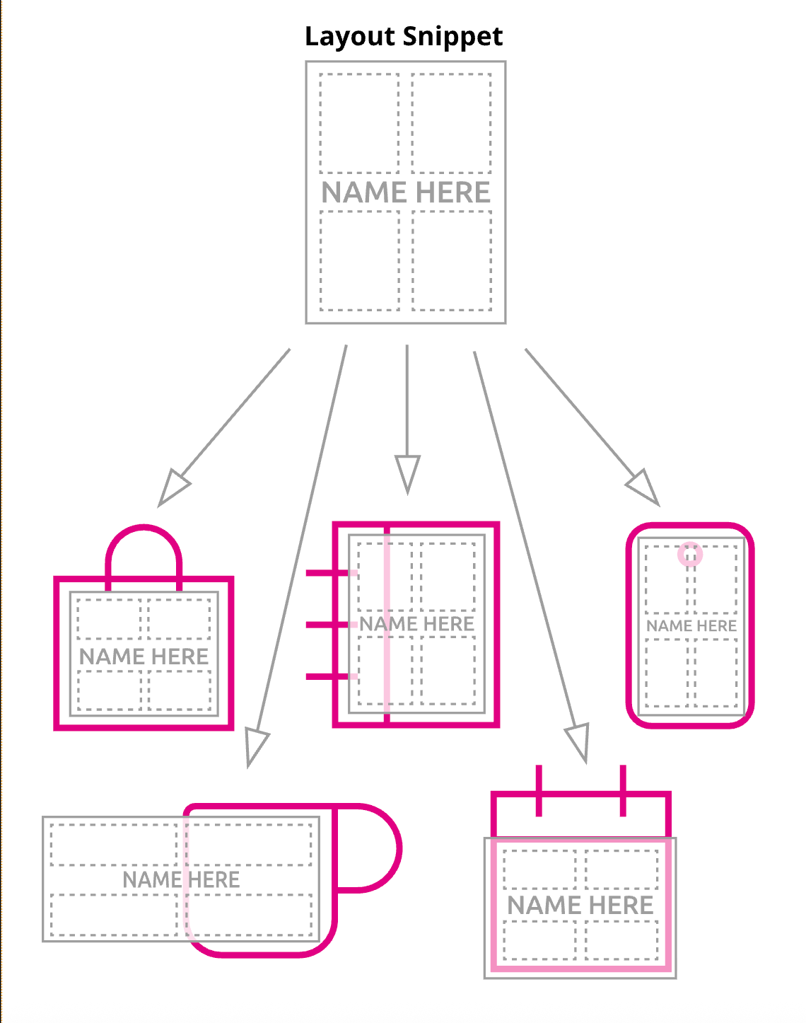
With Layout Snippets you no longer need to design a variation for each different size or ratio.

With Layout Snippet you can build layouts that will automatically adjust to the final size of your Document. So that you can use it for different products of any size with a similar aspect ratio. So for a large range of different products you can use the same Layout Snippets.
Learn more about Layout Snippets
Note: With the new Panel-UI the SubDocument Group can now be replace by a Sticker.
A SubDocument Group is more than putting frames together. It builds one graphical block even that you and the Buyer can still edit the Properties and Form Fields values of the single frames the Group is made of. When you place the same SubDocument Group several times on the Page, Document or Template each single one could be edited on its own.
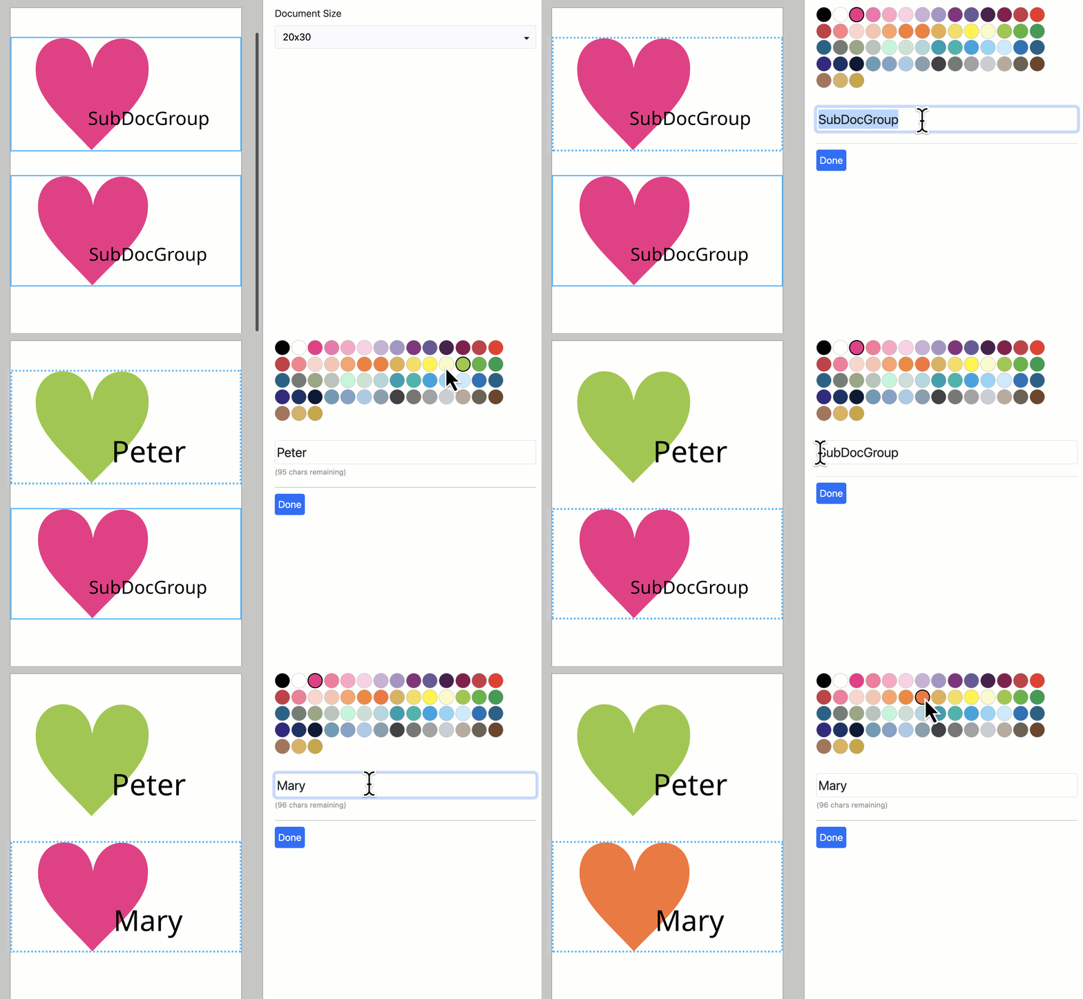
A SubDocument Group will behave like an image. It will scale proportionally even if you change only one dimension of the frame. That’s why it nearly fits into any aspect ratio if you place it into a page or document of a different size.
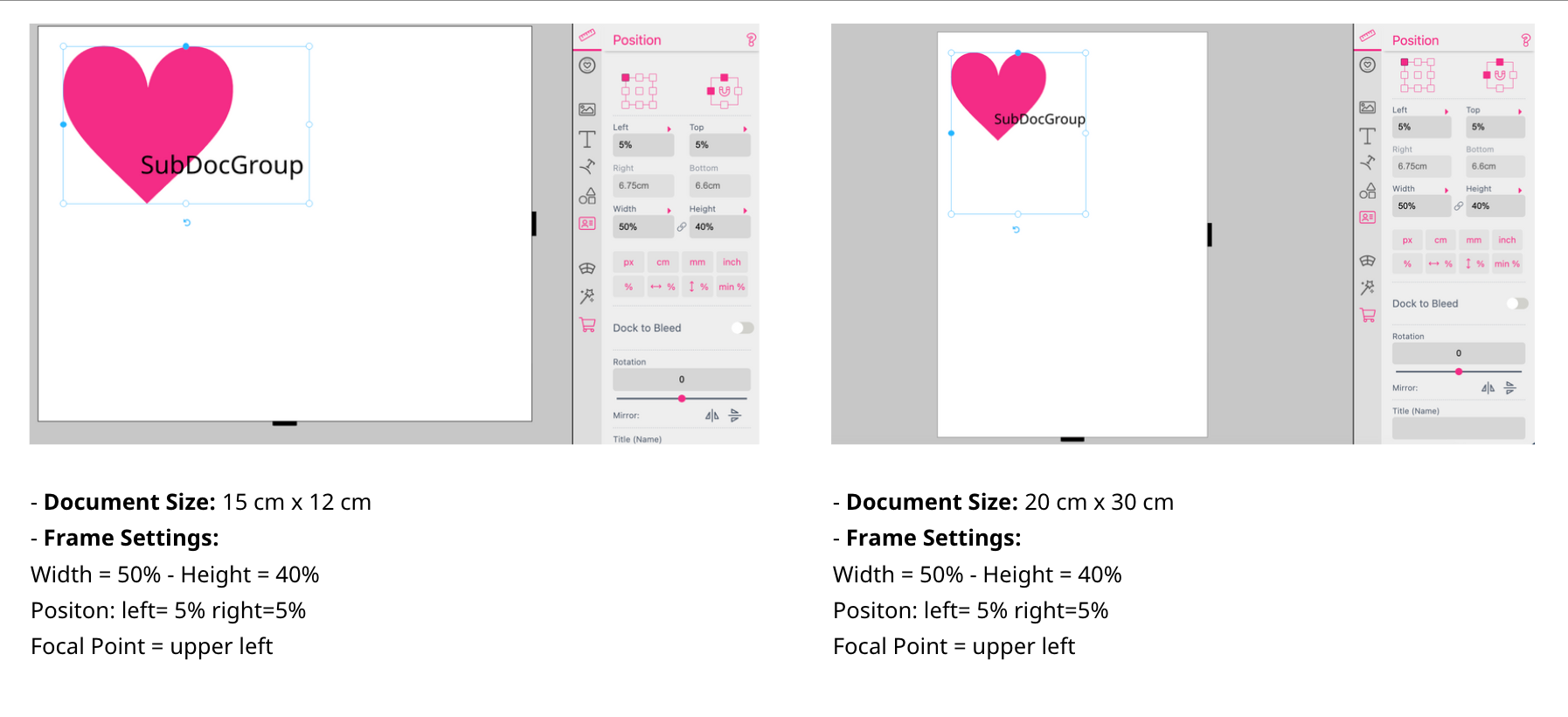
If you work with percentages rather than absolute values for the positioning and the size of the SubDocument Group it will automatically scale to the overall layout. The frame will always adjust its size and positioning in relation to the page size.
In this example the Focal Point of the frame is set to “upper left”. So the alignment of the elements within the frame is set to this point - no matter to which dimensions the frame itself is scaling.

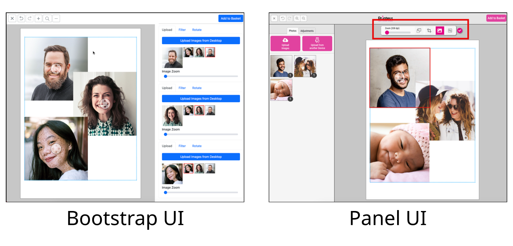
At the Buyer Side the editing of an image part of an image group differs depending on the UI used. Using the Bootstrap UI the Buyer can change the Properties of the single image frame just through the Group Properties at the right. With the Panel UI the Buyer can select each image frame of an image frame group directly to change it`s Properties.
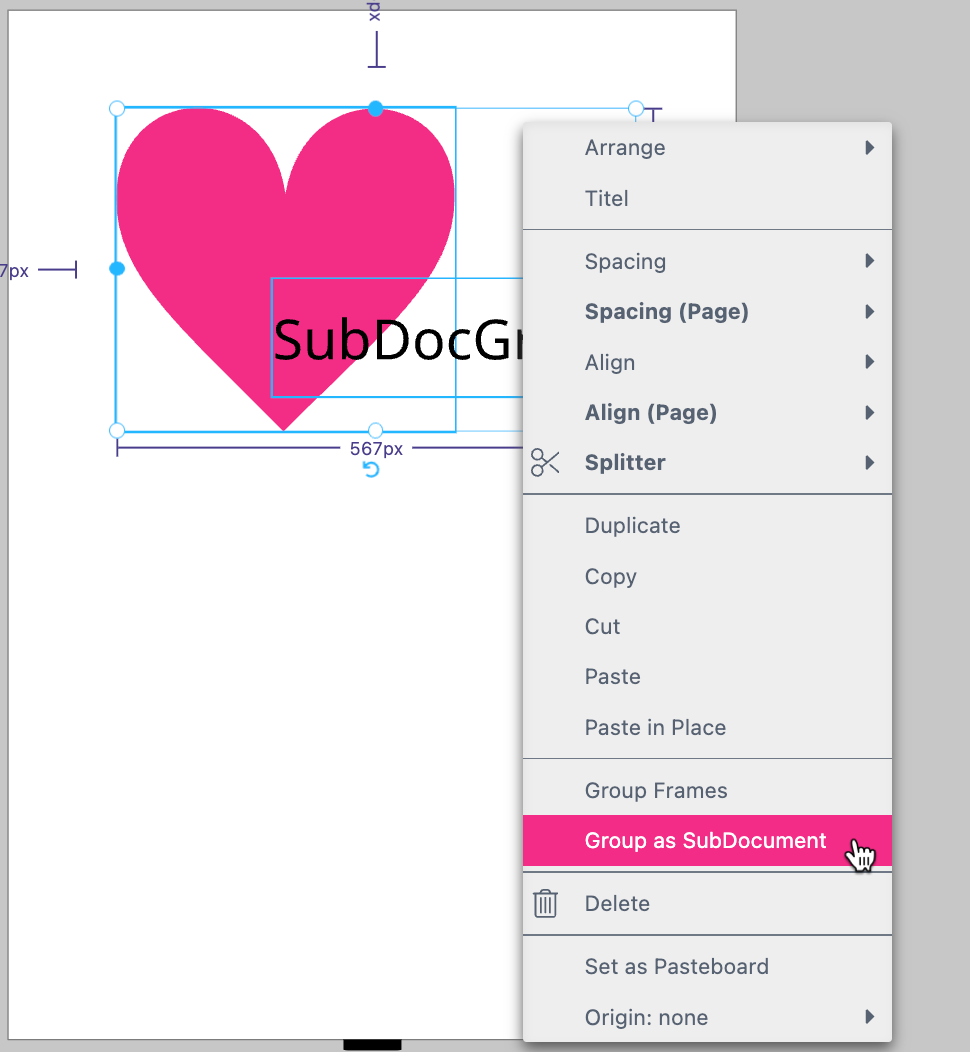
If you have more than one frame selected you can use the Frame Context Menu to group all these frames. Also regular Frame Groups can be changed into a SubDocument Group using this option.
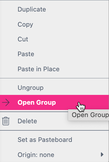
If you like to edit the Group you don’t have to ungroup first. Instead you can open a separate view for editing. You got three different options to do so:
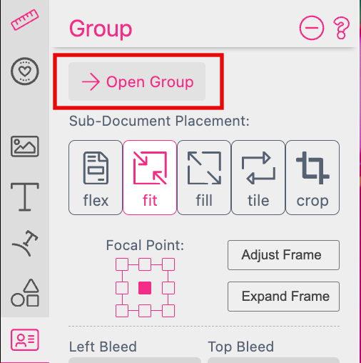
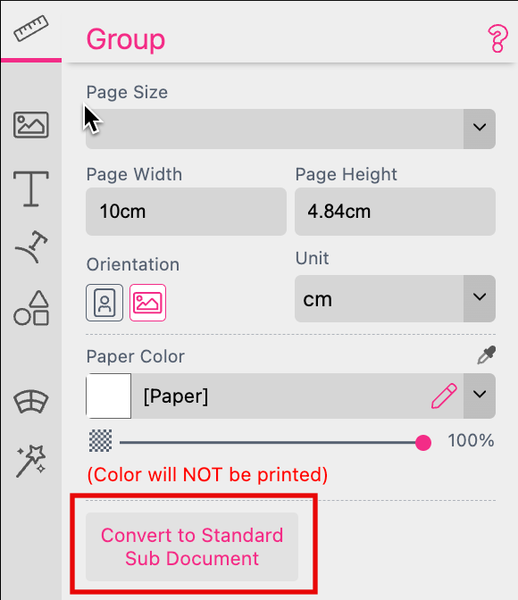
If you opened the group in the separate view you find all relevant features on the group’s Features Panel. And you can convert the Sub Document Group into a real Sub Document by pressing the option Convert to Standard Sub Document.
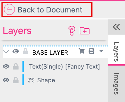
After you have done the changes you can switch back to the Document by clicking on the option Back to Document.
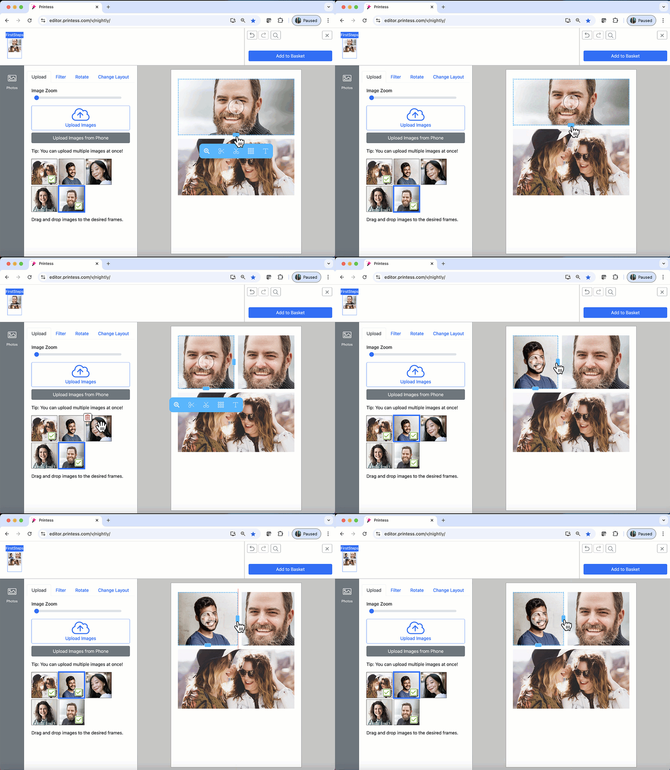
Splitters are the perfect basis for photo collage products. They allow the Buyer to scale and split frames. The Buyer can add and replace graphic elements without damaging the layout. This creates beautiful designs without the Buyer having any graphic skills.
To learn more about Splitters watch the video tutorial:
Note: You can use the ready made Printess Splitter Layout Snippets to not build them from scratch. Therefore you have to go to the Layout Tab at the Resources Panel to add the Tag “printess-splitter-layouts”.
Learn more about the use of Layout Snippets here.
Go to the Frame Context Menu of an activated image frame to select the option Splitter -> Cut Horizontal or Splitter -> Cut Vertical.
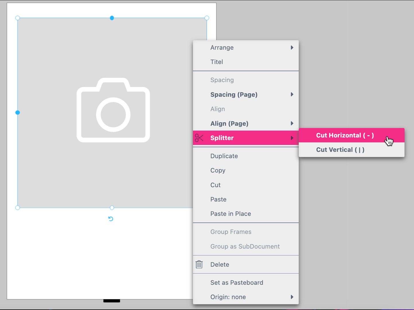
You will get the following result:
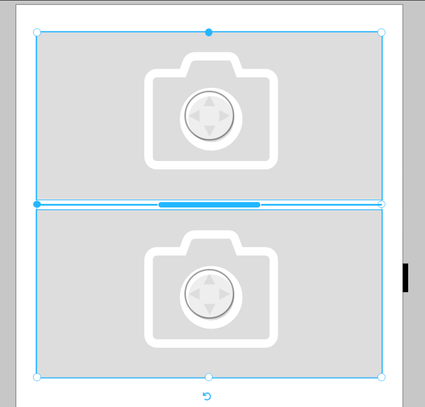
Now toggle to the Buyer Side to check the result. Congratulation! - you have created your first Splitter! Just load up some images and have a play.
But you can also set a single Frame to “Spitter” manually. Activate the frame and go to to the Buyer Side Settings at the Features Panel.
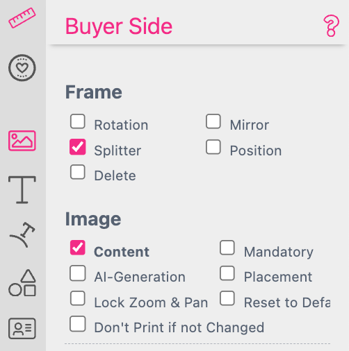
Set the activated frame to “Splitter” and “Content” to enable this feature for this particular frame.
By default the Scissors Toolbar is activated at the Buyer View Appearance Settings so that the blue Toolbar will be displayed as soon as the Buyer is selecting a frame.
Find the Scissor Toolbar option here.
If you turn this option off the Buyer can only upload images and moving the Grid.
This feature was originally developed to override the settings from Layout Snippets. If a Layout Snippet uses a Splitter Grid you can turn on and off Gap Change and Scissor for each “Layout Snippet” before exporting. If you want to override these settings when placing a Layout Snippet in a particular target Template you can do so here. Additionally you can use these features as described below.
If the Scissors Toolbar is activated at the Buyer View Appearance Settings you can restrict the Gab Change and the Scissors feature per Page or Spread at the Page Context Menu.
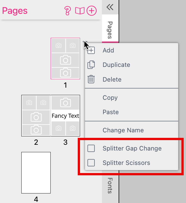
Here you can turn on and off the options to enable the Buyer to change the Gab Size of the Splitter Grid and to use the Scissor to cut the frames of the Splitter Grid.
If both features are turned off the Scissors Toolbar only supports the options to upload an image or place a Sticker Snippet in the selected image frame.
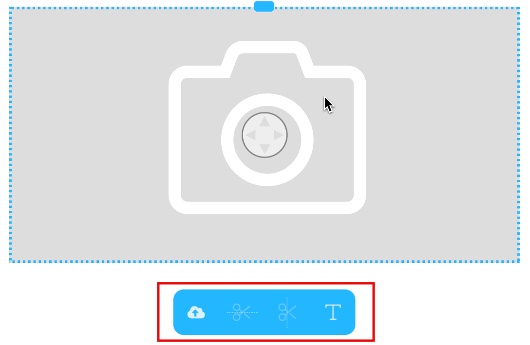
The Scissors Toolbar includes the option for the Buyer to place a Text Sticker Snippet into a selected image frame.

Therefore the Buyer has to press the Text Icon at the Scissors Toolbar.
A default Text Sticker Snippet will automatically be placed into the selected frame and additional Sticker Snippets will be shown.
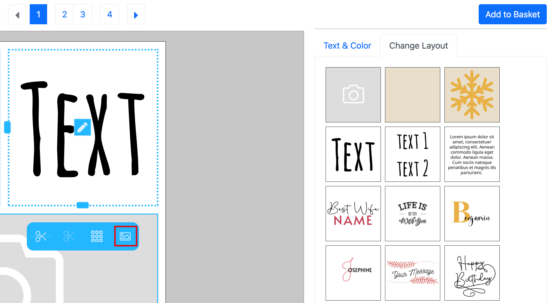
The Buyer can now choose any other Sticker Snippet or pressing the Image Icon at the Scissors Toolbar to undo this step and making the frame an image frame again.
Learn more about Sticker Snippets here.
Back at the Designer Side you find the Splitter Grid Settings at the Document Tab. They are only visible if you turn on the option Splitter:
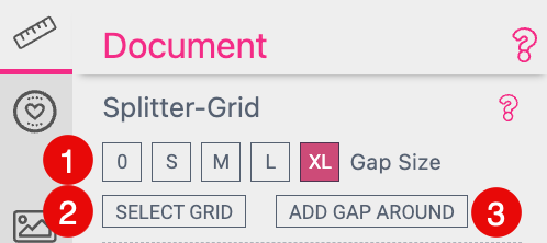
 here instead.
If no Bleed is defined for a Document the option Gap Around does not make sense. So make sure that you have no Gab Around defined for a Document without Bleed. The option to change the Gap Around will then not be displayed at the Buyer Side.
If you are working with Bleed and the Buyer is deactivating the Gap Around images frames will automatically scale up into the Bleed. The same applies for rectangle Shapes with no Corner Radius defined. Any other Shape won’t do so by default. Because most of the time you want to keep that shape.
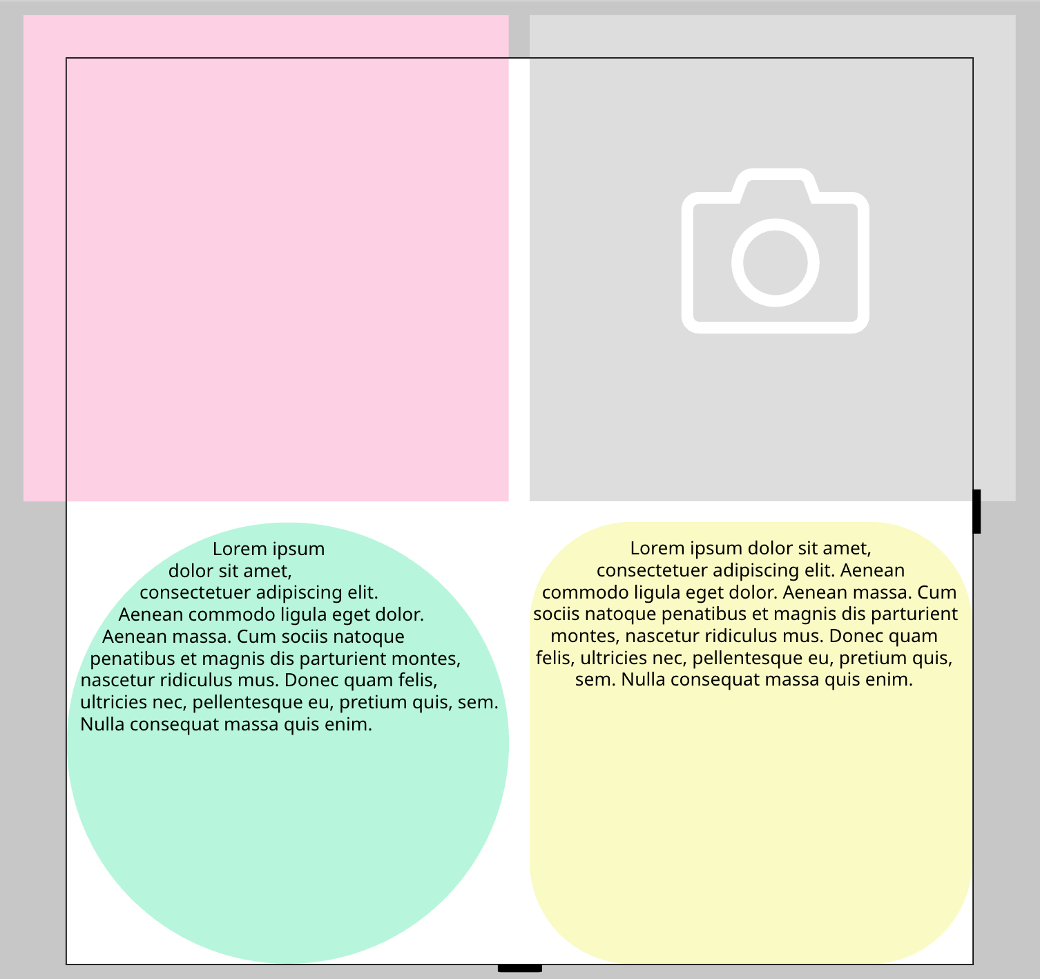
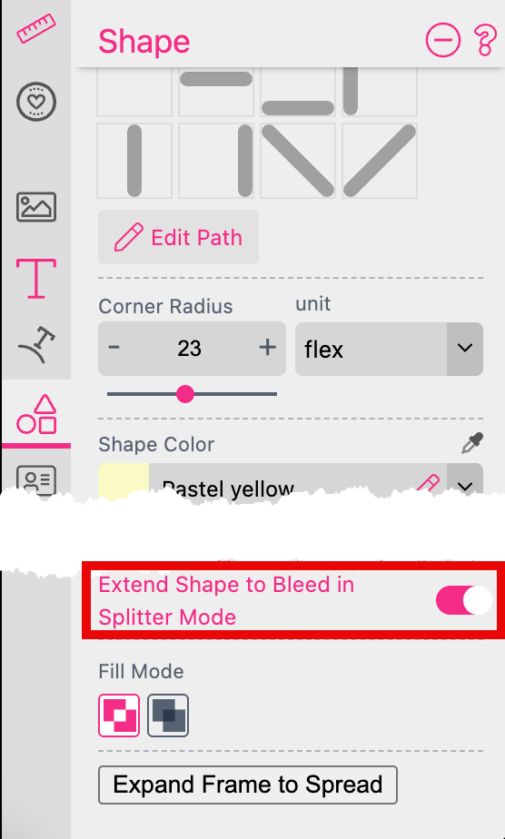
But you can activate the option Extend Shape to Bleed in Splitter Mode for each Shape Frame which you want to extend to the Bleed. You find that setting at the bottom of the Shape Tab.
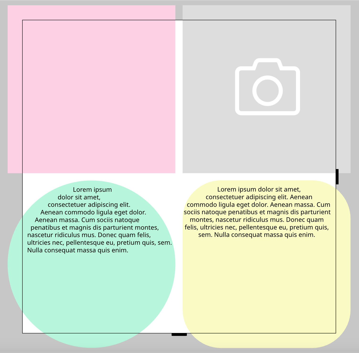
In this example we activated this option for both Shape Frames which are not a rectangle without Corner Radius defined. As a result both frames are scaling up to the Bleed.
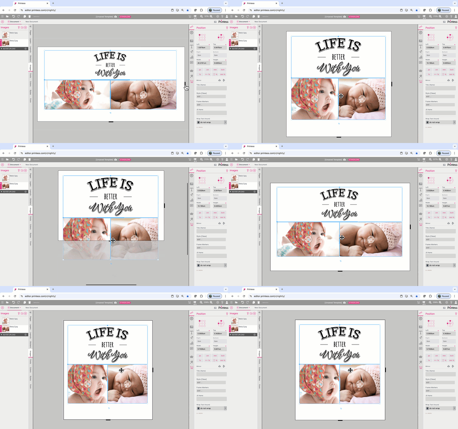
Splitter Grids can deal with different dimensions of documents there will be placed on. They will scale automatically to the Document Size.
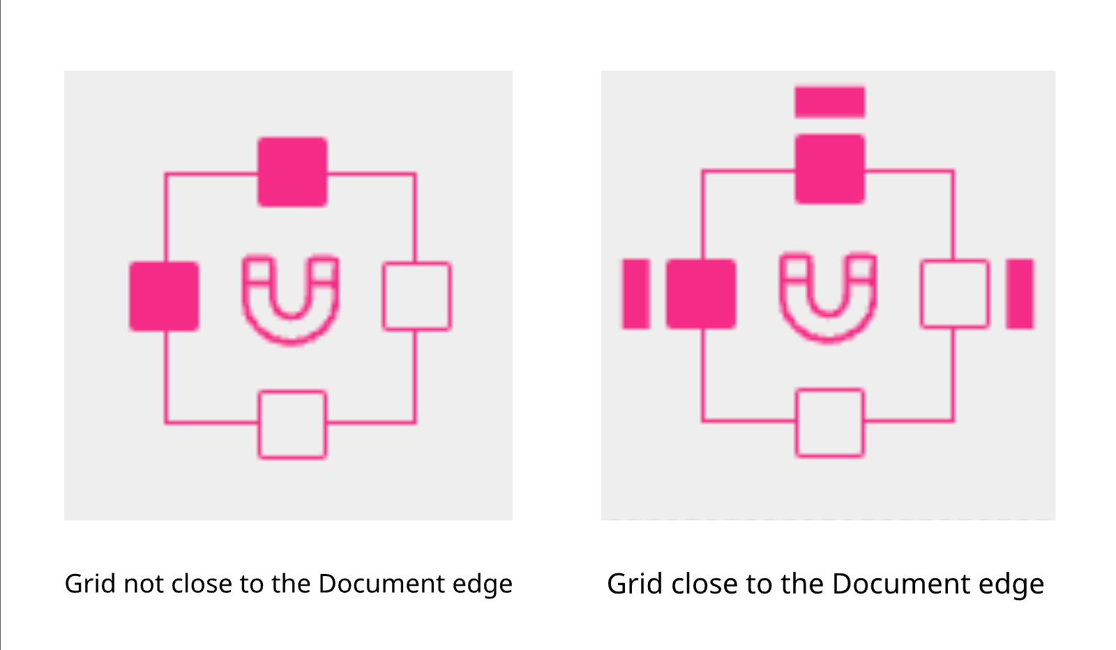
The Splitter Grid will dock to the Document edges if you move it close enough. A red aura will show you that the docking is active. The defined “Gap Around” is taken into account when docking.
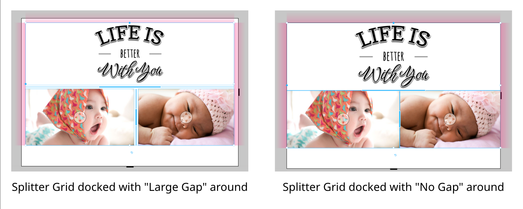
Also the appearance of the Anchor Control will indicate if a docking is active.
Learn how to create Layout Snippets
Learn how to assign Layout Snippets to your Document
Especially the combination of Groups together with Splitters makes complex resizing tasks fairly easy. Let’s have a look: click to open sample document
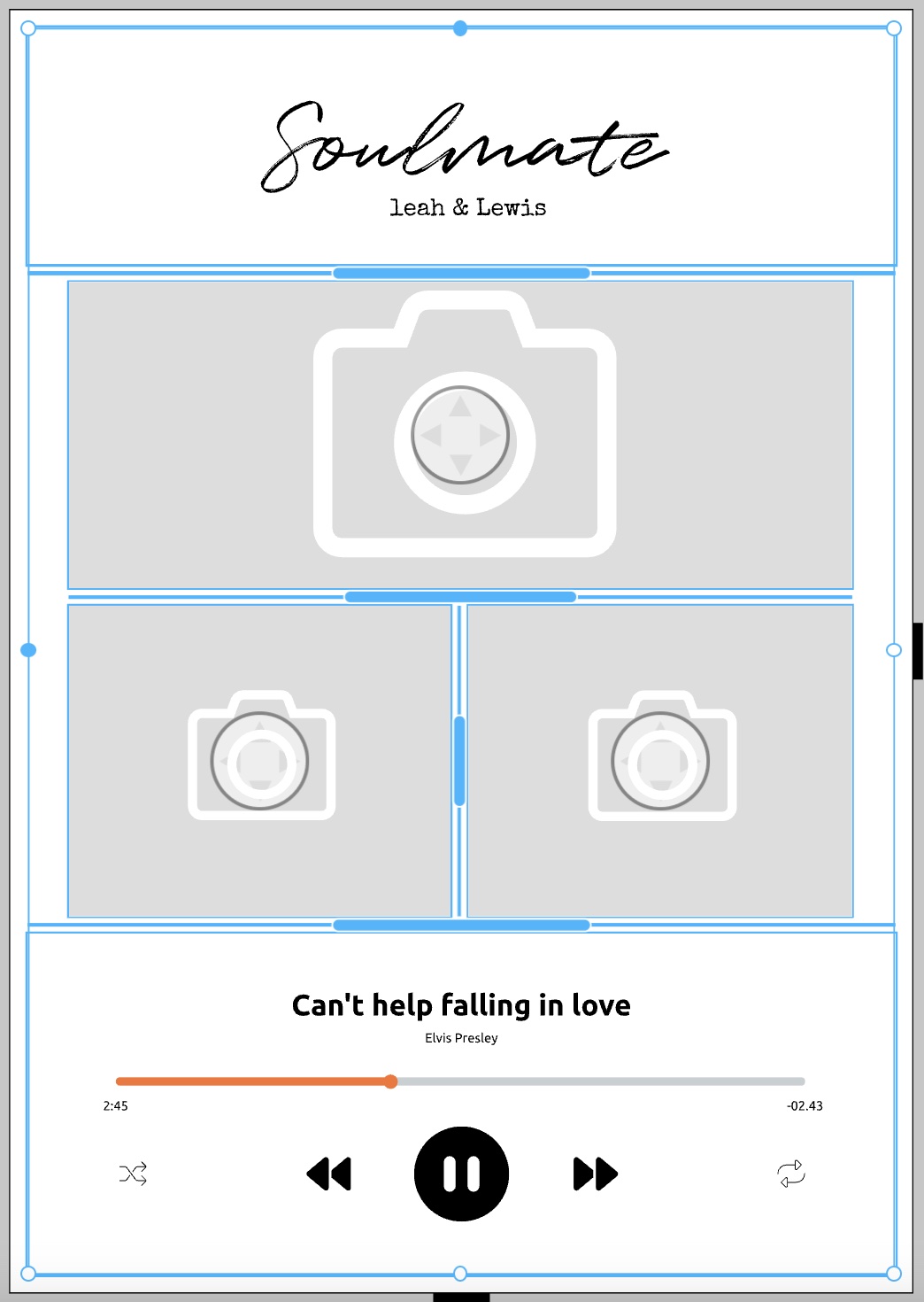
This photo-product design - let’s call it Player - uses 3 images frames set to Splitter plus two Groups. One is called Head and the other is called Player.
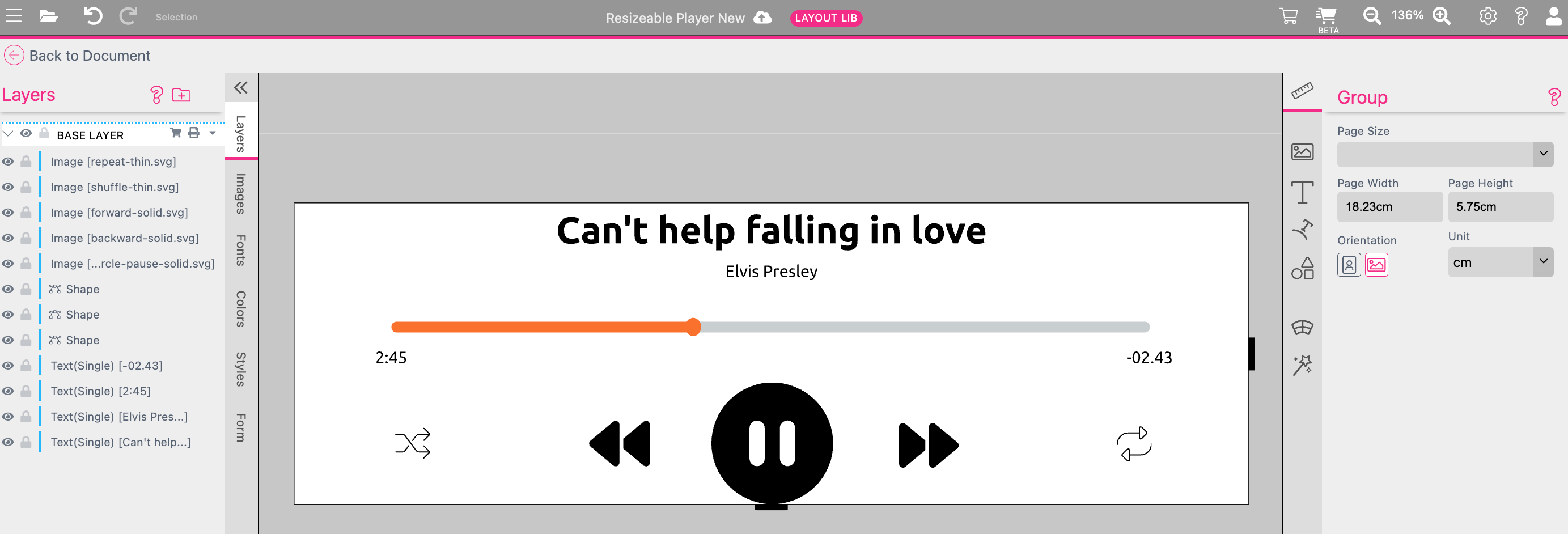
Both Groups are placed on the primary document. The advantage is that the inside layout gets not destroyed if the aspect ratio of the Group Frames are changing. Plus the buyer still can edit all the Properties of the frames the Groups are made of.
The good thing is, that Splitter-grids doesn’t have be symmetrical. So the 3 images do not stretch to the page border, but the Head and the Player Groups do.
If you don’t like the Head and Player to extend to the bleed area, click Add Gap Around in the Context-Menu Splitter with all frames selected.
You can play around with this template in your own account. You’ll find it as Resizable Player in the Design Tutorials section of the New Template Dialog.
To see how it resizes, you have to toggle to the Buyer Side. Here you can simply click the circles beneath the aspect ratio range symbols:
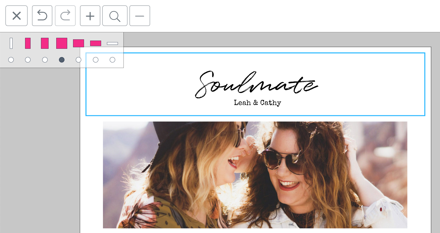
Watch the video tutorial about the Player Example here:
There are several elements which make up a Flex Design:
Please also read the chapter on frame position and sizing.
Here are some examples:
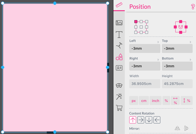
First, let’s see an example using the Anchor control. We will create a background rectangle which should be in the bleed by 3mm on all edges, even if the document size changes. Here we can use the Anchor control and anchor the Frame on all 4 edges. Then one just needs to set the position for Left, Top, Right and Bottom to -3mm to position the bleed 3mm outside the documents page.
Here is an example making heavy use of %, %% and <% values:
This document can get changed in size. Have a look what happens if we drastically change the size of the document.
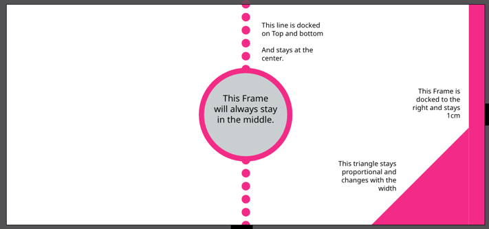
This is the same document but changed to a portrait-like size. For better understanding the position settings for each Frame are shown:
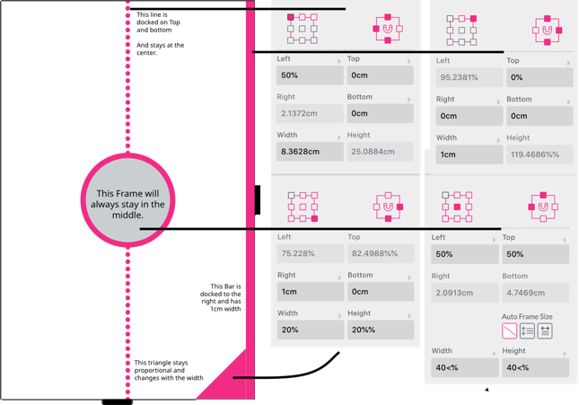
The dotted line will stay in the middle of the document and always goes from top to bottom. This was achieved by setting the anchor points to the top, left and bottom and setting its Left position to 50%.
The bar to the right has a fixed width of 1cm, its reference point was set to right and its Right position was set to 0cm and is anchored to the top, right and bottom. This makes sure it always goes from top to bottom and extends 1 cm into the document.
The triangle is anchored to the bottom right and has a width of 20% of the document width. Because its Height is set to 20%% it will use the width of the document as reference while letting the Frame expand and contract on the document base width only.
The circle in the middle has its reference point set to center and uses a position of 50% Left and 50% Top to always stay in the center. The Width and the Height are set to 40<%. This will either correspond to 40% of the width of the document or 40% of the height of the document, whatever is smaller.
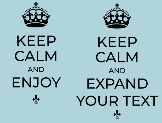
Another useful Flex Feature is automatically moving Frames below a Multi Line text frame set to vertical Auto Frame Size mode, below built-in Multi Line text frames. Simply Group the Multi Line Text with the Frame below and when the Text is edited and expanded the Frame will adjust accordingly.
Styles are another way of implementing Flex Designs. In this business card example, one can enter a fax number, thus expanding the used Multi Line Text. This will then move the pink bar on the bottom down. Additionally, if the job title spreads over two lines the bar disappears completely to make room for the text.

This example was created using Named Frames and a Style assigned to the bar.
Start by giving the auto sized Multi Line text frame the JS Name ‘main’. Click here to see how to give Frames a JS Name.. Then create yourself a Style ‘.box’ like below and assign it to the pink bar.
.box {
 	visible: ${frame.main.bottom < 180 };
 	top: ${frame.main.bottom + 20}px
}
This will set the top of the pink bar to the bottom edge + 20px. As one can see ‘px’ was added after the literal ${…}. This is because frame.main.bottom just returns the pixel coordinates without any unit to allow for arithmetic operations. That’s why we need to add px after the curly bracket, to make it a valid value for a position.
Important Limitation: Note that this Style only works with Multi Line text frames as the positional source (as these are the only Frames which can expand) and it is limited to one dependency. So a Frame positioned by a Style cannot have another Frame dependent on its position.
Attention: Frame coordinates have px unit. All positions in literals will always be given in px which has the size of 96px/inch. So, if one needs inches here, simply divide the values by 96. If one needs centimeters multiply an additional 2.54.
The other function this Style serves is that if the bottom of the Multi Line Text gets below 180px the visible property will become false - making the pink bar invisible.
A good example on how to use Styles to react on the DOCUMENT_SIZE form field is the Printess example calendar. In this example we use conditional Styles to move Frames for different designs.