![]()
All Text on Path settings are located at the Text on Path feature icon in the main features panel. If a frame with the Text on Path feature is selected the tab shows the settings for Text On Path. Text on Path must have a shape feature enabled as well.
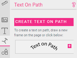
If no shape is present, a circle shape will automatically be enabled when a Text On Path feature is added to a frame or a new frame is created.
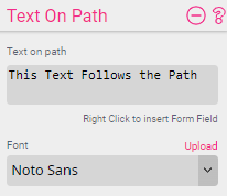
The Text on Path is independent of a possible Multi- or Single Line Text. If you want the text to come from a Form Field then just enter ${form.formfieldname}.
String operations, conditions, or any other JavaScript literal are also possible inputs. Such as: ${(form.myVal == “Test”) ? “this is a test” : “that’s reality”}.
You can also connect one single line or path text frame to another by naming the source frame and addressing it with ${frame.name.text}.
If the text gets longer than the available path length, the font size will automatically reduce until the full text fits on the path given.
With the Font drop-down you can select any font loaded onto the Template.

Horizontal alignment can be set to left, center or right.
Left means the text starts at the first point of the path and extends as long as it runs.
Center means the text is centered at the center of the shape’s path.
Right means the text aligns right on the last point of the shape’s path.
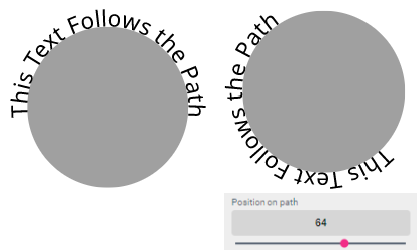
The text alignment can also be fine-tuned with the Position on Path slider (which shifts the text clockwise):

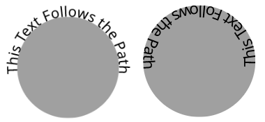
Flip the text on path vertically at the baseline. This will let the text flow right to left instead of left to right along the path.
Use distance to shift the text to the desired distance around the object.

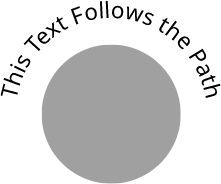
This defines the distance of the baseline of the text to the outside of the shape. The value can also be negative, which means the baseline will be shifted into the shape itself. For example, the Text on Path below was created with a distance of 30pt to the path:
![]()
This defines the space between the single characters:
![]()

Defines the font size of the Text On Path. If the text would get longer than the path the font size will be reduced to a font size that will fit the complete text into the designated area.
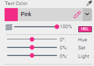
Set the fill color of the Text on Path by either selecting a swatch from the drop-down or use the  create icon inside the drop-down to create a new color.
If you have selected an RGB color, the HSL manipulation option is available as well. Press the HSL button to change the hue, brightness, or saturation of the selected color.
Tint will define the opacity of the selected color.
If Stroke Width is set to any value other than 0 the stroke settings will appear:
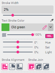
Font Stroke Color allows users to control just the color of the stroke around the letter. Functionality is the same as in Text Color.
The Stroke Alignment and Stroke Join buttons control where the stroke should appear. Please see Single Line Text alignment settings for more details.
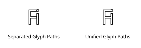
Union Glyph Paths combines overlapping glyphs paths into one. The stroke would then be applied to that outer path ignoring any path segments which overlap each other.

Text case can automatically uppercase (upper) or lowercase (lower) the user’s input. If it is set to mixed case (mixed) the text will stay unaltered.
Max. Chars will define the character limit for the text (Before & After Texts are not counted).

Before and after define a prefix/postfix text which will be added before/after the given text. If the text is empty no prefix or postfix will be added. This is useful if one would like to create a Phone Nr. line on a business card saying “Phone: (XXX) XXX-XXXX”. If no Phone Nr. is given “Phone:” should not appear as well. To achieve this put “Phone:” in the Text Before input box.