![]()
Frame position settings are located on the Ruler icon in the top menu bar. When a frame is selected the tab will show the position settings of the frame.
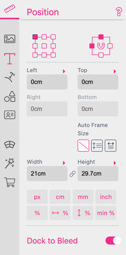
Valid values for top, left, width and height are expressed in cm, inch, px, %, <%. The default unit, if none are present, is the unit set in the document settings.
% and %%, <% units are especially useful to position items in a flexible document:
% unit refers to the document width or height depending on the respective axis you are in (E.g. inputting 100% into width means 100% of the document width.)
%% means the same but for the other axis
<% means the minimum of both axis
Please also read the chapter on General concepts of Flex Designs
The Aspect Lock icon ![]() is used to toggle locking of the width and height ratio. Selecting this icon will automatically change the height of the document if the width is changed (or vice-versa) based on the document size settings existing at the time that the Aspect Lock icon is selected.
is used to toggle locking of the width and height ratio. Selecting this icon will automatically change the height of the document if the width is changed (or vice-versa) based on the document size settings existing at the time that the Aspect Lock icon is selected.
With the px, cm, etc. buttons below the input fields it is possible to change between different units.
One might also use calculations in all input boxes by starting with = followed by the calculation e.g. = 2*3cm+1cm.
Use Percent to Find the Middle.
If one would like to position a bar 1cm to the right of the middle of a
double page. Simply input =50% + 1cm for the left position of the bar.
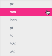
One can always convert units into each other. Either collectively by using one of the unit buttons at the bottom of the position field or selectively by clicking on one of the small triangles above the input fields. In this case, a selection popup will appear and offer different conversions. E.g. to convert the height of a frame.

With the Reference Point control, the user can control the point of rotation as well as the point on the frame which represents the top-left position.

The Anchor control is extremely useful for flexible document designs. This control sets the dock points of the Frame (normally top left) to the sides of the document (e.g. bottom, right) and can also anchor the width or height by selecting up to four of the anchors.
If the document size changes, the respective anchor points will move and reposition/resize the frame accordingly. An example template for a mobile phone cover can be found in the Printess program. To see this, just create a new template and select the phone cover example from the pre-made templates available in Printess.
Rotation for Anchored Images Rotation for images anchored with more than two points is limited to content rotation in 90° steps. The rotation slider will be replaced by the content rotation selector.


By default Multi Line text frames grow in height when additional text is added, so height is set by the content. Here you can change this behavior to let the text either grow in width or not grow (necessary to let the text flow between Frames).
Text in Auto Size mode can shift elements below in the same group on Buyer Side. Setting the Auto Size mode to Height also enables the Adjust Document Height setting in the Buyer Side tab.
Learn more about shifting elements below Auto Size Text here.

This feature is very useful if you would like a background frame to extend to the bleed while any frames in the foreground remain in place, or when you give a Buyer control over document dimension settings. With this powerful feature, you do not need individual Layout Snippets for each product and can use each Layout Snippet across essentially all of your products.
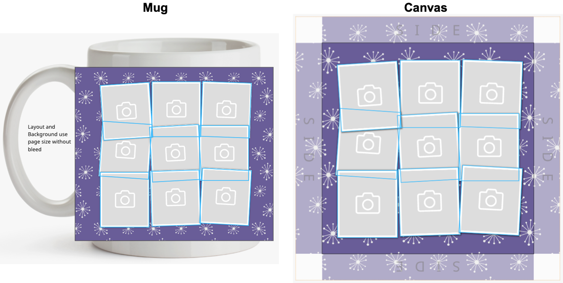
For example, above we have an example of a mug product (without bleed) and a canvas product (with bleed). Both use the same Layout Snippet with a purple background and a 9 image collage in the foreground. So how do we create a versatile Layout Snippet that can be used across multiple Templates?
Simple! With the Dock to Bleed feature, we can apply Dock to Bleed to the purple background frame on the Layout Snippet, and keep the positioning of the foreground layer of the Layout Snippet image frames centered inside the page or placement margins.
As you can see, this Layout Snippet will appear normally in the mug example, while extending the background of the page bleed of the calendar. In the mug example (left) the Layout Snippet extends to the page size without bleed. In the canvas example (right) the the Layout Snippet uses the page size for image frame placement and the bleed area for the background placement.
This keeps the documents and products organized and looking beautiful, while at the same time being highly customizable from various premade, we recommend to use our versatile Layout Snippet libraries.
This feature saves you time and effort as you can create Layout Snippets that can be applied across multiple products. Instead of creating different Layouts for different products, you can simply create more products and use the same Layout Snippets for them! The Layout Snippets also will appear just as beautifully on products with placement margins and bleed, such as a calendar:
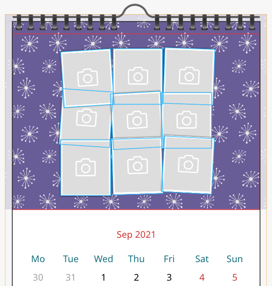
Here the layout is centered inside of the placement margins while the background extends to the page bleed.
It is important to note, that the position of frames is adjusted when:
Giving the customer control over their document dimensions and the ability to resize a document really puts them in charge, and adds a dynamic level of personalization for the Buyer. But keeping the positioning of frames is also very important. Here is also where Dock to Bleed shines. Buyers can switch between page sizes and even create their own custom dimensions, and the Layout Snippets will automatically adjust their frame positioning to the preset bleeds and placement margins for different products or materials:
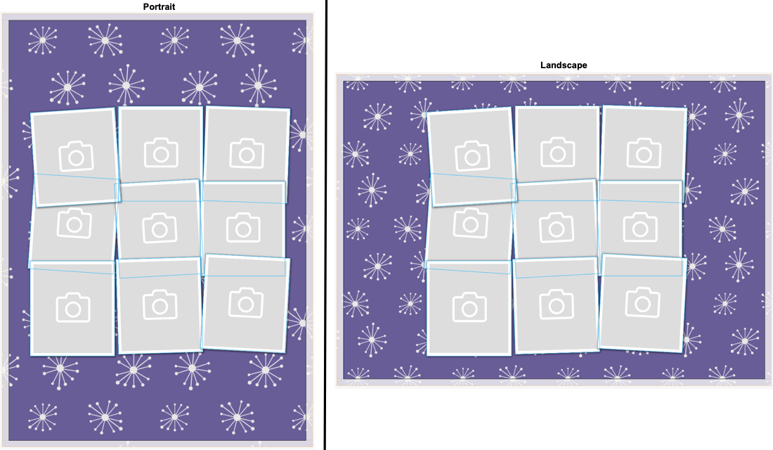
In the above Universal Layout Snippet example, we see 5 different products with various Layout Snippets that can be applied to all of them regardless of their document dimensions. The backgrounds will automatically extend to the bleed when a bleed is present such as with the calendar, canvas, portrait, and landscape examples.
Lets take a look at an example calendar Template.
You can follow along with this process with the Printess Calendar example Template from the New Template section of the Template Browser:
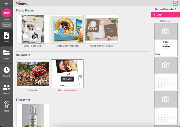
First, lets enable Dock to Bleed on our Image frame. We select the frame and navigate to the Position panel, then toggle Dock to Bleed on for this Image frame.
When placement margins are turned on, frames and Layout Snippets will dock to the position set by the placement margins:
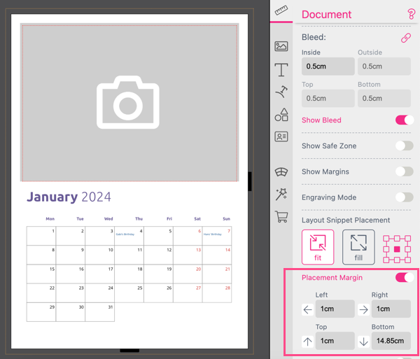
With Dock to Bleed enabled on the Image frame, we see that it is still docked within the placement margins.
To bypass this, simply use the Layout Snippet Placement Margin arrows next to the value inputs on the Document frame features tab (unselect the current frame by clicking the document or pasteboard to open this panel) to extend the frame to the bleed in any direction for frames with Dock to Bleed (or the Splitter tool) enabled:
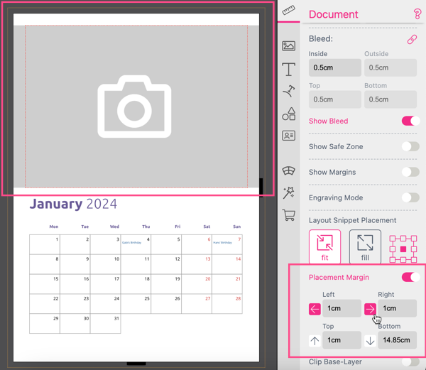
Info: Any frames with the Splitter tool activated support this feature by default.
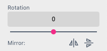
Rotation will rotate the selected frame based on the set Anchor control points from the top of the Position panel.
The Mirror icons are used to vertically or horizontally mirror the frame based on the central axis.
Any frame can have a Title. This Title will appear in the Layer tab to easily identify the frame in the list. There are three different ways to define that Title.

Through the Context Menu of the Layer:
Just do a right click on the Layer in the Resource Panel.
Through the Context Menu of the Frame:
Just do a right click on the Frame.
Frame Position Panel: In the Feature Panel of the Frame Position you can just type in the Title of the Layer.
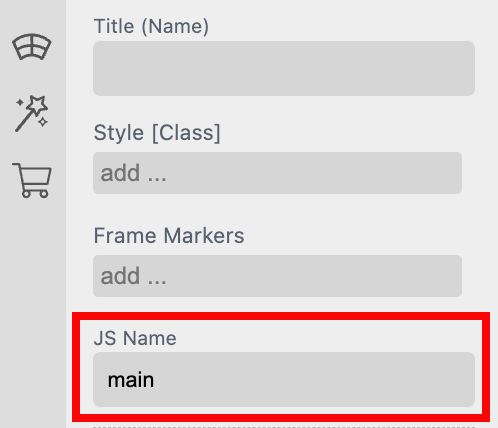
Any frame can have a JS Name. This JS Name will appear in the Layer tab to easily identify the frame in the list. In difference to the Frame Title the JS Name is a technical feature. It could be used to address the frame through the API and to control the frame through Styles.
frame.JSName is only visible in Document Styles.
If you would like to use the properties of a named frame in a Style, note that these are only usable in Document Styles. Auto-completion will also not show them if you work on Global Styles.
Also make sure that if you’d like to use JSName Frames in Styles that you don’t accidentally use the same name twice!
Click here to open the Business Card example document
Within that document the JS Name “main” is used in the Style “.box”.
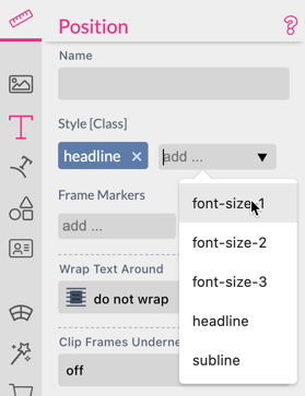
Each frame can use multiple styles created in the Styles tab to change its style based on form field values or other conditions. Use the Style Selector to choose and add a style that should be applied to the frame. x Will remove a selected style.
Styles Overwrite Behavior
If one selects multiple styles containing the same properties e.g. color - the style which appears last in the style definition will determine the property independent from the order in which the styles are mentioned in the style selector of the frame. Also Document Styles will win over Template Styles.
With Frame Markers you can either generate statistical data or implement a pay per artwork model with your buyers. You can mark every frame with a custom marker of your choice and after editing use the editor API to analyze the appearance and amount of certain tags.
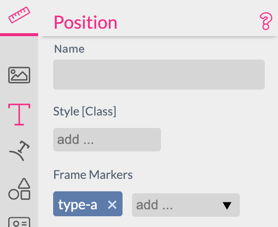
Use the API method getBuyerFrameCountAndMarkers() to retrieve used Markers together with some other useful editing statistics. Read more here.
Tip One can also use this API call to analyze if the user has changed/added any frame on a specific document to e.g. determine if the buyer put something on the back of a T-Shirt …
Depending on the frame type you will find additional text properties at the bottom of the Position tab.
Wrap settings:
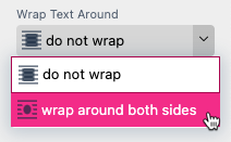
All frames have Wrap settings which determine if Multi Line text will flow around the frame or the shape selected. When wrap around both sides is selected, a Text Flow Distance setting appears beneath the Wrap Text Around properties that you use to set the distance at which Multi Line texts flow around the frame:
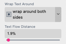
Info: Select a shape or Single Line text frame to enable this feature on the bottom of the document settings tab.
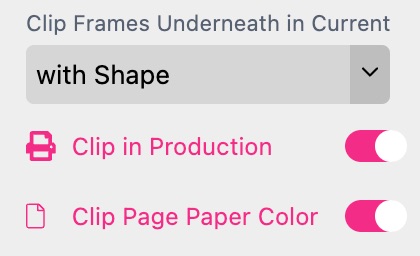
This allows you to clip all frames below a shape or single line text within one layer. This is a powerful feature. It even works in conjunction with variable Single Line text. Additionally, you can select if the clipping should happen in PDF output mode as well by selecting Clip in Production.

Clipping is always local to the layer the clipping element is in and happens only below the clipping element. Clipping elements are marked as Clip-Path in the layer view.
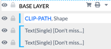
See this example where we clipped a complete layout with a round shape.
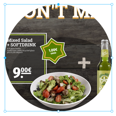
If a clip path element is made invisible by a style, the clipping effect disappears as well.
A good example on how to use Clip Frames Underneath is our Photo Tile example document.
Pro Tip: If the CLIP-PATH is the topmost frame in the Base Layer Printess will insert all Stickers below it so that the Path clips even them.
When working with irregular shaped products you can use Clip Page Paper Color to also clip the page background. This takes away the pain to adjust page-background to pasteboard (and other hacks) if the design is not rectangular and therefore is using a clipping path.
