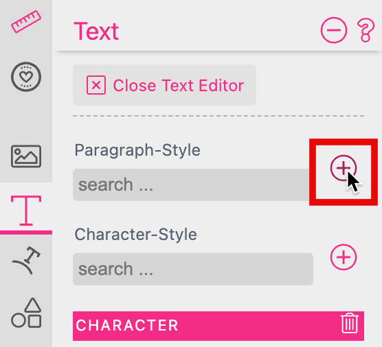
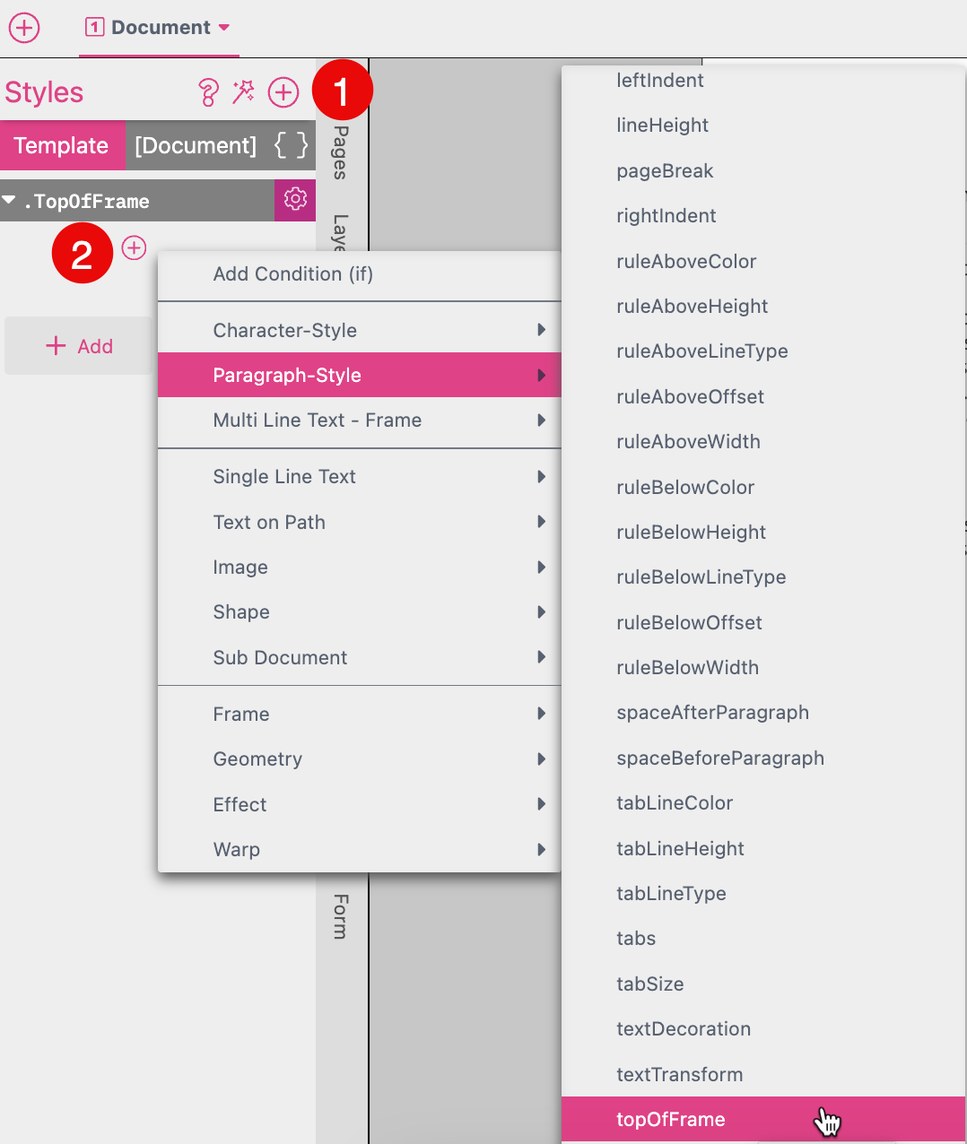
A very useful addition to setting text properties manually is to use combined Styles. To create combined styles, create a text with the settings to be set by a Style and press the Add Character or Paragraph Style button:
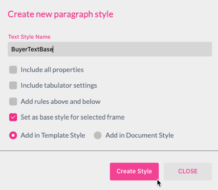
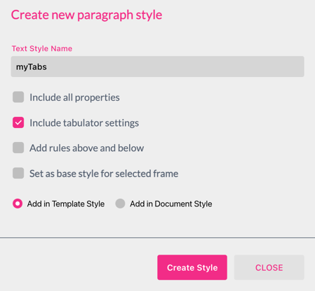
This will open up a dialog where you can enter a name for the new Style:
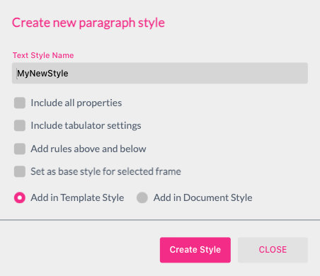
Besides giving the style a name, one can also select:
Below the check-boxes one can then choose whether to add the style globally (template) or just for the current document.
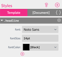
Once created you can alter the style in the Styles tab to the left.
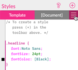
There is also a code view available
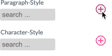
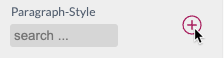
To use the created style(s) click into the Paragraph / Character Style search field and pick a style from the list (a list is filtered while typing). Once selected, the chosen style will be shown in blue above the search field:
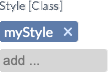
You can add more than one Paragraph Style and/or Character Style - properties will be automatically added. Properties that are tied to a style will get grayed out and are not editable in the UI. They also show the name of the style that the value originates from in […] in the label above.
Styles Overwrite Behavior If one selects multiple styles containing the same properties e.g. color - the style which appears last in the style definition will determine the property independent from the order in which the styles are mentioned in the style selector of the frame. Also Document Styles will win over Template Styles.
This controls the background color of a Paragraph. This Paragraph property can only be controlled via a Style.
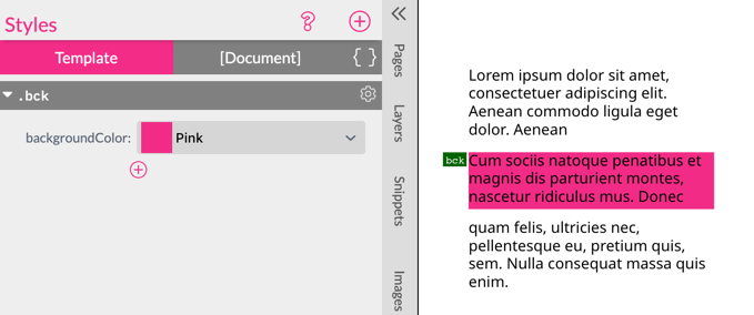
Tip: Combine this feature with ruleAbove & ruleBelow as well as left and right indents to create yourself info boxes, decorated headlines, tables with alternating backgrounds etc. - which flow with the text.
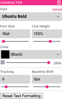
Here you can set all character properties for the selected text - note that Paragraph Styles can also contain all Character Properties, but Character Styles cannot contain Paragraph Properties and selection will automatically enlarge to the current Paragraph when changing a Paragraph Property.
Font - Here you can change the font. If the font is not currently loaded one can also upload a font here (TTF or OTF files are supported).
Font Size - Sets the glyph size for the current selection / the current paragraph.
Line Height - Sets the line height as a percentage of the maximum font size.
Color - Sets the color of the current selection / the current paragraph.
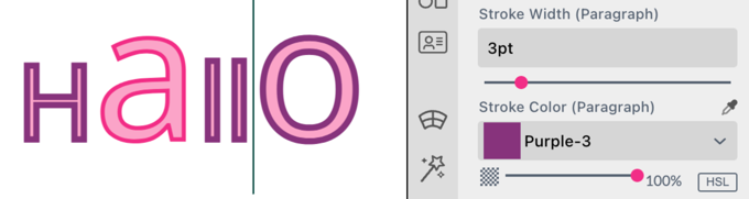
Stroke Width / Color - Sets the stroke-width & stroke-color for the current selection.
In addition to the properties you can add the Character Style textTransform at the Resources Panel to set e.g. your headline text frame to upper. This will convert any text input from the Buyer Side into upper chase. Just click on the plus icon of the style and select Character-/ or Paragraph Style textTransform.
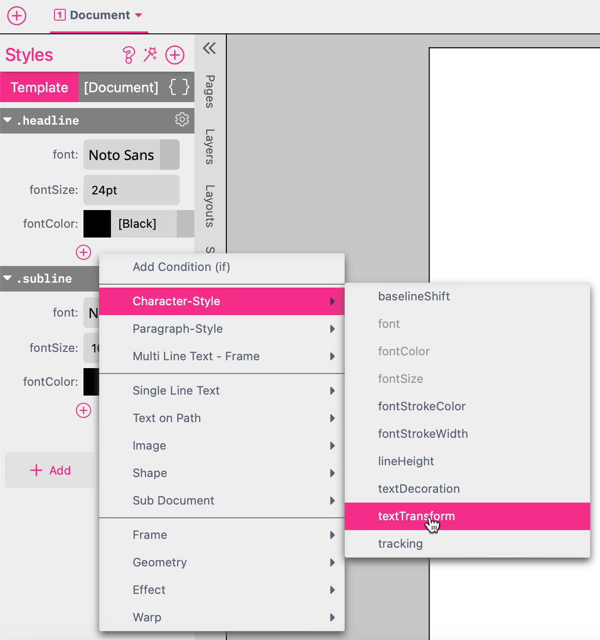
mixed: Upper and lower chase characters are supported. upper: Any text input will be converted into upper chase only. lower: Any text input will be converted to lower chase only.
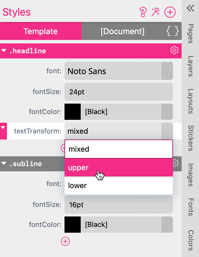
Note: This feature is only available for Multi Line Text Frames.
You can add the textDecoration at the Resources Panel. Just click on the plus icon of the Style and select Character-/ or Paragraph Style textDecoration.
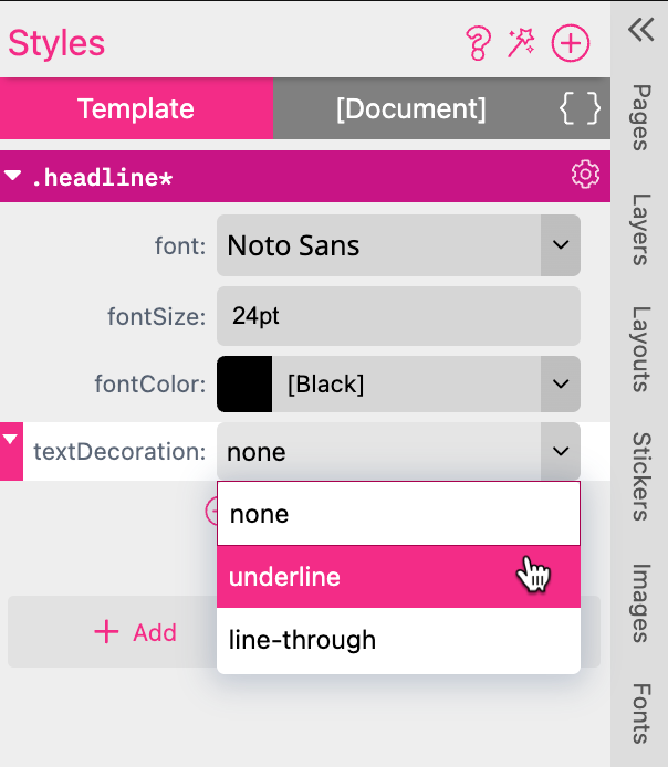
none: No Decoration applied. underline: The text will be underlined. line-through: The text will have a line through.
Special kinds of Styles are the Character-, Paragraph-, and Base Styles of a frame. Paragraph Styles may contain all paragraph properties (e.g., indents, alignments, and paragraph distances) plus all character properties like font size, font color, etc. Character Styles can only use character properties such as font size and tracking.
Both Styles can either be applied to the frame (by using the Style selector from above) or selected within the Multi Line Text Editor in the Text tab. Styles can also be comfortably created within the Multi Line Text Editor.
Learn more about Multi Line text frame features here!
Both usages have different outcomes. If you apply a Style within the Multi Line Text Editor (paragraph or character Style Selector), the properties which are set in the Style tab will disable the respective UI elements and you cannot overwrite the properties.
If you set the Style for the complete frame, it will form the new base style of the text (resetting all styles will also revert to this style). Properties can be overwritten in Designer & Buyer Side UI.
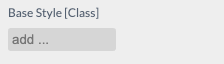
This can be achieved by selecting the base Style in the Text tab while not being in the Editor:
Another convenient option if no Style has been created is to format the text as you want the base Style of the frame to be (for a minimum of one paragraph) and while the I-beam pointer is in the paragraph press the Add Paragraph Style button:
A popup will appear asking for the name of the Style, which you must enter and select Set as base style for selected frame. This will create a new Style and assign it to the current Multi Line Text Frame as its base Style.
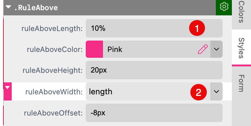
ruleAbove-XX properties control a line above the paragraph and ruleBelow-XX properties control the line below a paragraph.
These special paragraph Styles cannot be addressed via the UI.
Either use Add rules above and below in the Create New Paragraph Style dialog or manually add the following properties to a style from the paragraph Styles properties.
ruleBelowWidth, ruleAboveWidth - can be set to frame which will create a line in the width of the frame, or text which will create a line the width of the text. The third option is to define these parameters by the ruleBelowLength respectively by the ruleAboveLength.
ruleBelowLength, ruleAboveLength - can define the ruleBelowWidth and ruleAboveWidth. It enables you to define the width of the line below or above the paragraph independently from the text- or the frame width. Instead you can define the width of the line in mm, px, % etc.
Therefore you have to:
If you are working with two different values for ruleAboveLength AND ruleBelowLength the background color of the Paragraph will expand to the bigger value.
ruleBelowColor, ruleAboveColor - defines the color of the line.
ruleBelowOffset, ruleAboveOffset - defines the offset of the line to the baseline of the text. Positive offsets will move the below line downwards and the above line upwards.
ruleBelowHeight, ruleAboveHeight - defines the thickness of the line.
ruleBelowLineType, ruleAboveLineType - this property sets the line type. By default, it is solid which will show a solid line. dotted will create a line from dots, dashed1 - dashed6 will create a dashed line with different distances between the segments.
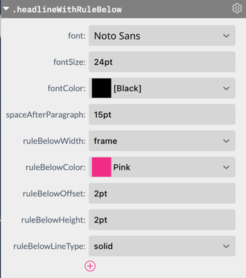
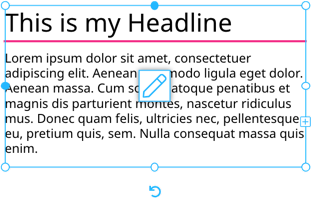
The above Style will create the following output when it is assigned to the first paragraph.
Here is the same Style expressed in code:
.headlineWithRuleBelow {
 	font:Noto Sans;
 	fontSize: 24pt;
 	fontColor: [Black];
 	spaceAfterParagraph:15pt;

 	ruleBelowWidth: frame;
 	ruleBelowColor: Pink;
 	ruleBelowOffset: 2pt;
 	ruleBelowHeight:2pt;
 	ruleBelowLineType:solid;
}
A special Paragraph Style that cannot be addressed via the UI elsewhere are the Tabulator settings.
Start by creating a new Paragraph Style with tabulator settings included. When you are in the text edit mode you can press the plus icon at the Features Panel at Paragraph Styles to add a new one.
A new window will open where you can define which settings it should include. Just choose “Include tabulator settings”.
This will create a Paragraph Style where all tabulator-related properties are included. Alternatively you can add them manually to a Style by adding from the Paragraph Style Properties.
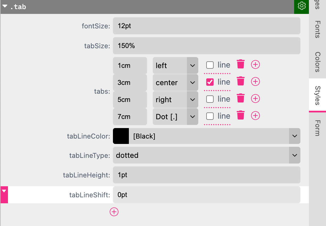
fontSize - this controls the standard font size of the paragraph Style.
fontColor - controls the color of the paragraph text.
tabSize - this controls the standard tab size when no specific tab is defined. Values can be either % of the character height or absolute values (e.g., pt, px).
tabs - here you can define specific tab steps and types. The first parameter is the position of the tab followed by its type. Tabs can either left-, right-, or center-align a word. They can also align to a certain character in the word - a so-called decimal tab - here the choice is between , or . or -.
The  removes a tab position and the
  adds another position.
tab line - additionally you can enable a line between the last position before the tab and the tab position.
tabLineColor - controls the color of an activated tab line.
tabLineType - controls the type of the line where you have the choice between solid, dotted, and several dashed line types.
tabLineHeight - controls the height of the line. Can be expressed in absolute values (pt, px, etc.) or as % of the character height.
tabLineShift - controls the shift of the line up or down. Can be expressed in absolute values (pt, px, etc.) or as % character height. You can use positive or negative values.
Here is the same Style expressed in code:
.Tabulator {
	fontSize: 24pt;
	fontColor: [Black];
	tabSize: 150%;
	tabs: L1cm C_3cm R5cm .7cm;
	tabLineColor: [Black];
	tabLineType: dotted;
	tabLineHeight: 1pt;
	tabLineShift: 0pt;
}
For dotted Tab Lines you got one additional setting available. The tabLineGapFactor. It controls the distance between the single dots.
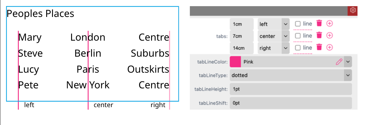
By default there are three different Tabs available to your Paragraph Style to define:
With the recycle bin you can delete Tabs - pressing the plus icon you can add one.
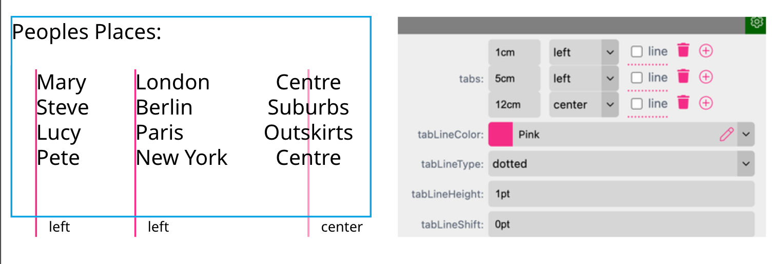
First of all make sure that you have set any Tab within your Multi Line Text Frame. This example shows a Table of peoples locations. The Tabs are set but the Paragraph Style is not assigned to the Multi Line Text Frame. So first select the frame to click on the gear icon of the Paragraph Style. Now select the option "Assign to Frame. Now the defined Tabs of your Paragraph Style are used for the Tabs you set in the Multi Line Text Frame.
Example #1
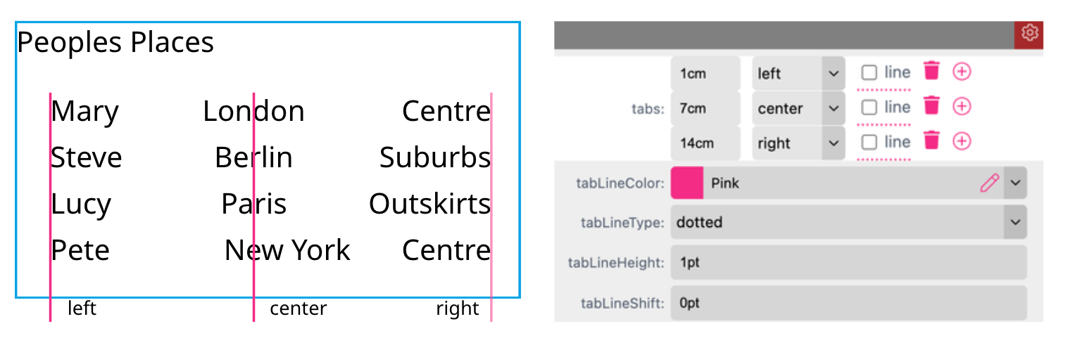
Example #2
In this example the centering does not work for “New York” because it includes a white space. That’s why we have to use a Printess Utility to convert that white space into a protected sign. So we add the Utility ${u.noBreak("New York")} to our text frame. If you work with a Text Form Field called e.g. “city” you would add ${u.noBreak(form.city)} to convert the white space.
You need to have Text Flow activated before you can use Page Break.
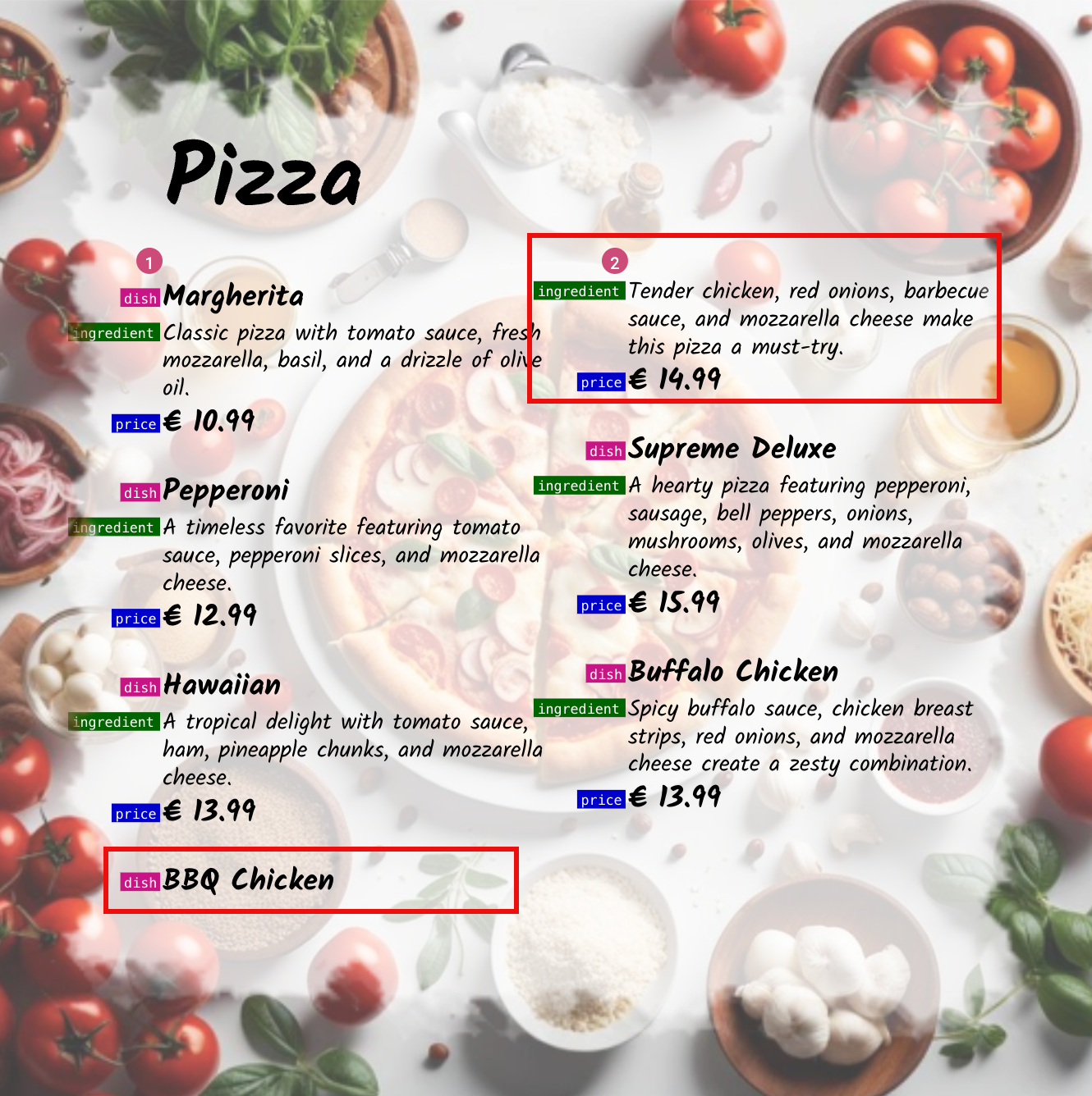
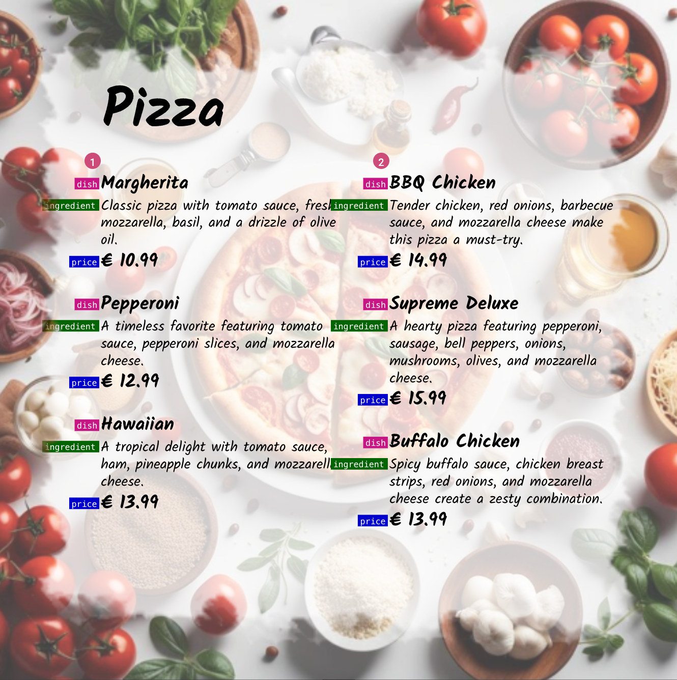
With Page Break you can avoid the line break inside or between paragraphs. This example shows two connected text frames of a menu card. It is using three different Paragraph Styles: dish, ingredients and price.
We would like to avoid that a line break will be executed between the three paragraphs to not get a result like this.
To resolve this make sure that your paragraph is using a style. Just select it at the Features Panel while your cursor is next to the text block.
Learn more about Paragraph Styles here!
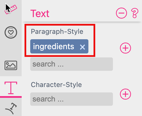
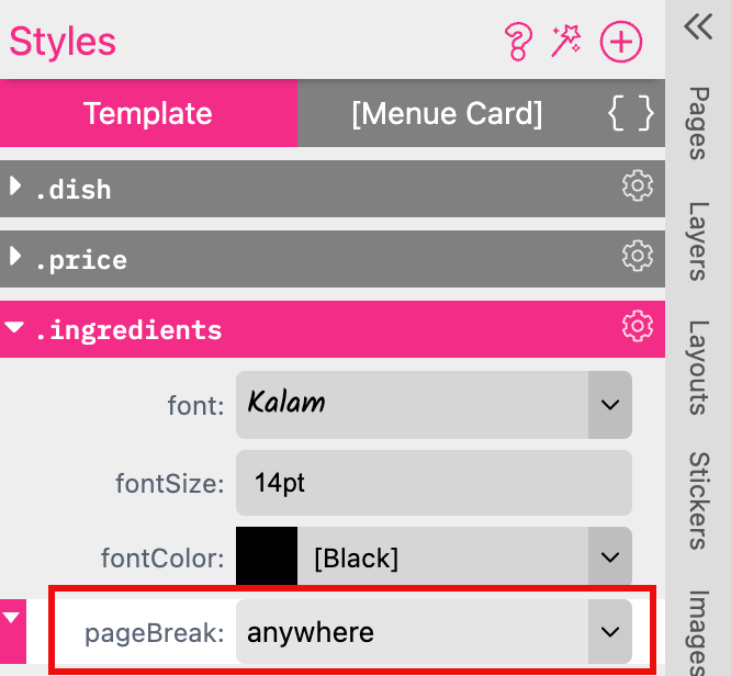
In our case we only have to define a line break for the paragraph “Ingredients”. So go to the Resources Panel to click on the plus button of your Paragraph Style ingredients.
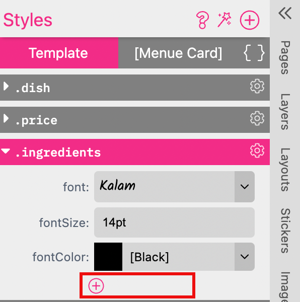
And select Page Break
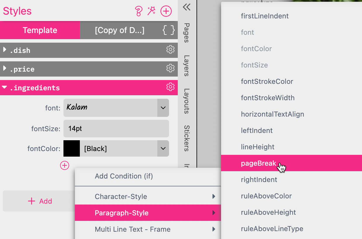
By default the Page Break is set to anywhere and the text frames are looking the same like before. Because the text is allowed to break between frames at any point (“anywhere”). In this case after the first paragraph at the bottom of the first frame (after “BBQ Chicken”).
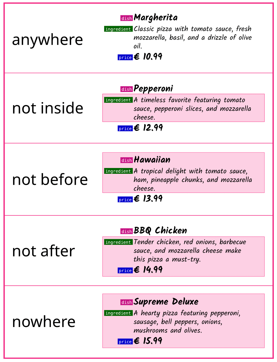
If you set the Page Break to nowhere it will not allow any line break before, after or inside the paragraphs.

This will keep all three paragraphs dish, ingredients and price together which we need for a menu card. Because we never want to have one of these three paragraphs on its own.
All Page Break options available:
Page Break anywhere does allow a line break inside the paragraphs at any point.
Page Break not-inside does not allow a line break inside the paragraphs.
Page Break not-before does not allow a line break inside or before the paragraphs.
Page Break not-after does not allow a line break inside or after the paragraphs.
Page Break nowhere does not allow any line break before, after or inside the paragraphs.
This graphic shows the different Page Break options and there results. The Page Break is defined for the paragraph ingredients. The pink area indicates where a line break is prevented.
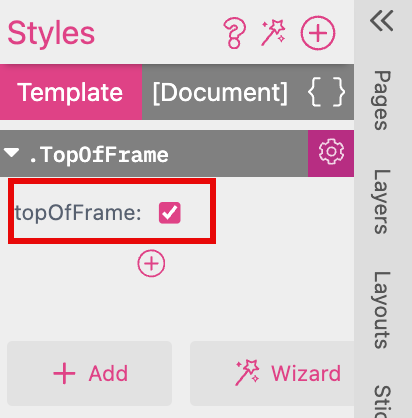
Top Of Frame This is a Paragraph Style which will break the Paragraph onto the top of the next frame when it does not fit completely in the current frame. This only works if Text Flow is activated.
You can now activate and deactivate this Style by a checkbox.
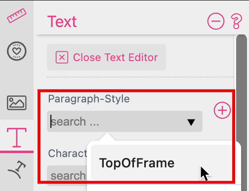
You can place the cursor somewhere in the paragraph to choose the Style at the Text Tab of the Features Panel.
Click here to open the example document
This is a very special Character Style and you can assign it in the Code Mode only. It enables you to write text with images.
If you would like to set up that Style you have to prepare a single images for each Character you want to use to upload them to the Images Tab of the Resource Panel first.
Please mind the width of each single image because this is influencing the tracking of your font.
You have to name these images following the syntax “[Character].png”. So you can name them e.g. “A.png”, “B.png”, “C.png”. In this example they are named “C_[Character].png”. Just make sure that you are using exactly the same syntax in the Style.
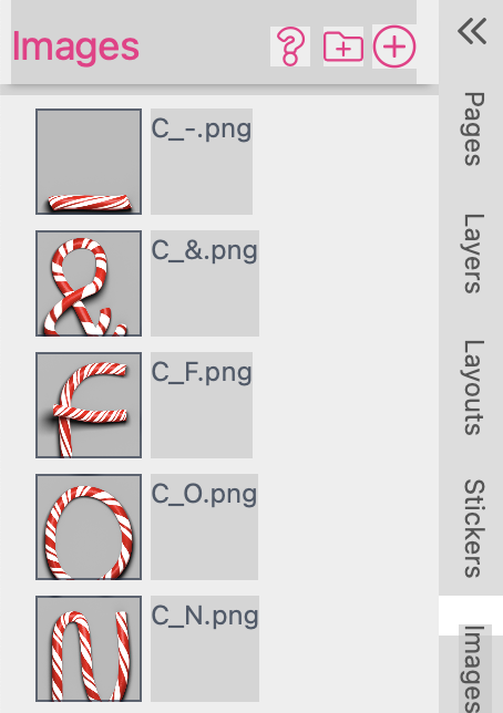
And if you would like to use several versions of the same character you can upload up to 6 different images of it. Name them “C_A.png”, “C_A1.png”, “C_A2.png”, “C_A3.png” etc.
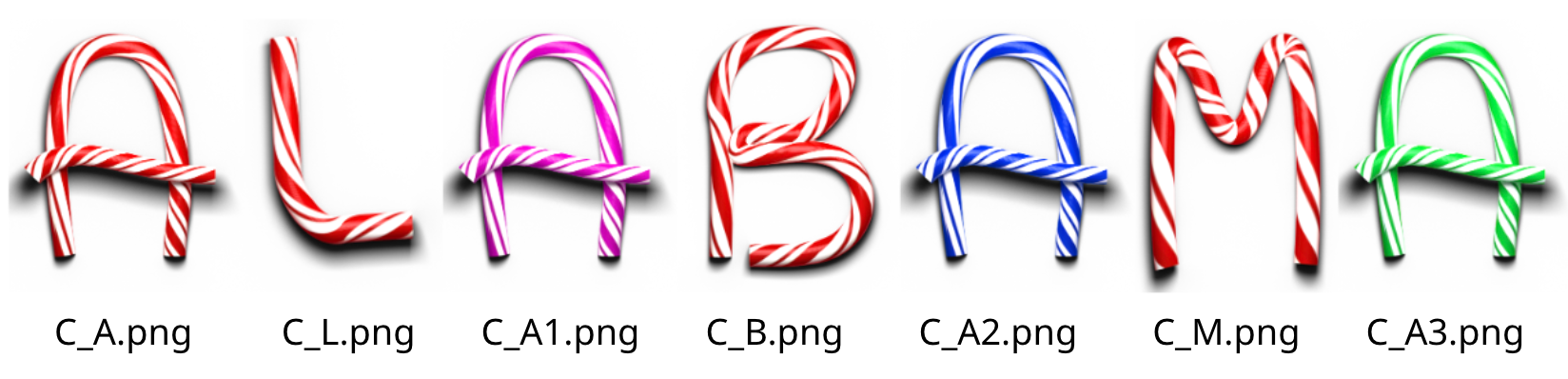
Printess will use the created versions in sequence and start again from the beginning once the end is reached. If an image is missed — for example A3.png — only the previous versions will be used (i.e. A.png, A1.png, and A2.png).
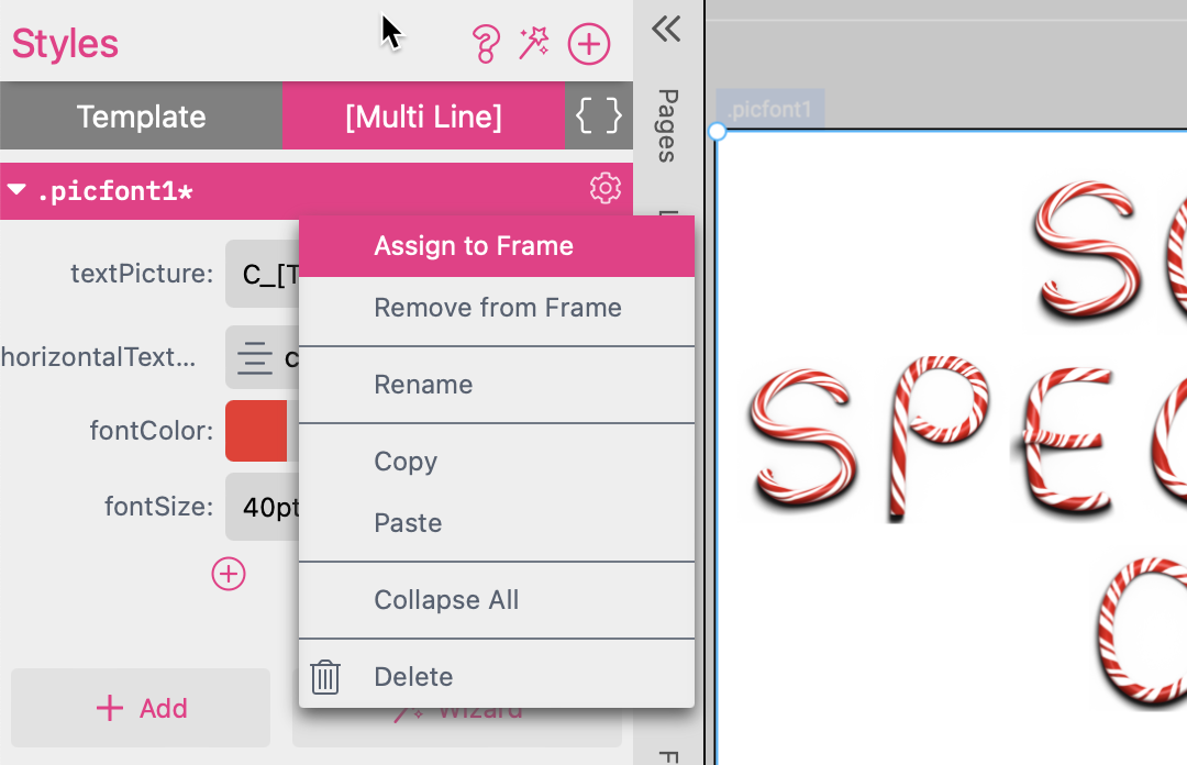
Create a Style:
Now add a new Style called “.picfont1” and switch to the Code Mode to paste the following Code:
.picfont1 {
	textPicture: C_[T E X T].png;
	horizontalTextAlign: center;
	fontColor: Fire red;
	fontSize: 40pt;
}
The first line “textPicture: C_[T E X T].png;” is assigning the images you have prepared to text which will be typed in. The others are regular Character Styles. In our example we have also defined a fontColor to “Fire Red” as a fallback. So any character which does not exist in your image library will be replaced by a regular character of the default font in “Fire Red”.
For lower case Characters you have to use “textPicture: C_[t e x t].png;”.
Now switch back to the regular view of the Styles. Click on the gear icon on the upper right of the Style to assign the Style to the activated Multi Line Text frame.
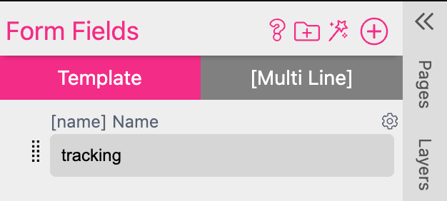
You can also add a tracking to your Style to define the distance between the single images.
Just press the plus icon underneath your Style and select “Paragraph Style” or “Character Style” to select “tracking”. Now you got a slider to adjust the tracking.
Each font includes specific letter combinations that require special tracking adjustments. For example, when a capital V is followed by a capital A the standard spacing is often too wide. High-quality fonts compensate for this by adjusting these spaces. With Text Pictures, however, this is not as straightforward. A Script is required that contains all relevant letter pairs, along with multiple Styles that define different tracking values. Additionally, a Form Field is needed for text input to allow for individual tracking adjustments.
To set up such an individual tracking it needs the following steps:
You can also copy and paste the Style code here:
.t50 {
	tracking: -50;
}

.t100 {
	tracking: -100;
}

.t150 {
	tracking: -150;
}

.t200 {
	tracking: -200;
}
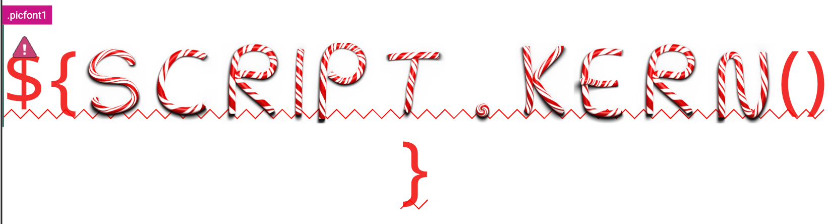
Now the Scripts window is opening an here you can copy the following Script to it:
function kern() {

  let v = (form.name || "").toUpperCase();

  if(v.length < 2) return v;
  let r = "";
  const kernings = {
    "VA": "t100",
    "AV": "t100",
    "PA": "t100",
    "BJ": "t100",
    "JO": "t200",
    "US": "t100",
    "BA": "t100",
    "AC": "t100",
    "ID": "t50",
    "GR": "t50",
    "IN": "t50",
  "IA": "t200"
  };
  for (let i = 1; i < v.length; i++) {
    const c = v[i - 1];
    const n = v[i];
    const needle = c + n;
    const kerningClass = kernings[needle];
    if (kerningClass) {
      r += "<w:" + kerningClass + ">" + c + "<w:>";
    } else {
      r += c;
    }
  }
  r += v[v.length - 1];
  return r;
}
Press “Save” to close the Scripts Dialog.
The first line “let v = (form.name || “”).toUpperCase();” is assigning the Form Field “name” to the text frame and is converting any lower case input into upper case because the example Text Picture Font only includes upper case characters.
“VA”: “t100”," is defining the letter pair “V” followed by an “A” and the assigned Style which should control the tracking between them. In this section of the script you can add as many letter pairs as you like.
Close the Text Edit Mode. Well done! Now you can control individual tracking for different letter pairs.
Now you can type in different letter pairs into your Text Form Field “name” to check the trackings.
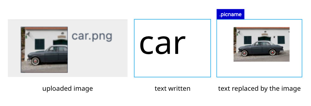
You can use a similar Style Script to replace an entire word with an image. Add a new Style called “.picname” and switch to the Code Mode to paste the following Code:
.picname {
	textPicture: [TEXT].png;
	horizontalTextAlign: center;
	fontColor: Fire red;
	fontSize: 40pt;
}
Now assign the Style to a Multi Line Text frame. The Image will replace the written text as soon as it matches the image name.
But of course you can work with just one, two or three images. So if you need just one image to be displayed in a Multi Line Text frame add the following Style:
.picfont2 {
	textPicture: house.png;
	horizontalTextAlign: center;
	fontSize: 40pt;
}
If you have uploaded an image called “house.jpg” it will replace the text you have marked to assign the Style “.picfont2” to.