Select List, Select List & Info, Image List, Checkbox
This is a predefined Form Field types that are made for special use cases and they have special properties. They are one of the powerful features of Printess because they could be used to build complex logics - without the need for programming knowledge.
The values will be presented as a drop-down list for the Buyer to choose from. Besides being able to define displayed values that are independent of the value returned, you can also define the images that will be displayed within the drop-down.
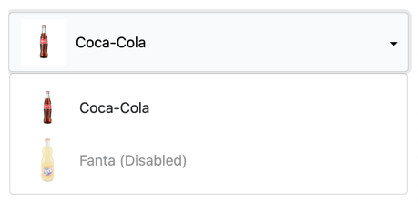
A select list is useful for letting a Buyer choose from different options. Besides the value, there are seven different elements that can be displayed for selection:
All elements can be used together or alone. This is an example of the Buyer Side view where all elements are used:

And these are the corresponding settings in the Form Field properties:

Select List Autocomplete
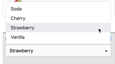
Using a Table Data Type with a Select List Form Field also enables force auto-complete on the Buyer Side. Do enable this feature, simply write a list with square brackets on each end to auto-complete what a Buyer types. This is very useful for Buyers to search through and select from large inventories.

Writing the same list without brackets will give a drop-down menu for Buyers to select from, this is the default:
Tip: Please be aware that the copy and paste JSON works slightly different with Tables.
Learn about Copy and Paste for Table here
Internally the values of a Select List are represented as an array of row objects and their named properties. You can export and import the values in a Select List** as a JSON string in two different ways.
Using the context menu of the Form Field

In the Properties of the Form Field
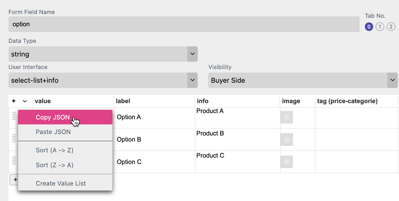
Select Copy JSON and the content of the Select List will be copied to the clipboard in JSON format.
In both ways the result will look the same:
[{"key":"a","label":"Option A","description":"Product A"},{"key":"b","label":"Option B","description":"Product B"},{"key":"c","label":"Option C","description":"Product C"}]
This also works for Select List with Info and Image List.
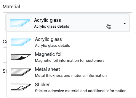
This is a Select List Form Field that displays additional information on the Buyer Side.
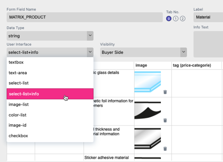
This Form Field User Interface displays the information from the Select List Info column underneath the Value and Image information for each row on the Buyer Side selection drop down menu:
The values are represented by images. Image appearance, selection, and hoover state are configurable via standard CSS properties. The image must have been previously uploaded in the Images tab.

The image-list type is made for all options where every value is represented by an image. All options are shown together and it features a CSS controllable appearance and hover effect.
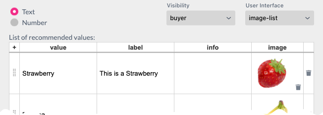
The label text will be used as a tool-tip when hovering over an image, the info text content will not be used.
The List Image Width and Height properties define the box (in pixels) that the image will be proportionally scaled into.
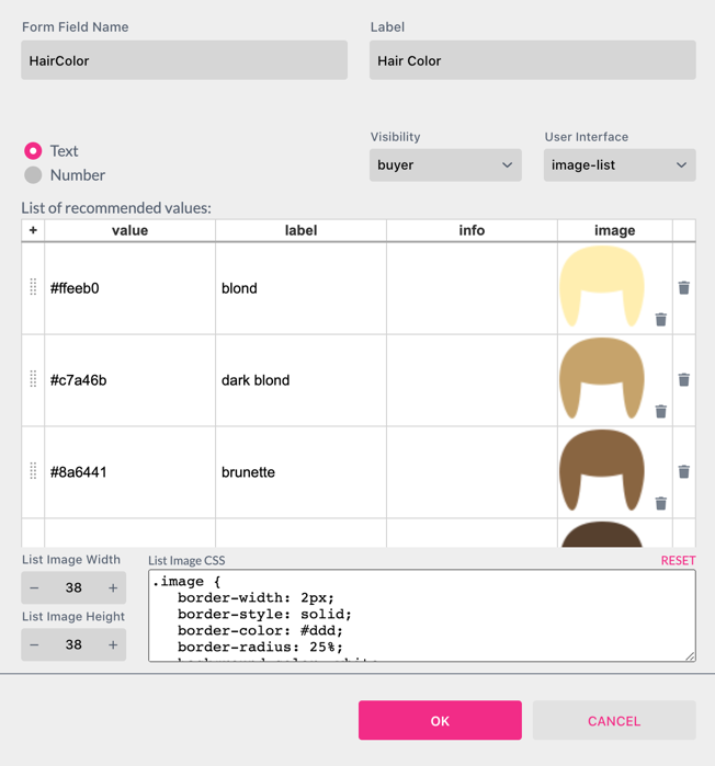
Notice: Besides using ${form.name}, one can also use ${label.name} and ${info.name}. With the help of a Style ${image.name} can directly assign an image used in a Form Field to a frame by assigning it to the image property in the Style. A good example of this is the demo document T-Shirt Configurator, where the T-Shirt image is directly taken from the Form Field’s image value.
In difference to the Image List the Image List & Caption displays an Image Caption at the Buyer Side. If a Label is defined in the List, the Label is the Caption. If not, the Value of the List is the Caption.
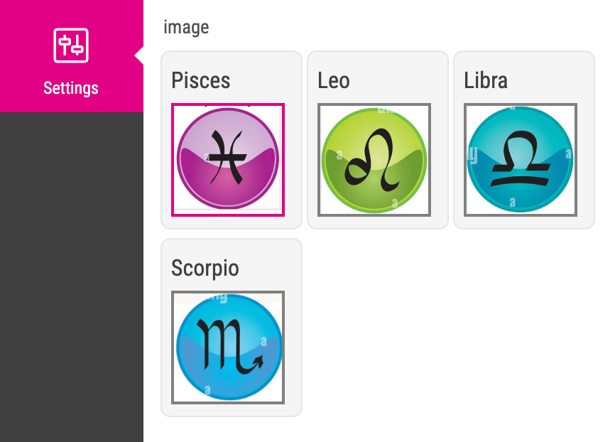
The Color List user interface allows a simple color selection at the Buyer Side.
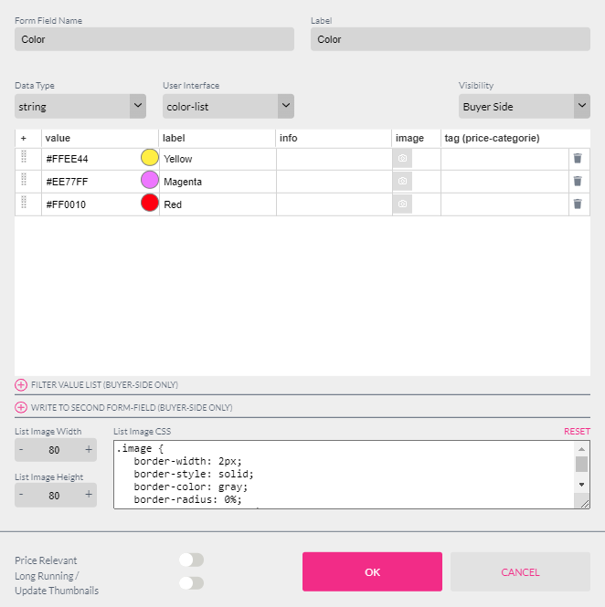
By entering a Hex RGB color value in the value column, the color-list displays a color patch with this color to the Buyer.
This value can directly control a Style. If work with Spot or CMYK colors use their names in the “value” column.
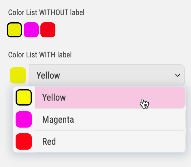
Depending on the UI you are using the color selection will be displayed in different ways at the Buyer Side:
The color selection will be displayed with color patches. No matter if the column “label” of the Select List is defined or not. The size of the color patch can be controlled with the List Image Width and Height Properties of the Select List.
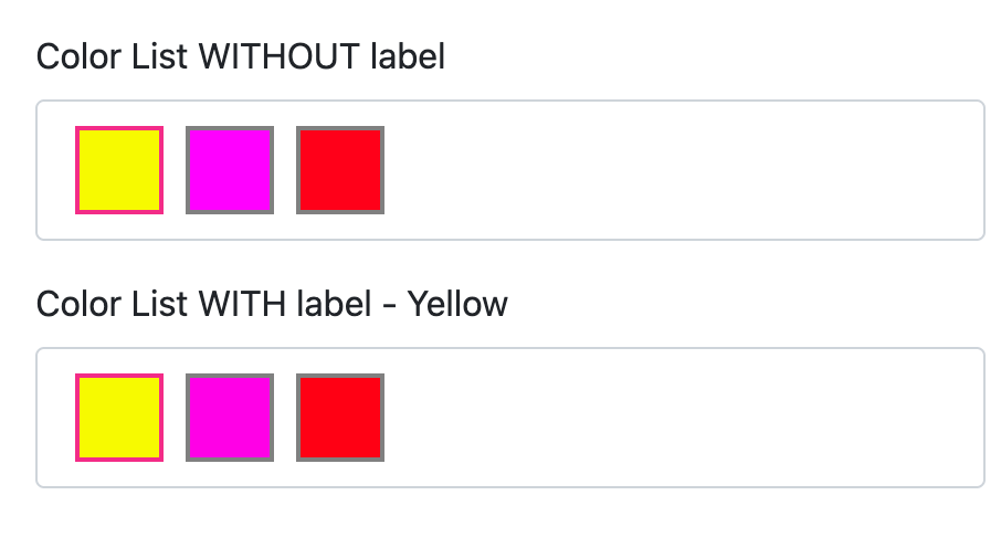
The color selection will be displayed with color patches if there is no label defined and you can not control the size of them through the Form Field.
If a label is defined the color selection will be displayed as a drop down menu.

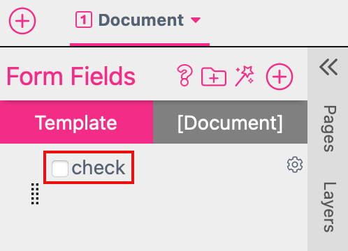
The checkbox Form Field exposes a table with only two values: True and False.
The Label, Image, and Tag columns can be set to any value. But it is important to note that the checkbox Form Field will remain as a String type (as it is not a real boolean T/F value).

If you set the Checkbox to Mandatory make sure that you set it to “unchecked” in the Editor to make it work.
You can disable one or more rows of your List by activating the checkbox in the Properties Dialog.

At the Buyer Side the content still will be shown but it can’t be selected from the Buyer

When filtering is applied, the Form Field is not only filtered but its value is also overwritten — specifically with the first value that becomes valid through the filtering.
List filtering is super handy when you’d like to filter a select-list, image-list or color-list by a category. The values used to filter down the list must be entered into the info column or into one of the meta columns. You can also put multiple values in one column by just separating them by comma.

To enable filtering, select a second Form Field containing the categories (in the value field) for the column with the corresponding values. In the example the Form Field List “category” is filtering the Form Field List “food”. So if the category “Burger” is selected by the Buyer all products with the info value “Burger” will be displayed at the Buyer Side.
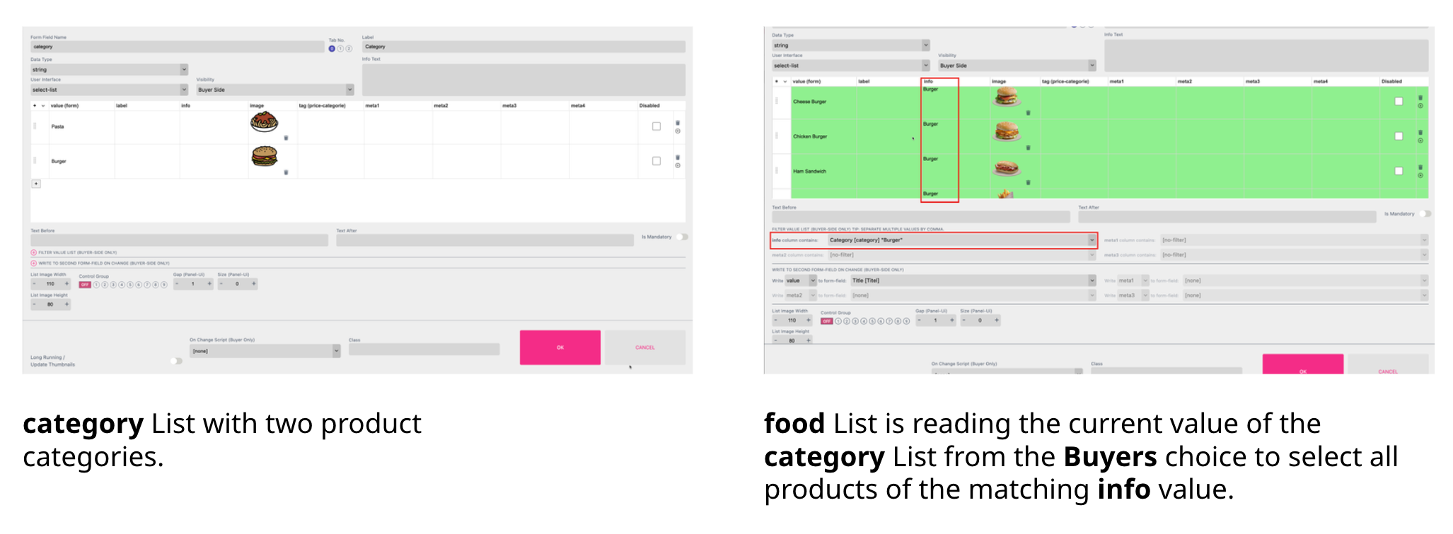
All rows that are matching the current conditions are highlighted in green. Note that this filtering will only be in effect on Buyer Side.
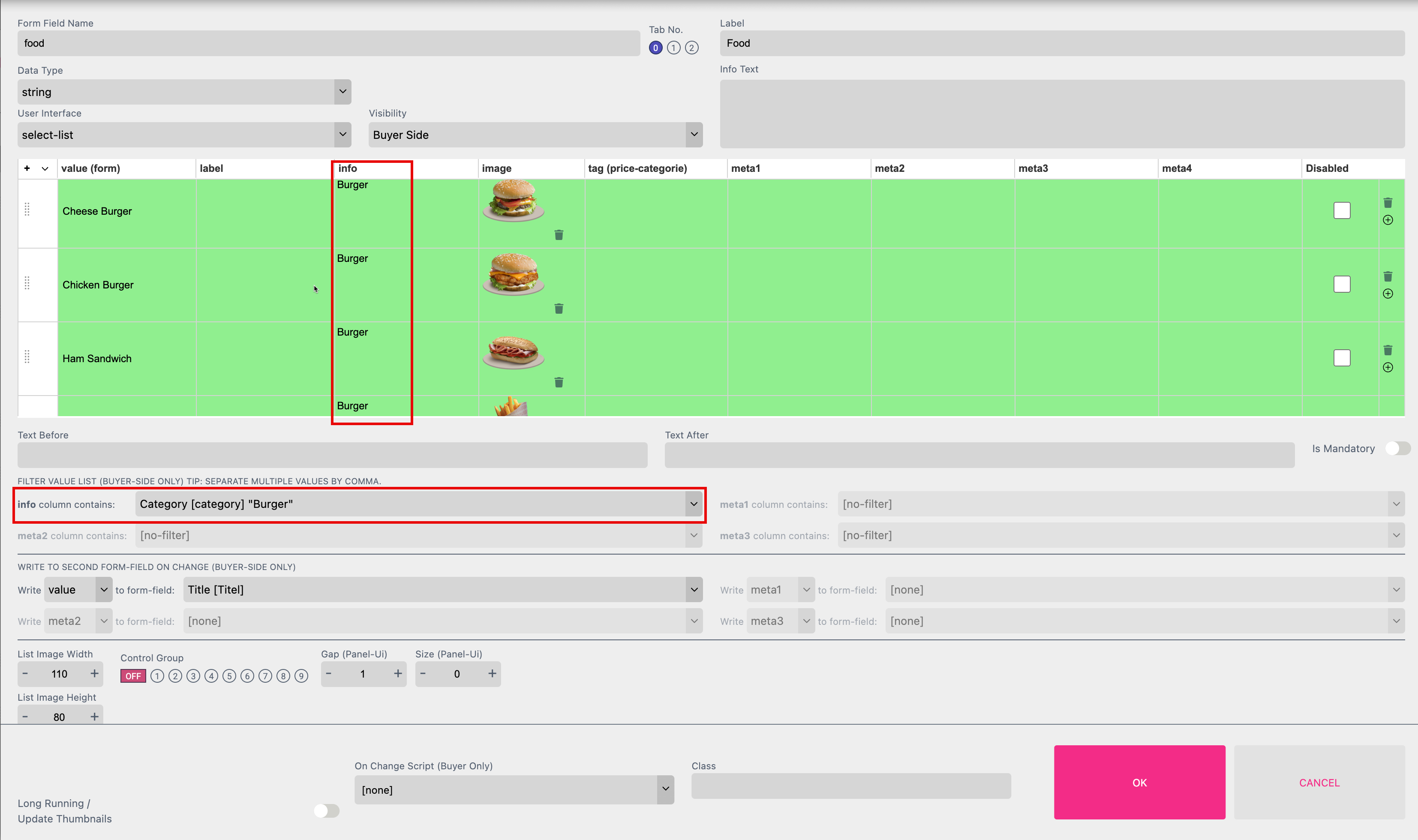
Once a new category is selected in the Form Field “category”, Printess will make sure that the filtered Form Field List will show a valid value. If there is more than one filter applied, it will only show entries valid for all filters.
To write the content to another Form Field through the production call you have to activate an additional setting here in the Template Preferences.
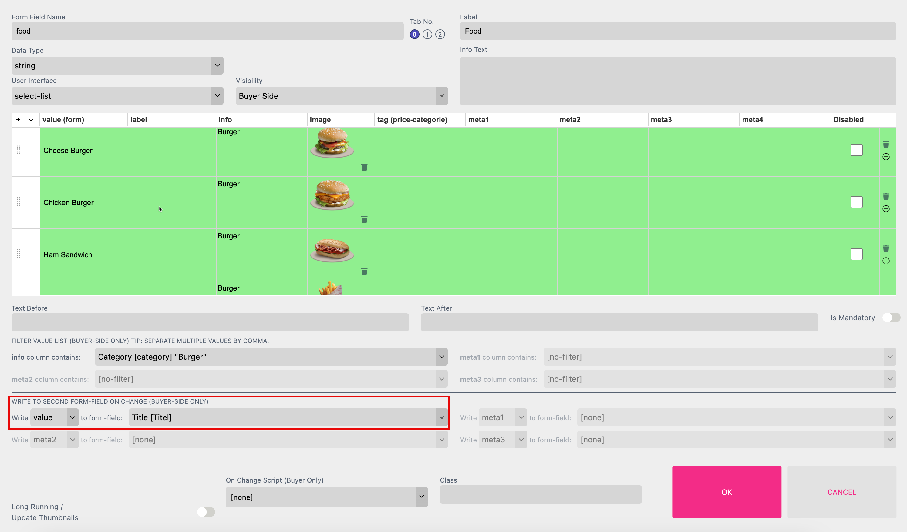
You can use Write to Second Form Field to write the content of either the value, label, info, tag or meta (1-4) field of your list to another Form Field (into the value). You can write content to up to four Form Fields.

In this example we fill the Text Form Field ‘Title’ with the value from the Form Field List “food”. The current value depends on the current selection at the Buyer Side - e.g. Cheese Burger.
This got two advantages:
A: Depending on the Product selection at the Buyer Side the right “Title” of the menu will be displayed in the Text Form Field automatically.
B: If the Buyer is now typing in a different “Title” the value of the Text Form Field will be changed but not the entry in our Select List “food”!
Write to Second Form Field can also be used without a List Filtering involved.
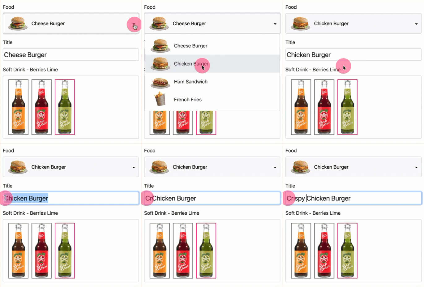
Try list filtering and write to other form field yourself with our Tutorial Template “List Filtering”. You can also open that Template in the Editor from the “NEW TAB”.
Please have a look into our Menu Card example and try it yourself.
This is a special option to enable the Buyer to change the language. This will control:
Learn how to define a language for a Sticker Snippet here.
Learn how to define a language for a Layout Snippet here.
Learn how to use different languages for a Single Line Text Frame.
Learn how to use different languages for a Multi Line Text Frame.
To enable the Buyer to change the language create a Select List first. Now define the languages the Buyer should be able to choose from.
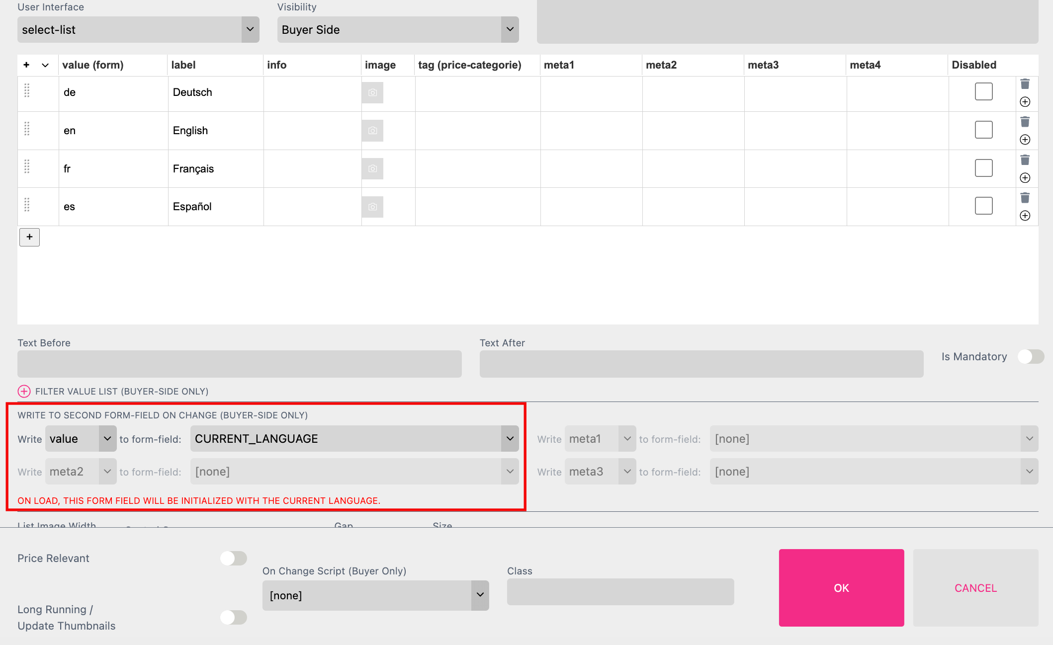
Click the plus icon at “WRITE TO SECOND FORM-FIELD ON CHANGE (BUYER-SIDE ONLY)” and select the option CURRENT_LANGUAGE. Close the Form Field Properties with “OK”.
The Buyer can now choose from different languages.
The Form Field supports the language ISO standard:
Take a look at the example Template here.
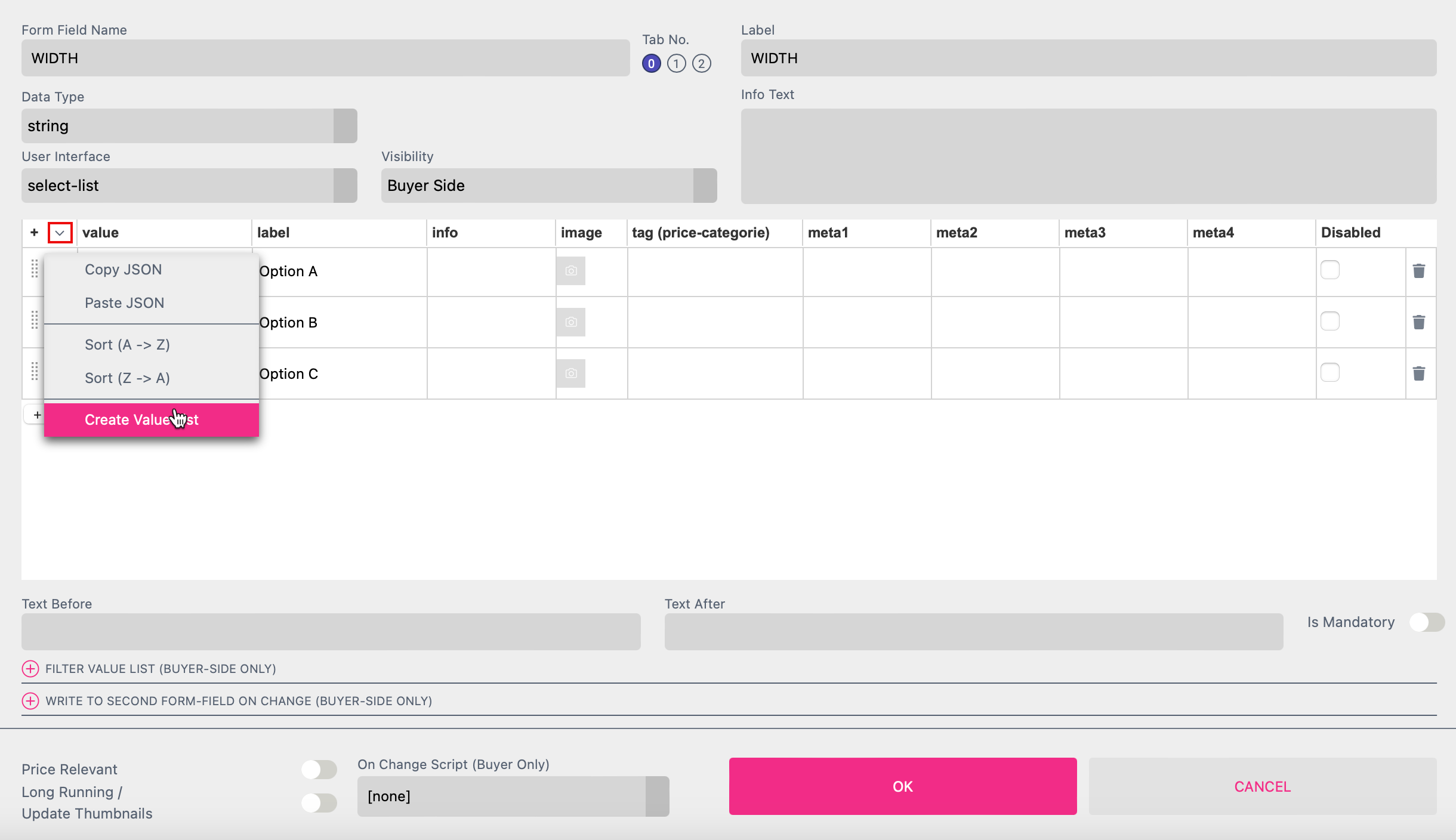
If you need a list of numeric values you can get it generated within your Select List. Click on the small triangle next to “value” in your Select List to choose the option Create Value List.
A separate dialog box will open where you can define the details of the list. In this case we will create a list of values in cm. This is a great feature for posters and signs where a Buyer can choose the exact dimensions they want for their product.
Learn more about Document Size defined by Buyer here!
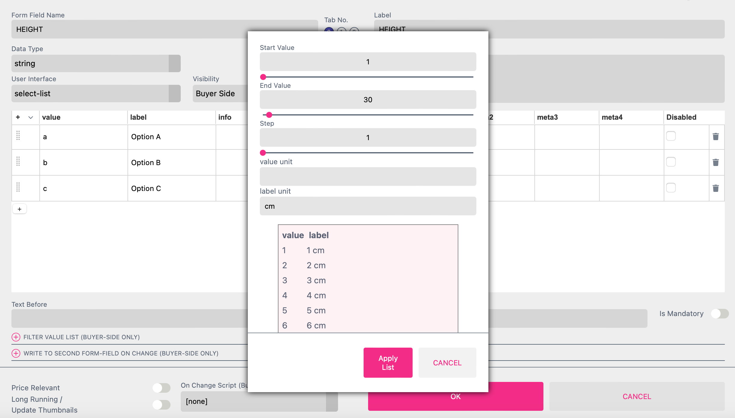
For Start Value, End Value and Step please use natural numbers only.
For Value Unit and Label Unit please use alphanumeric characters only.
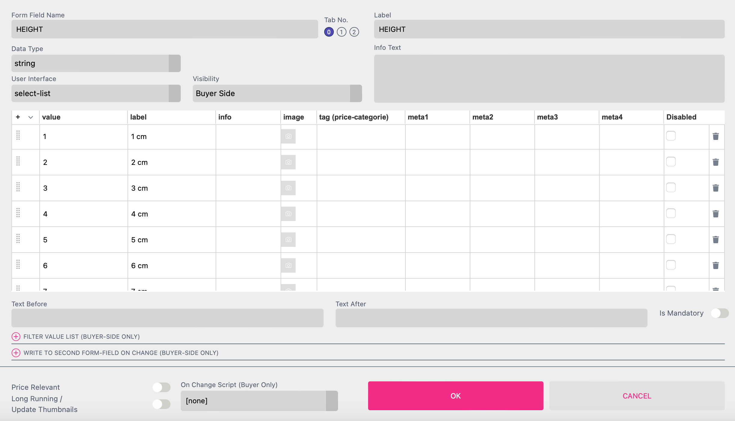
If you click Apply List the values you have defined will be added to your Select List.
For any Select List you can change the Printess Template used and shown at the Buyer Side by a change of the Form Field value.
Note: This feature can only be tested through the Test Link - not by toggling to the Buyer Side.
Using the syntax “load-replace:templatename” in the “tag” column of the list will execute the switch to another Printess Template.

This could be a helpful feature if you are offering e.g. different merchandise product of the same brand. It enables the Buyer to switch between a mug, a pillow and a lanyard for example within the Buyer Side Editor.
To keep the Buyer’s changes already made before switching to another Template you have to set an Exchange ID for each Document of each Template. How to set an Exchange ID.
This is a special Form Field which you have to set up manually. Its needed if you want to set the Spine Width through the API.
First you have to set up a Cover Page with Spine. To learn how to do this please read here.
Now you have to set up a Form Field to name the it “ffSpineWidth”. Otherwise this feature won’t work. Only for testing you can set up a Select List Form Field to define the values for the Spine which later will come through the API.
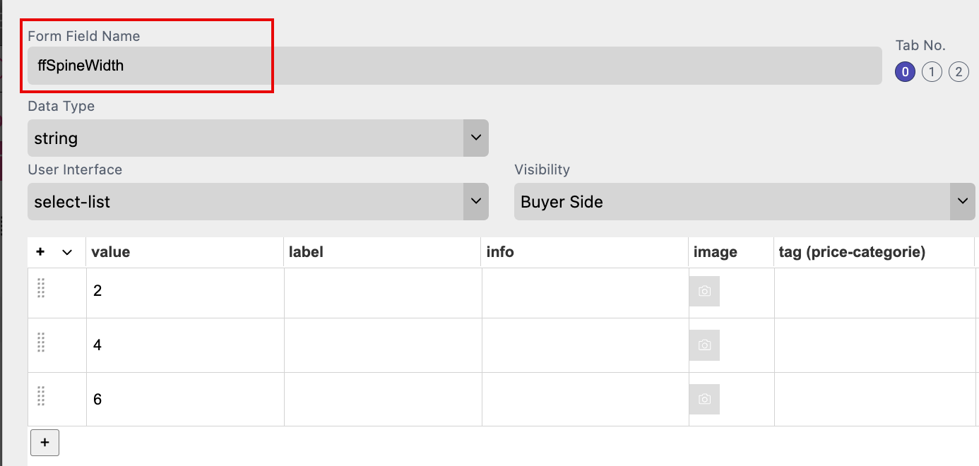
In the column “value” you can now define the values of the Spine you need. But you don’t define the unit for these values here. The unit is based on the unit you are using for your document format!
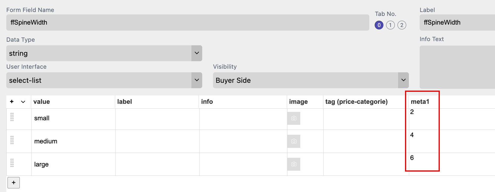
Alternatively you can also define the value in the “meta1” column. In this case always this value will be used! Doesn’t matter whats written into the column “value”.
In a last step you have to change the formula in the Length Field Spine e.g. at the Document Tab of the Features Panel.
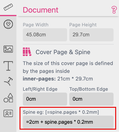
Length Fields can handle units like cm, pt and % and calculations. But the use of Form Fields is prohibited in general. This is why you have to follow exactly this syntax: =spine.ffSpineWidth * 1cm to replace the default formula.
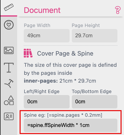
By multiplying with “1cm” you make this function work and you define the unit for the values of the “ffSpineWidth”.
Note: This Feature requires:
If you want to enable the Buyer to change the Contour Length for the AI Image features Face Sticker, Background Sticker or Contour you can set up a Form Field Select List with predefined values. To make this feature work the name of this Select List has to start with “contourLength”.

Just open the Properties of your Select List and type in the values including their unit like “%” or “mm”.
Go to the Styles Tab of the Resources Panel an add a new Style. Therefore press the plus icon on the upper right of that Tab. Name the Style “contourLength” too.
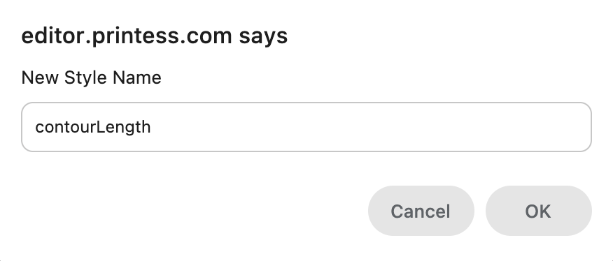
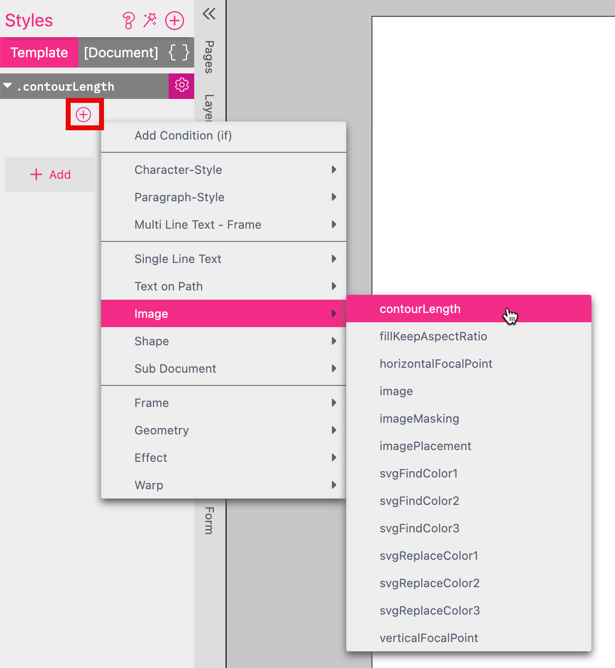
Click on the plus icon underneath the Style to select the Property “Image/contourLength”.
Now you have to assign the Form Field to the Style. Therefore click to the left of the Style to select the option “${Form-Field}”.

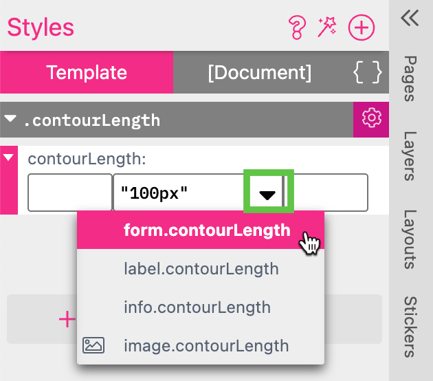
Click on the black triangle next to the default value “100px” to select the Form Field which should control this Style. In our case “form.contourLength”
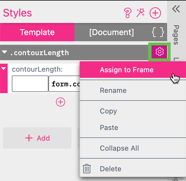
In a last step you have to assign the Style to the image frame. Click on the gear icon of the Style while the image frame is selected. Choose the option “Assign to Frame”.
You Have done well! Now the Buyer can choose from two different contours.

Learn more about Face Sticker here
The Image-ID Form Field can be used in all situations where you would like to let the buyer choose one image and distribute it across multiple image frames in one or many documents. That’s why you need to also define the default image size and aspect ratio in pixels.
In addition you can Check Image Resolution. You have to define the width and height of the frame and the minimum resolution based on the frame size. This setting is independent from the minimum resolution setting of your Document at the Buyer Side Tab of the Features Panel. If an uploaded image does got a smaller resolution a warning will be displayed at the Buyer Side.
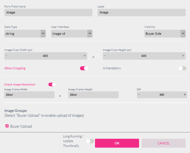
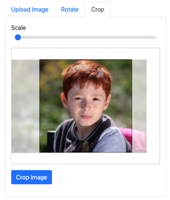
With this information, Printess will automatically show a matching crop option whenever the buyer uploads an image. It is also possible to disable cropping in the Image-ID properties.
Tip: To get a working example you can also use the Style Wizard. Press  on top of the Styles tab and choose Image Frame Linked to ‘image-id’ Form-Field. This will create a frame with the connected Style and Image-ID Form Field.
Read More about the Style Wizard here.
To use the Image-ID Form Field one needs to define a Style that is assigned to the image. Then this style can be assigned to all frames which should show the uploaded image.
.ffImage {
 image:${form.Image};
}