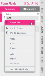
To open the Form Field Properties Dialog you can click on “Properties”" in the drop down menu of the Form Field

Or you can click on the gear icon  on the upper right of your Form Field.
The Form Fields got most of their Properties in common. Some of them are dedicated to particzular types of Form Fields:
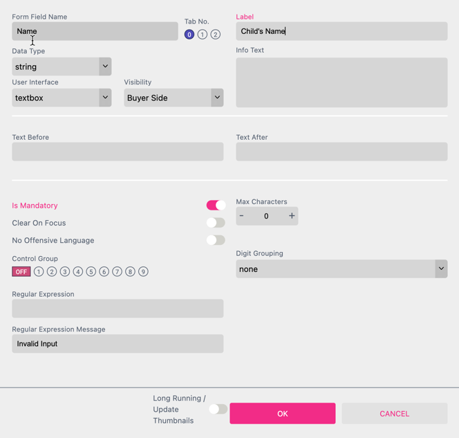
Sets the name of the Form Field (except for auto-generated Form Fields where the name is fixed). The name has to be unique in its scope and can only contain characters and numbers without spaces. This name is used later on when addressing the Form Field in expressions.
This is the display name for the Form Field which is used in the Buyer Side interface.
This feature is used to display helpful text on the Buyer Side underneath the Form Field:

Info Icon
When a web link is entered into the Info Text box, an info icon ![]() will appear next to the Form Field label:
will appear next to the Form Field label:
![]()
Selecting the info icon will open the web link in an overlay within the current browser window, and does not exit the Printess editor. Note that you must include the full link address (https://www.printess.com/) as shown in the example above.
Hyperlink and Text
If you would like to provide users with a link and text, simply add brackets to the text you wish to link and then parenthesis around the web link:
![]()
Note that you must include the full link address and no space between the brackets and parenthesis. You can hyperlink any text within the Info Text box with this same method.
Assign another Form Field
Simply enter ${form.formfieldname} into the Info Text to display the value from another Form Field as information. To ensure that the displayed value is updated on the Buyer Side you should add an On Change Script. Alternatively you can utilize this functionality through the API.
Read more about On Change Script here.
You can assign text from the Translation Table to the Info Text and the Label of a Form Field. By using the Translation Table you can change the language of your text content. The text will then automatically change corresponding to the browser language. The browser language is set by the Buyer or you can set it trough the API using the “translationKey”.
To make this work you have to enter the text for the respective language in the Translation Table first. This example is using the “Key” myText in the “Name Space” “tx”:. In the example it is set up for two languages: “de” and “en”.

Learn more about the Translation Table here.
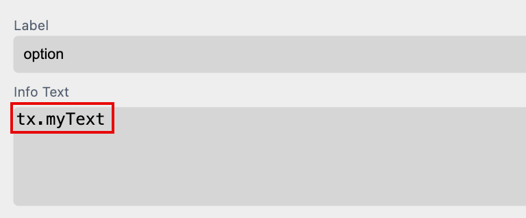
To assign the “Key” myText of the “Name Space” “tx”: to the Info Text or Label of the Form Field use the following syntax:
tx.myText
Just write it into the Info Text for example. When you switch to the Buyer Side the text will be displayed depending on the language set for the Editor.
For testing you can now change the language of the Editor and the Buyer Side by adding"?lang=en" to the URL for example. So the entire URL will look like: “https://editor.printess.com/?lang=en”. And the text will be translated into German in this case.
You can distribute all the Form Fields that you display at the Buyer Side to three different tabs. Therefore you can define the Tab No. for each Form Field in the Form Field Properties Dialog.
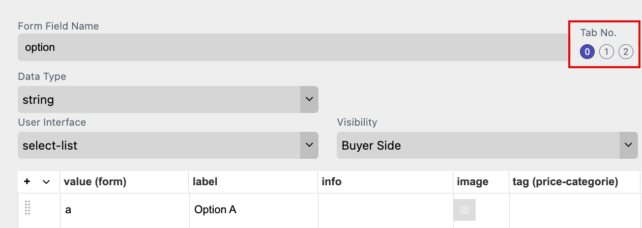
But it only works if you set the Buyer View Appearance to Creative Photo Products.
Learn how to display Form Field Tabs at the Buyer Side
Defines if the Form Field should be visible on Buyer Side (default) or only in Designer Side.
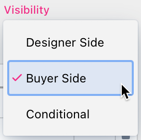
Form Fields can be shown conditionally (conditional disclosure). This is useful in all situations where a specific option should only be shown to the Buyer if another Form Field has a certain value.
For example, you allow adding an envelope and the buyer to select the envelope color. Then the Form Field for the envelope color will be conditionally shown based on whether the envelope option was chosen.
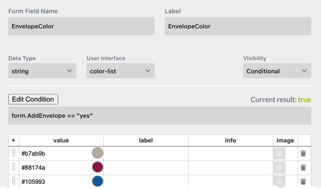
The condition must be a valid JavaScript instruction returning a boolean value. One can use form, info, label, and data fields here. Result will give you an indication of the outcome where true means the Form Field will be shown and false means the Form Field will be hidden.
Edit Condition will open the Condition Editor which allows for easy creation and editing of the visibility rule.

Please read about the Condition Editor in the Styles chapter here.
In addition to the text you can set Text-Before and/or Text-After in the Form Field Properties. This will add additional text before or after the entered text (but only if the textbox is not empty).

This can be very useful when, for example, you create a business card where a fax number can be entered. Text-Before will tell Printess to recognize when a number is entered to add the prefix (Fax: __).

If a number is not entered here, then the complete line will be omitted on the business card.
Notice: Within these fields one can also use special formatting options:
<w:styleName>Text with Style<w:> adds a character Style before the text and reverts it after the text. You can also let the style span the complete text by starting in the text before and putting the <w:> in the text after.
For Multi Line text, it is sometimes useful to use a paragraph Style.
<p:styleName>Text With Paragraph Style<p:>
A paragraph Style will create a new paragraph at the end of the paragraph <p:> and nothing can be added after it.
Additionally, one can insert special characters:
\t to insert a tab
\n to insert a newline
\f to create a formfeed which in the event of text overflow between frames means, “please continue in the next frame.”
A nice example of using Text-Before and Text-After is shown in our Business Card example. Please have a look at the “phone” Form Field in the linked Template.
Control Groups allow to group Form Fields into one line. eg. to have a area code selection and a phone number in one line but still separated. Simply select one Control Group for several Form Fields. The Form Fields will then be shown in their order from left to right. You have up to 5 Control Groups available.

Tip You can make a grouped Form Field inside a group smaller by setting max characters. See this example where we set max characters of the area code to 5:

When using control groups in Single or Multi Line texts you can use the ${group._(x)} syntax to address a Form Field control group instead of concatenate all members. Additionally, this has the advantage that only the first control group members text-before and last control group members text-after will be used - and only if the entire group has a value.
Printess allows for easy digit grouping for phone numbers.

Digit grouping works best if you split up a phone number into its components like in the above control group example. So you should not try to format a complete number.
Digit grouping works with groups of characters and also define where characters which do not match the pattern are added (the *).
Try selecting some formats from the list and observe the outcome both for you current Form Field value and an example value.
Imagine you’d like to format a cell phone number in the pattern ‘111 22 333’ then the pattern of choice would be ‘### * ###’ which will first fill one pattern of three letters and then tries to create as many 3 letter pattern from the right as possible and put the remaining letters (up to 2) after the first three letter pattern which will give the desired output when ‘11122333’ is entered.
In our Business Card example, we use this feature in conjunction with a digit grouping control group to achieve a good user experience for entering a phone number.

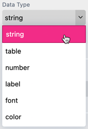
The data type defines what type of data will be stored in the Form Field:

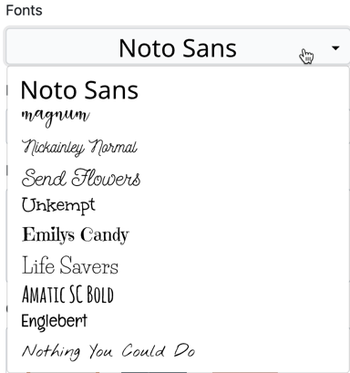
This defines how the Form Field will be presented:
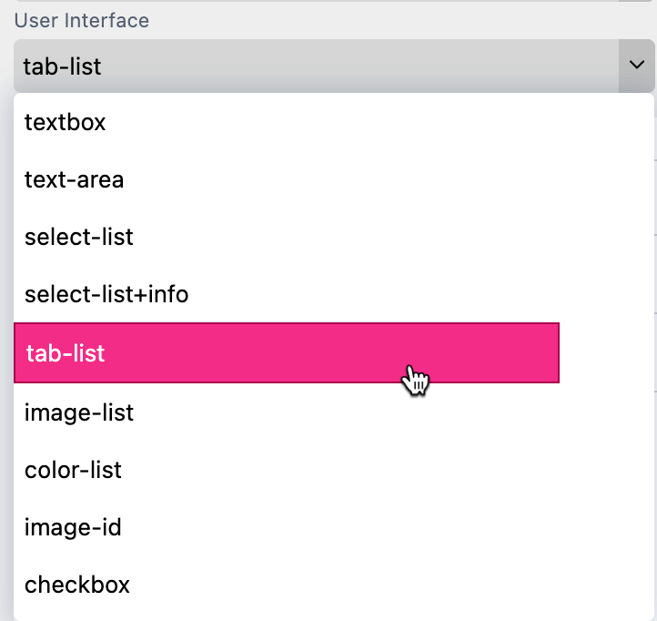
An overview of all Types of Form Fields you will find here!
If Number was selected as the data type, the number type defines the type of number stored:
This Form Field is made to show a message at the Buyer Side. This could be a headline of a Form Field Group or a hint for the Buyer like below “Please Note A-Z onnly”:

The Label data type also enables you to completely customize how information is presented. You can currently choose between 3 different sizes, 4 different colors (changable in your Account Theme + Logo Bootstrap Theme settings), and 6 different Info styles:
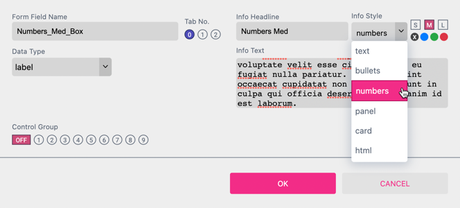
Note: This feature is only supported for the Panel UI.

If you turn on this option it renders a dedicated title on mobile UIs.
