The Panel-UI is web-component base and much easier to work with from a developer standpoint as with the classic iframe integration.
It also offers much more customization options. You can create themes and remove or move every panel in its position.
The Panel UI is dynamic. It generates the view of the same Theme differently. Depending on the document for which the view is used. The Tab Navigation Panel for example will only be displayed if its got content to show. The Pages Panel can be displayed automatically on the right or at the bottom. Depending on whether a document in set up in portrait or landscape format. This allows different documents to use the same Theme without restricting the user experience. Especially for the Mobile View the new ‘Panel UI’ contains various logics to make customization as easy and clear as possible for the Buyer.
You can toggle to the new Panel UI using this shopping car icon ![]() on the upper right of the Editor window.
on the upper right of the Editor window.
Note: With the Panel UI Theme Manager you define two different layouts for Desktop View and the Mobile View. They are completely independent from each other.
There is a DEFAULT Theme defined for all of your Templates and Documents. You can change and save it to match your corporate design. And you can reset it later to the initial design. But you can not delete it.
Note: Additional Themes are only available in the Large Plan
With the new Panel UI you can now easily customize different Themes on a Document level. It allows you to use multiple Themes in a single Template to tailor made them for a particular product.
Note: This feature is only available from the Printess Medium Plan. And you need the user rights of an Account Owner. It can be set in the Printess Account Portal.
At the Buyer Side Settings of the Document you can choose from existing Themes. And you can edit and add them by clicking on Manage Themes.
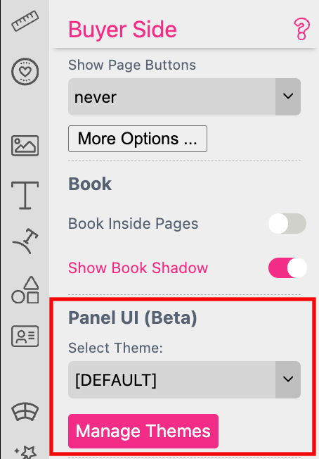
This will open the Desktop View of the current Theme in the Theme Manager where you can do the changes.
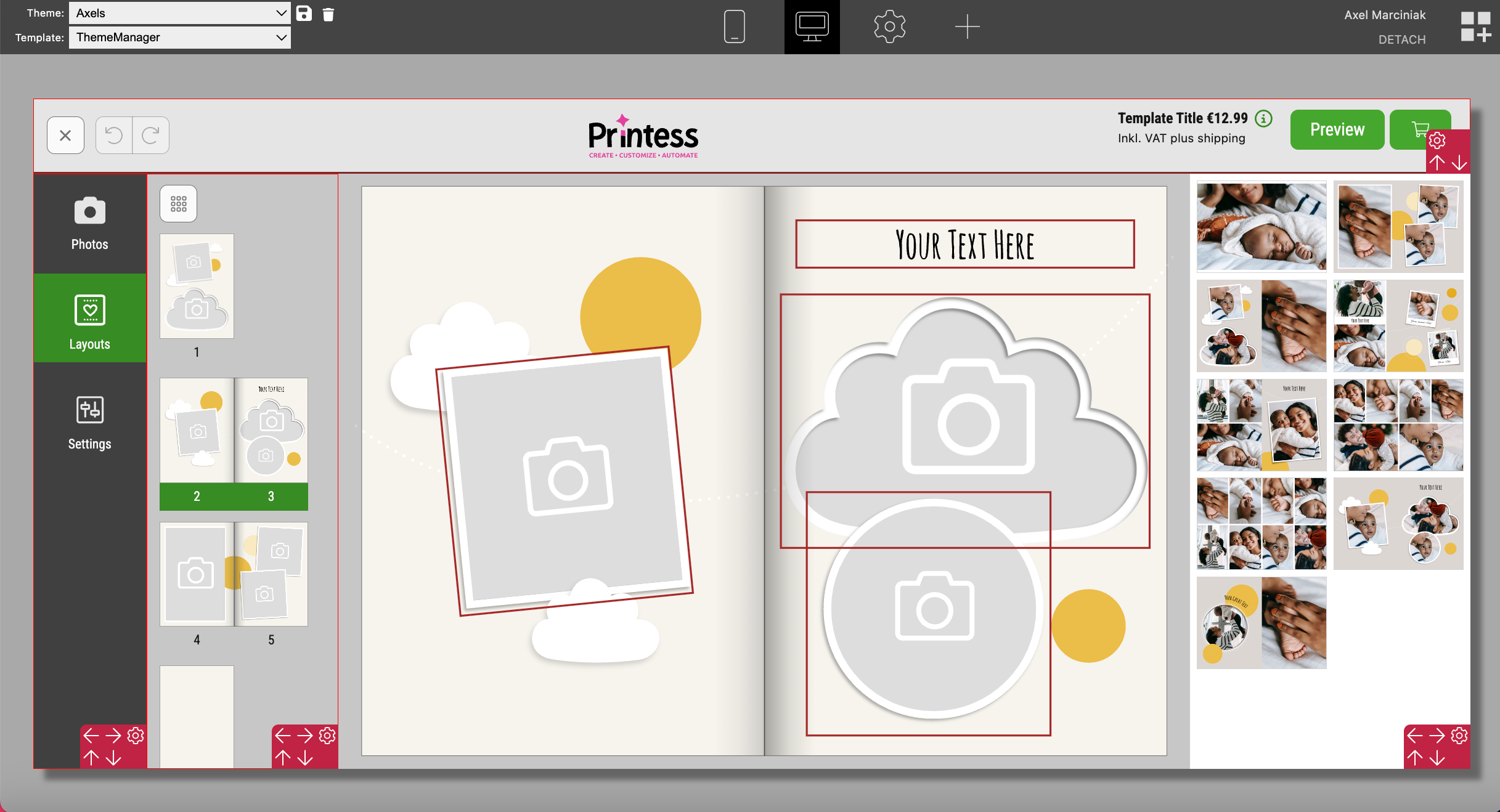
Changes at the Designer Side will not automatically be loaded to the Theme Manager if you keep it open. To make these changes visible you must refresh the Theme Manager.

Note: Any Printess Plan smaller than LARGE will only support ONE Theme - the DEFAULT Theme.
Save Button Press the “save” icon ![]() to save your changes. This action will open a new window where you can enter the name for the Theme you wish to save.
Here you can also save your changes of the DEFAULT Theme to match your corporate design.
to save your changes. This action will open a new window where you can enter the name for the Theme you wish to save.
Here you can also save your changes of the DEFAULT Theme to match your corporate design.
Delete Button If you like to delete an existing Theme click on the bin icon ![]() next to the Save Button.
next to the Save Button.
RESET Button To reset your changes press this button.
Template:
The Theme Manager always loads the last Printess Template used and not automatically the current one. So not the one you open the Theme Manager with. Therefore you must first load the right Printess Template for which you want to customize the Theme.
Mobile View: Switch to the mobile view. And lead in and out the keyboard of a phone.
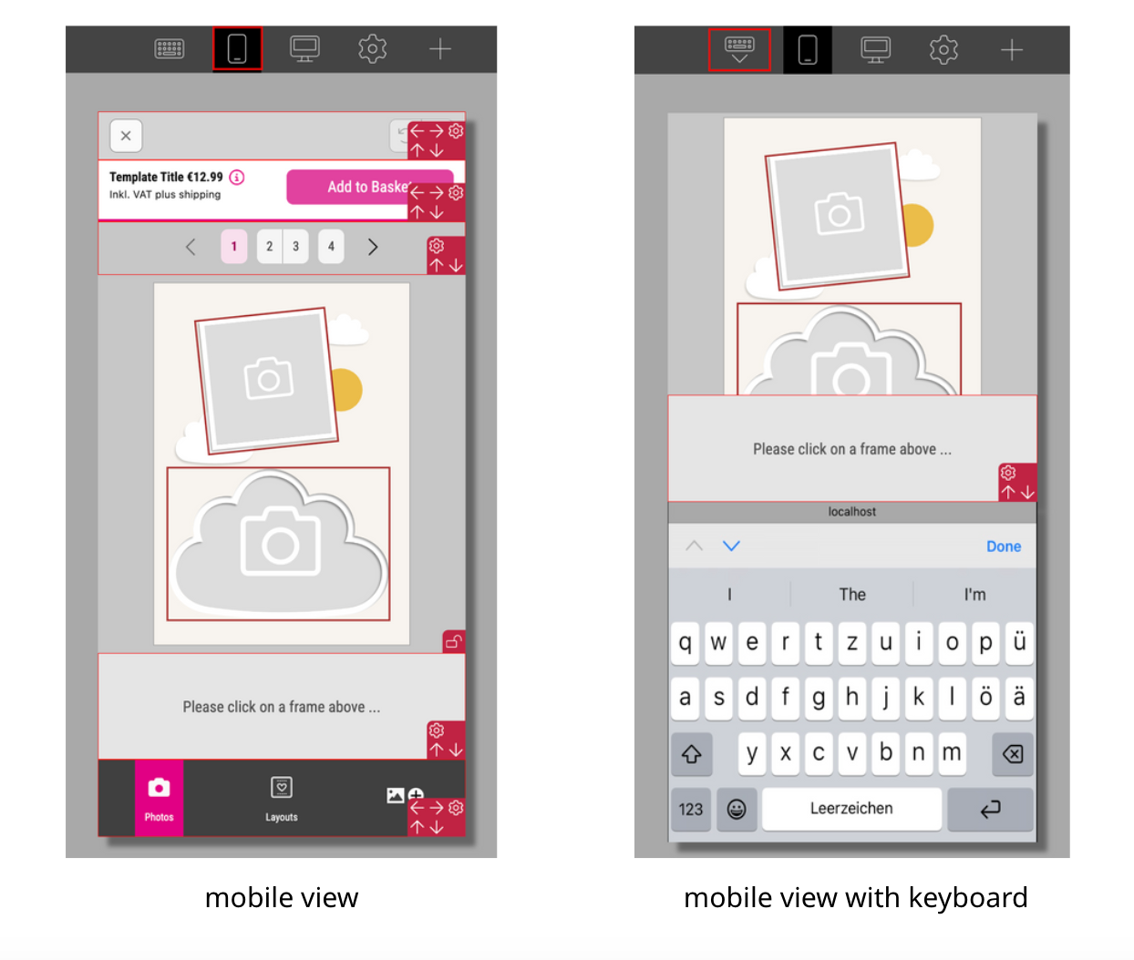
Desktop View:
Click on the icon to switch back from the mobile view to the desktop view.
Theme Settings:
The Theme Properties View will be loaded for more detailed settings of your Theme. These settings will apply to the Mobile View as well as to the Desktop View.
Read more about the Theme Properties View here.
![]()
If you click on the icon you would like to replace another dialog opens.
![]()
Just copy the code of the svg into the text input field and press Set Icon.
This example is using the following code:
<svg xmlns="http://www.w3.org/2000/svg" viewBox="0 0 512 512"><!--!Font Awesome Free 6.7.2 by @fontawesome - https://fontawesome.com License - https://fontawesome.com/license/free Copyright 2025 Fonticons, Inc.--><path d="M406.5 399.6C387.4 352.9 341.5 320 288 320l-64 0c-53.5 0-99.4 32.9-118.5 79.6C69.9 362.2 48 311.7 48 256C48 141.1 141.1 48 256 48s208 93.1 208 208c0 55.7-21.9 106.2-57.5 143.6zm-40.1 32.7C334.4 452.4 296.6 464 256 464s-78.4-11.6-110.5-31.7c7.3-36.7 39.7-64.3 78.5-64.3l64 0c38.8 0 71.2 27.6 78.5 64.3zM256 512A256 256 0 1 0 256 0a256 256 0 1 0 0 512zm0-272a40 40 0 1 1 0-80 40 40 0 1 1 0 80zm-88-40a88 88 0 1 0 176 0 88 88 0 1 0 -176 0z"/></svg>
I used it to replace the icon facing-pages. In the icons list both icons are displayed now. But of course only the new one would be used within the UI.
![]()
Press “OK” to close the dialog and don’t forget to save your Theme to apply the change. If you would like to remove this icon later just delete the code and save the Theme. If you still got your Printess Template open you have to reload it before you switch to the Buyer Side or the Theme Manager again. Otherwise the changes would not appear!
Add Panel:
To add a panel to your Theme click here. This will open a Dialog where you can choose from the different panel available. Each Panel could be placed only once.
Switch View:
Here you can switch from the Edit Mode and the View Mode back and forth.
In difference to the settings of the different Panels these settings will apply to the Mobile View AND to the Desktop View.
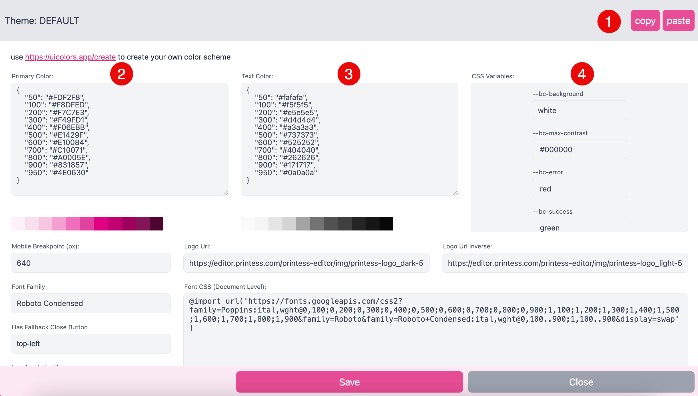
You can change the Extra Colors like the color of the error messages for example, the Font Size and the max characters, the General Controls like border width, margins and paddings and the Buttons settings like colors and paddings.
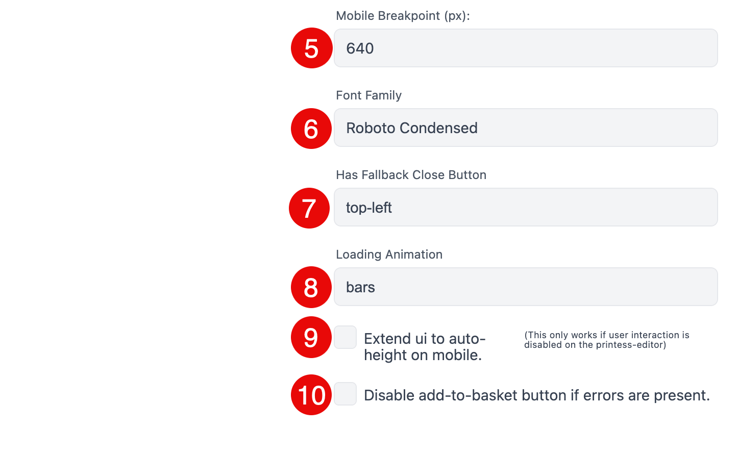
Mobile Breakpoint:
Define the break point from which on the UI should switch to the Mobile View. The value is defined as the pixel width. You have to type in a value only. The unit is always in Pixel “px”.
Font Family:
Select one of the font families that you have loaded to your website via the link in the Font CSS field (see below).
Has Fallback Close Button:
The Fallback Close Button will appear if it is turned on and if no other close button is defined. It could be helpful to use it on the Mobile View because it will be applied as an overlay. So that it does not need any additional space.
none:
The Fallback Close Button is turned off.
top-left:
The Fallback Close Button is turned on. It will appear “top-left” in the Theme when needed.
Loading Animations:
If you like to show the Printess bars while loading you choose “bars”. Otherwise you can set the animation to “none”.
Extend ui to auto-height on mobile
This is a special setting for the mobile view. The Panel UI will be rendered
in a scrollable container. The Buyer can NOT select items on the preview so that an interaction is not possible.
But the Buyer can scroll the entire view to reach a huge amount of From-Fields in
a mobile web site fashion.
Note: To make it work you have to set the Layout setting of the Panel: “Properties” to desktop as well.
And you have to set the Attach Parameter “noUserInteractionOnStage: true,” in the script.
Take a look at an example in CodePen here.
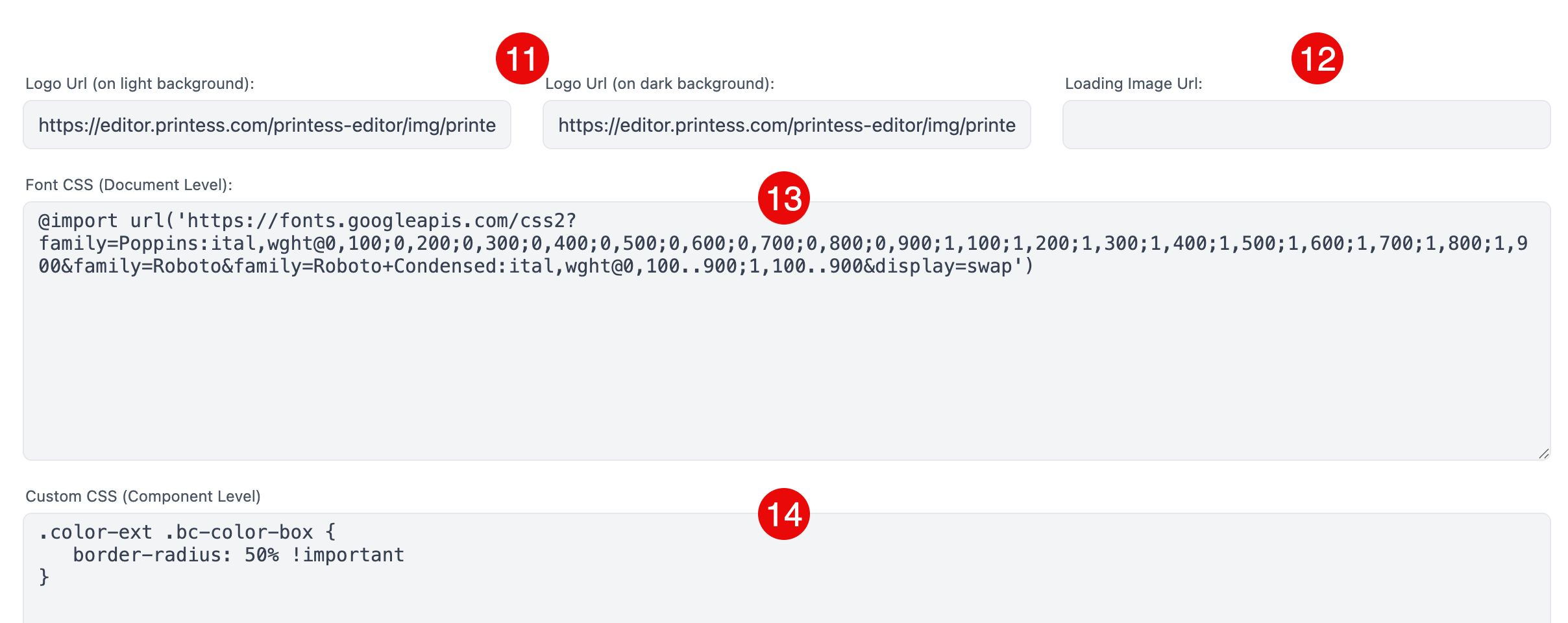
Logo Url
Here you can paste in the “Logo Url” for the logo on light background and the URL for a logo on dark background you would like to add to the Theme. It will be place in the Header Panel and saved as an additional panel you can add to the Theme. Depending on the saturation of the selected background color of the Panel Printess will show the one or other logo.
Loading Image Url
By default the Printess logo appears when the Editor is loading. Here you can address the URL of your own image to be displayed instead.
Font CSS (Document Level)
Define a URL where you like to load the fonts for the Theme from. Browsers do not support to load fonts to the web component level. Therefore we have to insert the fonts in a separate section - the Document Level.
Custom CSS (Component Level)
Create your own CSS to design the panel.
Upload Image Placeholder
Here you can assign an image URL to replace the Upload Image


In the Edit Mode View the edges of each Panel are red and a small red Toolbar is shown.
Just grab a red edge of the Panel and move it. This will change the size of the Panel.
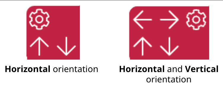
The Toolbar of the Panel shows arrows to move them into the different directions. Some Panels got an Horizontal orientation and can be moved up and down only. Most Panels could be moved to the left and right as well. Simply click on one of these arrows and the Panel will move in the corresponding direction.
To open the Panel Settings you have to click on the gear icon of the Panel Toolbar. A new view will open with the different option for the different Panel types. But some of the settings all Panels have in common.
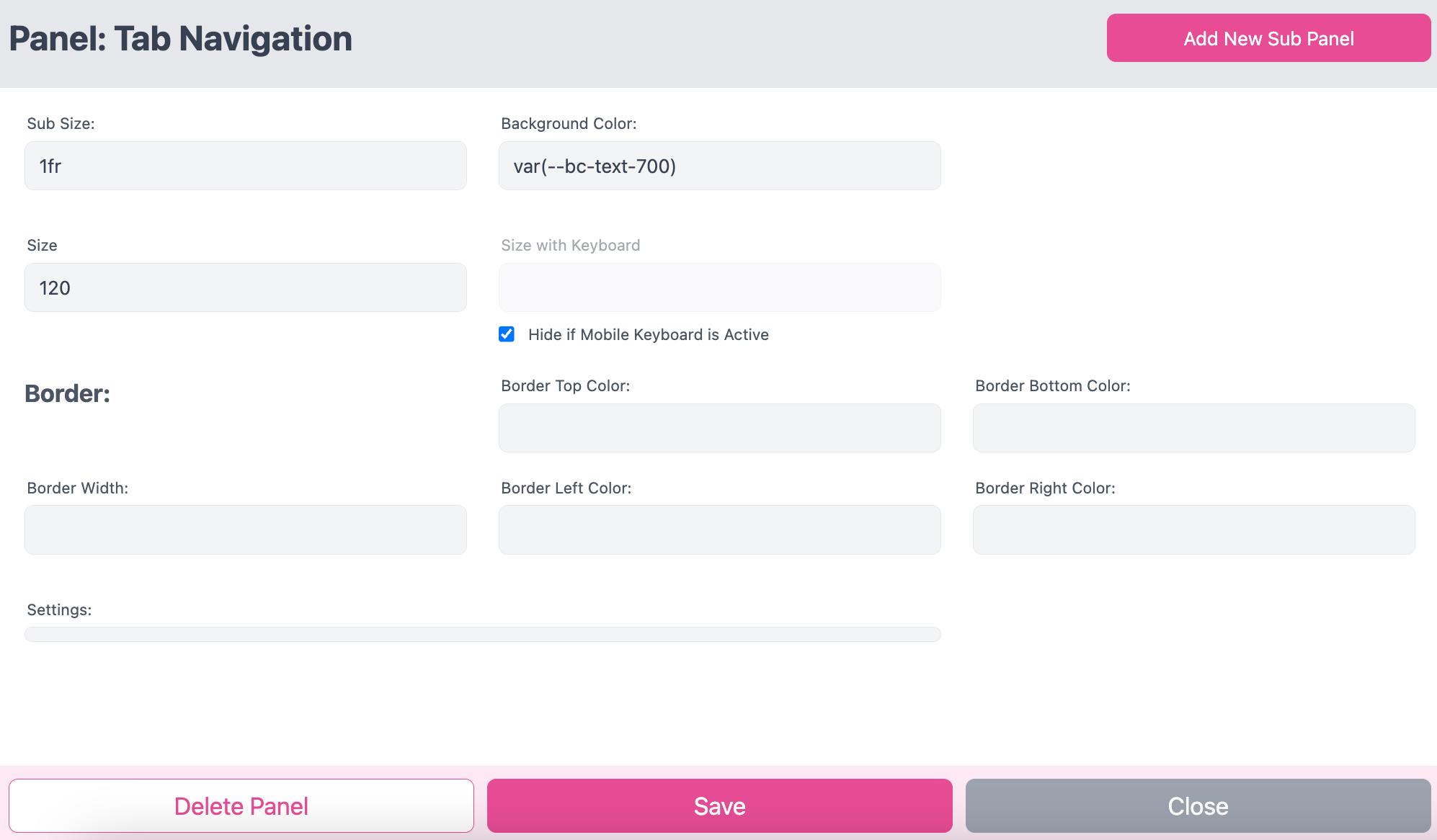
Add New Sub Panel:
You can add Sub Panel to your Panel. If you click that button a new view will open where you can choose from the existing panels. Each Panel could be only placed once.
Sub Size:
The size of the panel in relation to any Sub Panel may added here. It is using CSS length units like “auto”, “1fr” or “%”. “auto” will take the minimum space needed. “1fr” means 100% of the space available will be used. If you got two elements set to “1fr” each of them will get 50% of the entire space.
Background Color:
You can just type in a number code like e.g. “#ffffff” for a color to define. Or you can use the small triangle on the right to get a drop down menu shown with all CSS variables available to choose from. But you have to delete any value from this field first. Otherwise the drop down menu will not appear.
Size:
Depending on the orientation of the Panel you define the height or the width of the Panel. You have to type in a value only. The unit is always in Pixel “px”.
Mobile View with Keyboard:
You got two options for your Panels as soon as a keyboard is shown in a mobile view:
Size with Keyboard:
You can define the height of the Panel. You have to type in a value only. The unit is always in Pixel “px”.
Hide if Mobile Keyboard is Active:
Will make the Panel disappear.
Border
For the Border of each Panel you can set a Border Width in Pixel “px”. If you define a Border Width you can now define:
a. Border Top Color
b. Border Bottom Color
c. Border Left Color
d. Border Right Color
To define all of these colors you can type in a number code like e.g. “#ffffff”. Or you can use the small triangle on the right to get a drop down menu shown with all CSS variables available to choose from. But you have to delete any value from this field first. Otherwise the drop down menu will not appear.
Delete Panel
Delete the Panel from the Theme.
Save
Applies your changes to the current View but does not save them to the Theme. Please use always the small “save” icon ![]() on the top left to save your changes to the Theme.
on the top left to save your changes to the Theme.
Close
Close the Panel Settings without applying any changes to the View.
Learn more about the Buyer View Appearance Settings here.

This Panel is only visible in the desktop view. It has a horizontal orientation only.
By default it already includes the Button-Bar Panel and the Basket Panel as Sub Panels.

Maximum Logo Height
Set the maximum height for the logo. If you set it to “auto” the entire space available will be used. But you can also define a fixed value. You have to type in a value only. The unit is always in Pixel “px”.
Show headline instead of logo
You can type in a headline text which will be shown instead of a logo.
Turn on or off the Close Button in this Panel. There is a separate Panel for just the Close Button available.
Turn the Undo / Redo buttons on or off. Or choose the option Use Template Settings. In this case the setting form the Buyer View Appearance of your Printess Template will be used.

Learn about Buyer View Appearance Settings
You can turn on and off the Zoom Buttons. This is because you can use the Button Bar Panel several times as a SubPanel within other Panels. So may in one SubPanel you would like to display this option - in others not. The option with label will turn on the buttons and not just display the icons but also the text infos “ZOOM-IN” and “ZOOM-OUT”. Or you can choose the option Use Template Settings. In this case you define the appearance for the button in the particular Printess Template in the Buyer View Appearance Settings at the Tab Other Settings.
Learn about Buyer View Appearance Settings
Here you can turn on and off the Color Scheme to be displayed in the Button Bar Panel.
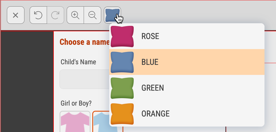
You can turn off all theses buttons because you can use the Button Bar Panel several times as a SubPanel within other Panels. So may in one SubPanel you would like to display this option - in others not. To turn on one of these Buttons in general you have to choose the option Use Template Settings. In this case you define the appearance for the button in the particular Printess Template in the Buyer View Appearance Settings at the Tab Other Settings.
Learn about Buyer View Appearance Settings
Layout Horizontal or Vertical defines the alignment of the two elements “Pricing Details” and the “Add to Basket” button and any additional Sub Panel within the Panel.

Show Pricing Details You can show or hide the “Pricing Details” in this Panel.
Learn more about Price Display here.
This Panel has a horizontal orientation only and it is meant for typing in a headline. You can not add a logo but other Panels like the Basket or Button panel.

Headline: Type in your headline here.
Horizontal Text Align
You can align the headline to the “Center”, “Left” or “Right” of the Panel.
Margins
You can define the following margins of the headline to the edges of the Panel:
a. Margin left
b. Margin right
c. Margin top
d. Margin bottom
You have to type in a value only. The unit is always in Pixel “px”.
Withe the Close Button the Buyer could leave the Buyer Side without adding the product to the shopping basket.
You can choose from the styles “Simple” and “Normal” for displaying the Close Button.
This Panel is meant as a space holder if you want to create your own header structure. For that reason it already includes the Headline Panel and the Close Button Panel as Sub Panels.

You always need a Properties Panel. Otherwise the Buyer can not customize the Document. Here you define how the different Frame Properties and Text Form Fields will be arrange on the Panel.
Layout (for mobile view only)
For the Mobile View you can choose between auto and desktop.
auto
This is the recommended setting. It arranges the position of the Text Form Fields and Frame Properties automatically to get the best user experience for the Buyer. So it will automatically switch to one of the other modes below. And this based on the current Selection of the Buyer.
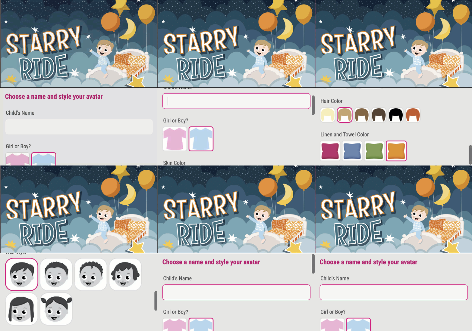
compact
This mode is tailor made for Avatar configuration products where you have just one Text Form Field and a few other configuration settings. The Text Form Field will be displayed on top of the Panel and the other Frame Properties as buttons below.
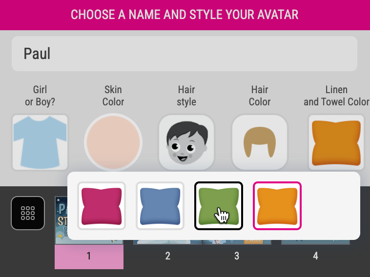
It will not move nor scale the preview above. Any Frame Property will be displayed as a small overlay. And you can display a dedicated title for this Panel.

Therefore you have to set up a Label Form Field to activate the option “Is Mobile Headline”.
Learn how to set up a Mobile Headline here.
Button-Bar
Displays the different Frame Properties and Text Form Fields as buttons in one row. If the number of the buttons do not fit the screen the Buyer has to scroll to the right.

Text-Sticker
This option is made for customizing Sticker Snippets at the Buyer Side. It forces to shows a block of the Colors in the first row and up to six Text Form Fields in two columns below.
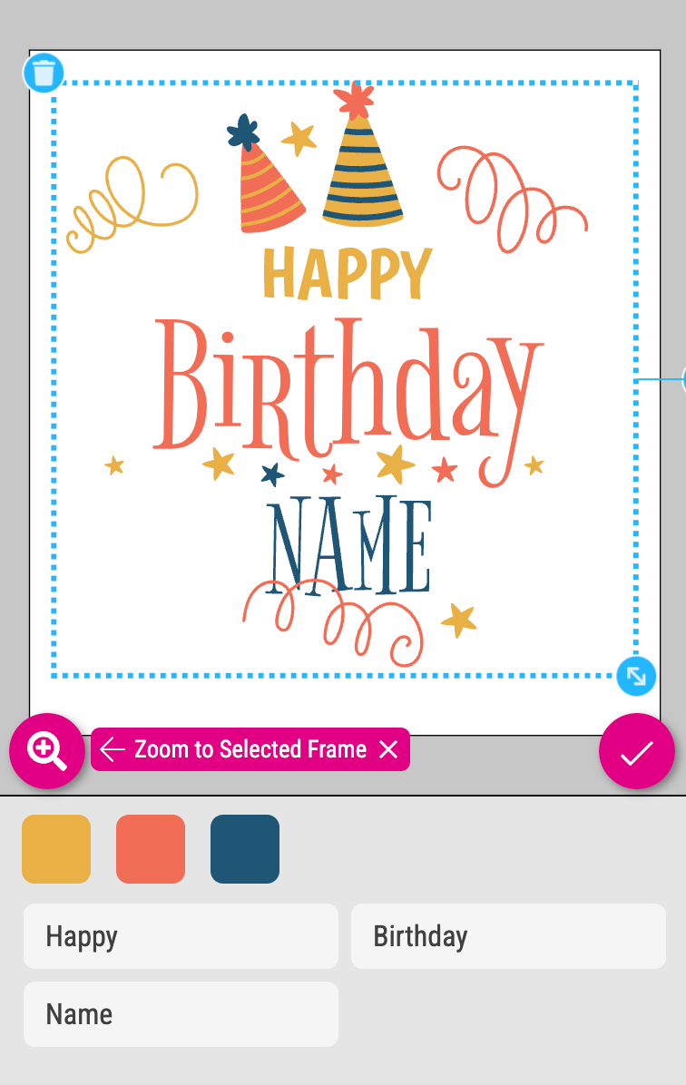
desktop
Forces to keep the position of the Frame Properties and Text Form Fields like in the desktop view. The Buyer has to scroll within that Panel to see the different options. So if you have a lot of Text Form Fields and Frame Properties to display the desktop view is the right choice. For a business card configuration for example.
If you like to get the entire Panel UI rendered in a scrollable container you have to activate the option Extend ui to auto-height on mobile in addition. You find a check box at the bottom left of the Theme Properties to activate it.
Read more about the auto-height setting here.
Label Style
Define how the labels of the Form Fields should be displayed.
Automatically choose label style
This is the recommended setting. Printess automatically sets Show as placeholder for the mobile compact and Text-Sticker View. For any other View it will be set to Show above input to display the Text Form Field Labels.
Show above input
Enforces the display of the Form Field Labels above the input field of the Form Field.
Show as placeholder
Enforces the display of the Text Form Field Labels as a placeholder text within the input field of the Text Form Field.

OK-Button after text boxes (for view mobile only)
You can show or hide a OK Button after the text input field.

Max Page Thumbnail Width
Define the maximum width for the thumbnails of your Layout Snippets and Sticker Snippets.
As a maximum value is defined here, the different Document formats are displayed in different sizes.
Max Page Thumbnail Height
Define the maximum height for the thumbnails of your Layout Snippets and Sticker Snippets.
As a maximum value is defined here, the different Document formats are displayed in different sizes.
Change docking for landscape from “right” to “bottom”
If you turn this option on you can use the Theme for different Document with different orientations. The Theme will then automatically place the Panel at the “right” for Portrait format Documents and “bottom” for landscape format Document. This is particularly useful if the Buyer can choose between different formats of the same Document.
Size when docked at bottom
Define the height of the Panel when it is docked to the bottom with the option above (Change docking for landscape from right to bottom).
Lock/ unlock the Panel (mobile view only)
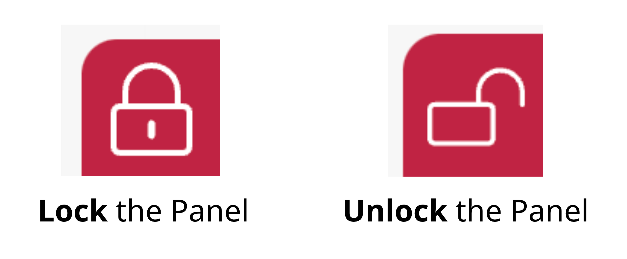
The Properties Panel display changes with each Selection made by the Buyer. In Mobile View this change can cause the size of the Panel to vary with each Selection. Consequently the preview may also scale accordingly. To improve user experience you have the option to lock the Panel. This action maintains a fixed aspect ratio for the preview, ensuring a consistent and enhanced user experience.
You can click on the small lock icon on the top right to lock and unlock the Panel.
Depending on the Buyer Side Settings of your Printess Template the content of this Panel is automatically generated. So if you do not use e.g. Layout Snippets in your Printess Template, the “Layouts” icon will not be displayed. Only the Form Field Tabs would be shown if you have activated them at the Buyer View Appearance Settings. But if the Tab Navigation Panel is empty it will not be displayed in the UI for this particular Printess Template. Even though it is visible in the Theme Manager because it is still part of the Theme as long as you do not remove it there. So please switch from the Edit Mode to the View to double check if it will be displayed or not.
Learn more about “Form Field Appearance” settings here.
If the Tab Navigation Panel is empty, it is used in the Mobile View to display the Page Preview. This is because it takes up less space than the Pages Panel.
This Panel is a page navigation for the Buyer. It shows the Pages of the Document as Thumbnails. You can define the size of these Thumbnails.
Max Page Thumbnail Width
Define the maximum width for the thumbnails of your Printess Document Pages and Spreads.
As a maximum value is defined here, the different Document formats are displayed in different sizes.
Max Page Thumbnail Height
Define the maximum height for the thumbnails of your Printess Document Pages and Spreads.
As a maximum value is defined here, the different Document formats are displayed in different sizes.
Dynamic Thumbnail Size
By default it is turned on to scale the size of the Thumbnails to the maximum hight or width. If you turn it of all Thumbnails are displayed in a fixed square size.
Change docking for landscape documents from ‘right’ to ‘bottom’
By default it is turned off. If you turn it on the Pages Panel will automatically move from the right to the bottom of the UI if the Buyer selects a landscape format Document - a spread for example.
Size when docked at bottom
Define the hight (in pixel) of the Pages Panel when it is docked to the bottom.
Enter Pages Preview
You can turn on and off the Pages Preview button. But the button only appears if the option Rearrange Pages is activated. This is the case if you allow the Buyer to add Spreads.

It will display a overlay view with bigger thumbnails of the pages to get a better overview specially for photo book products. It makes it easier for the Buyer to find and double click a dedicated page for editing. And to add pages and changing their order.
Learn more about “add Spreads” here.

This Panel is a page navigation for the Buyer. It shows two arrows to skip back and forward through the Document Pages. In between it shows the number of the current page and the maximum number of pages.
In the Desktop View it is also used to show the Frame-Bar.

It is showing the Frame Properties of the Buyers Selection.
If there is no Pages Mini Panel available in the Desktop View the Frame-Bar will be displayed at the top of the Properties Panel.
If you open this Panel it only shows you the logo you have assigned through the Logo Url (on light background). Even though it also automatically manages the logo version you assigned through the Logo Url (on dark background). Based on the background color saturation of the Panel where it is placed it will display one or the other version of the logo.

You can define the following margins of the logo to the edges of the Panel:
a. Margin left
b. Margin right
c. Margin top
d. Margin bottom
You have to type in a value only. The unit is always in Pixel “px”.