 .
.Groups are a powerful addition to control the Buyer Side UI.
Normally, each element you set up to have controllable features such as content or color will show its features when you select it on the Buyer Side.
Groups take this to the next level. Just group frames with controllable features. Then, Printess will analyze all the features and assign them all equal properties with one intuitive control on the Buyer Side.
So all frames with the same text (only Single Line text) will have just one input field, and all frames using the same color will have just one collective color selector. By grouping frames, you will create an optimized configuration group.
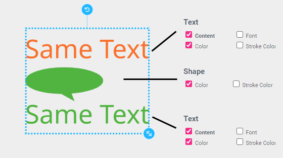
Let’s have a look at an example. Here is a group containing a shape and two text frames, with their respective Buyer Side settings to the right:
 .
.
As one can see, the Single Line text frames have the same text, and the shape and second Single Line text frames have the same color.
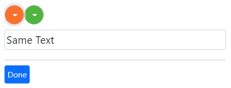
Printess will automatically create the following Buyer Side UI configuration when they are grouped:
 .
.
Changing the text will now change the text in both Single Line text frames. Changing the green color will change the color of the shape and the color of the lower text frame.
Therefore, grouping provides an easy way to change several properties at once if they are on the same page. If one would like to change several frames at once across multiple pages, consider using Form Fields. Learn more about Form Fields here.
A good example of the power of grouped configurations are Sticker Snippets, which are always grouped and thus will expose one simple UI to the Buyer.
Growing Multi Line text can shift elements below it that are in the same group. This is a useful feature to let a signature below a letter move down when the letter text gets longer.
For this to work, the element(s) to be shifted must be positioned below the top of the Multi Line text frame and Auto Frame Size must be switched on in vertical mode for the text. No additional configuration beside grouping the text is necessary for the elements to be shifted.
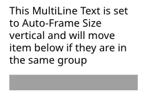
In this example we placed a simple gray bar shape below an auto-size text:
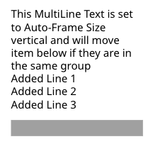
When additional text is added the gray bar moves down:
 .
.